The network for creativity
Join 1.25M professional creatives like you
Connect with clients, get discovered, and run your business 100% commission-free
Creatives on Contra have earned over $150M and we are just getting started
Back to feedPost

Most online stores look the same. Same theme, different logo.
That is not a design problem, it is a sales problem. When your store looks like the last five a customer visited, they compare you on one thing only: price.
Three things I change when I build from scratch.
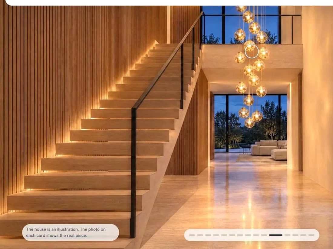
The product stands in its world, not on a white square. A lamp belongs in a lit room. A perfume belongs where its ingredients grow. People buy the feeling first and the spec sheet second.
The first scroll does the selling. Not a hero slider and a grid of thumbnails, but one idea in motion that tells a visitor what the brand is before they read a word.
Nothing is faked. The scene can be an illustration, the product photo cannot. A render that flatters the product costs you the return and the review.
Everything is hand-coded, so nothing here is a plugin fighting a template.
What I build
Landing pages, one job done well - from $300
Custom websites and Shopify stores - from $650
3D product showrooms: turn it, dim it, change the light in the browser - from $650
A 3D store with a built-in AI assistant that answers like a salesperson - from $1200
Web apps and internal tools - tell me the scope
Two live examples: a perfume house where you walk through one day from morning to dusk, and a lighting brand where you scroll through a house at blue hour while the fixtures light it as you go.
Tell me what you sell and I will tell you what I would build for it. The conversation costs nothing.
#shopify #ecommerce #webdesign #3d #landingpage



That is not a design problem, it is a sales problem is the line that reframes this whole post. The first scroll does the selling is spot on, and nothing being faked about product photos is a principle more stores should steal.
The network for creativity
Join 1.25M professional creatives like you
Connect with clients, get discovered, and run your business 100% commission-free
Creatives on Contra have earned over $150M and we are just getting started



Related posts

Halden - Landing Page Concepts
Halden sells to grid operators, and there were two good ways to pitch it: tell them what's coming, or show them everything happening now. Rather than pick one on instinct, I designed the landing page as an A/B test so real traffic decides.
The two pages share one 12-column grid, the same section order, type system and components. Each variant changes only its message, its hero visual and its light color, so any difference in demo requests comes from the pitch and not the layout.
The work was building a system flexible enough to carry two different stories without either one feeling like the backup version.
Forecasting (act before demand spikes) vs metering (see and bill every kilowatt)
Primary metric: Demo requests from the hero CTA
4 voted
57%
3 voted
43%
7 votes
Closed

I'd pick Forecasting. "From meter reading to early action" tells a grid operator what they get in one line. Did you write both hero lines before designing the visuals?

A modern, elegant website concept designed for J. Michaels Salon, showcasing a premium beauty and wellness experience.
The design combines sophisticated typography, warm neutral tones, golden accents, and beautiful interior imagery to create a luxurious and welcoming digital experience.
The homepage features a clean navigation system, an immersive hero section, elegant visual presentation, and a clear call-to-action that guides visitors towards exploring the salon's products and services.


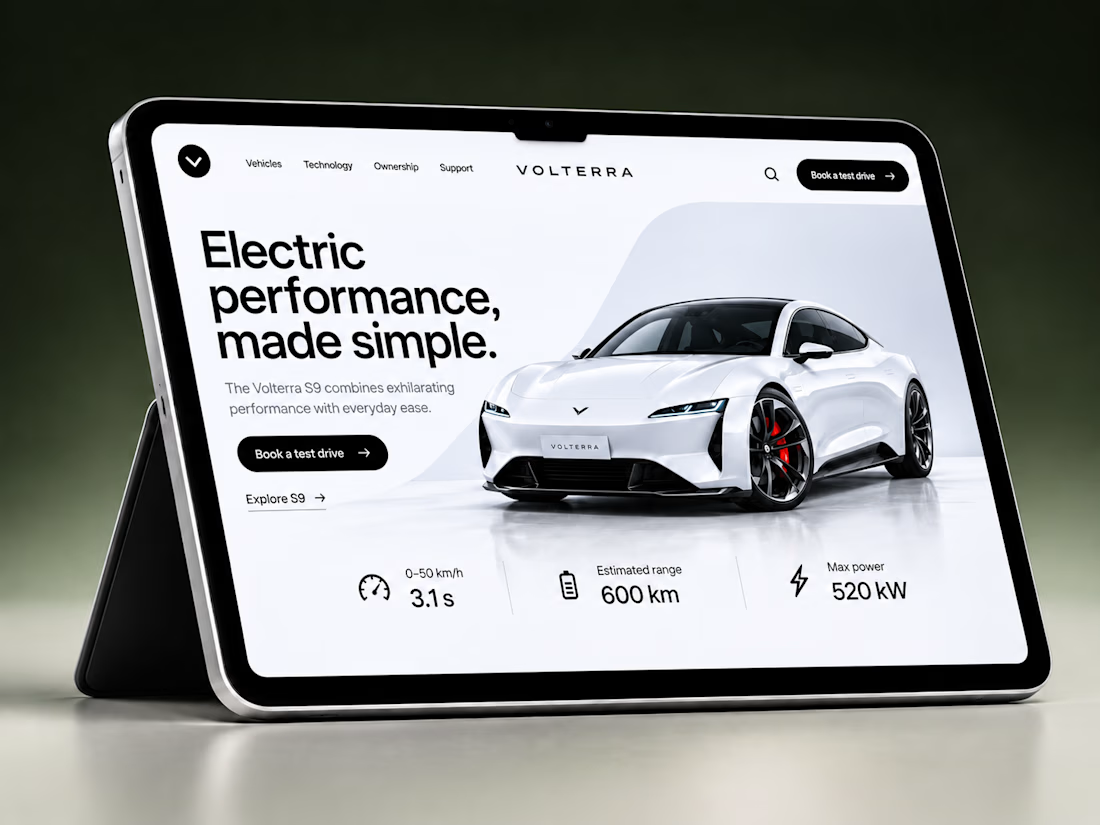

A fresh e-commerce redesign focused on making the product experience cleaner, clearer, and easier to shop.
Really happy with how this one came together 🫧
What do you think about this visual direction? Would love to hear your thoughts!

The cleaner product layout really lets the items breathe, Ella. The soft visual direction fits a shop that wants to feel calm and easy to browse.