The network for creativity
Join 1.25M professional creatives like you
Connect with clients, get discovered, and run your business 100% commission-free
Creatives on Contra have earned over $150M and we are just getting started
Back to feedPost

Lifestyle Webinar Landing Page Design



The network for creativity
Join 1.25M professional creatives like you
Connect with clients, get discovered, and run your business 100% commission-free
Creatives on Contra have earned over $150M and we are just getting started





Related posts

AI Sales Agent SaaS Landing Page
A modern AI Sales Agent & Sales Intelligence SaaS website designed for startups and growing businesses looking to automate sales workflows, streamline lead management, and boost revenue through intelligent automation and real-time insights. The design combines a premium SaaS aesthetic with a conversion-focused user experience, featuring clear product messaging, interactive sections, and a scalable interface built to support modern sales teams.

Amazing design

Saas Management Landing Page Design

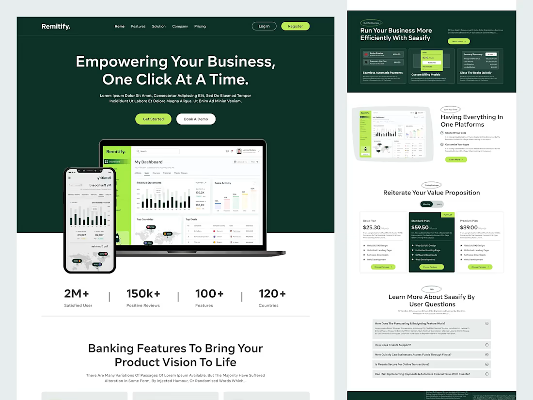
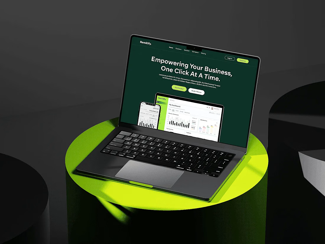

The deep green with lime accents reads "finance you can trust" without feeling like a bank, and the stats row right under the hero adds instant credibility. When pages like this get built, the dashboard in the hero is the part I'd make live: a lightweight animated version with...

Still waiting to hear back from @Contra HQ
So I did what any designer would do: I made the card myself 😂
Brushed metal. Laser-engraved logo. Holographic Mastercard rings. Full 360° spin. I'm going to keep polishing this until the real one shows up in my mailbox. Your move, Contra 👀
(Concept / fan design, not an official Contra product..Yet 🙌 )


“Okay, this looks WAY too good 🔥 Contra needs to make this real 👀”