The network for creativity
Join 1.25M professional creatives like you
Connect with clients, get discovered, and run your business 100% commission-free
Creatives on Contra have earned over $150M and we are just getting started
Back to feedPost

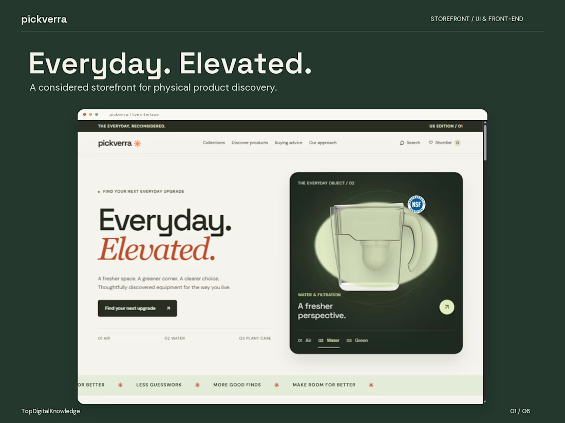
I wanted Pickverra to feel like a place you’d enjoy browsing, even before you knew exactly what you were looking for.
It’s a storefront concept for physical products across air and moisture, water filtration, and plant care. The challenge was giving those three categories a shared identity while making each one feel distinct.
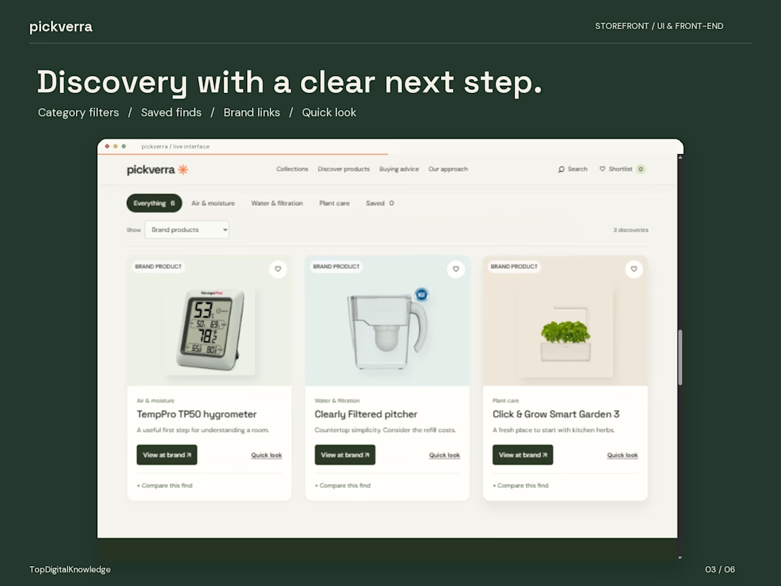
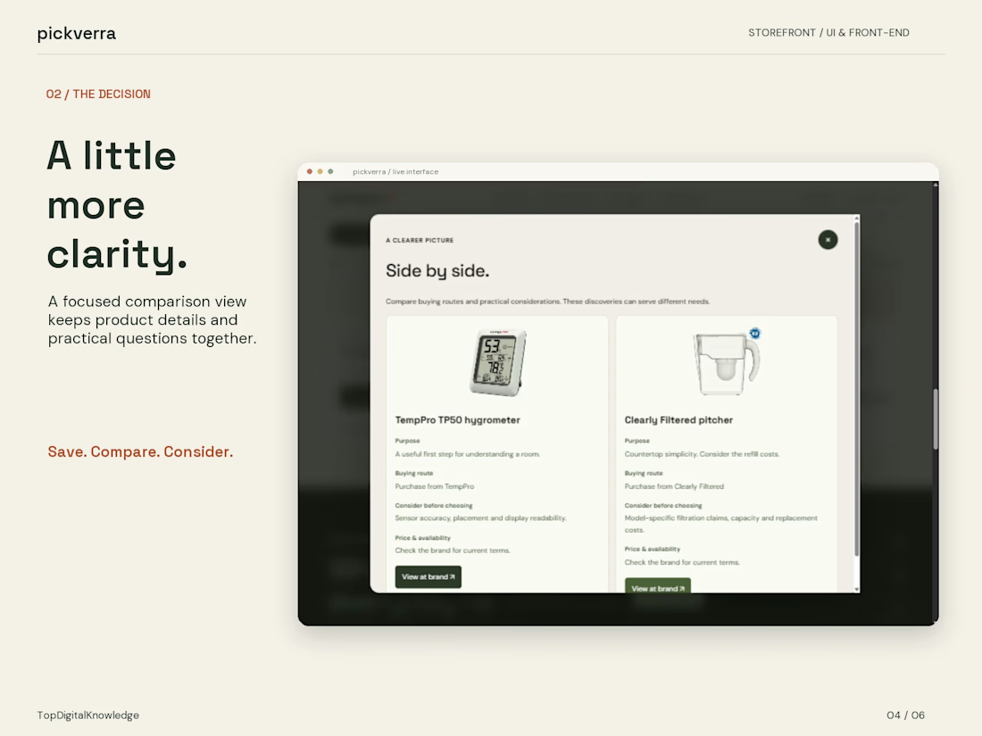
I built the visual direction around warm neutrals, deep green, rust accents and generous typography. Product imagery has room to breathe, while the category controls, quick views, saved finds and comparison panel give the experience a practical side.
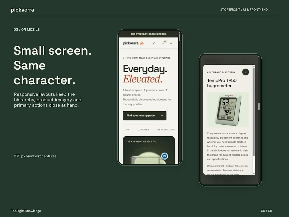
Motion adds a little atmosphere through the featured product stage, category changes and scroll interactions. On mobile, the focus shifts to a clear reading order, accessible actions and product details that are easy to scan.
This is a front-end project with working brand links. Checkout and affiliate tracking are still to come.
I’d love some honest feedback on the UI. Is it clear where to go next? Do the product cards and comparison view give you enough information? And does the motion feel right, or would you dial it back?


The network for creativity
Join 1.25M professional creatives like you
Connect with clients, get discovered, and run your business 100% commission-free
Creatives on Contra have earned over $150M and we are just getting started











Related posts

I built this speculative mineral cabinet to simulate ultraviolet fluorescence and light-wavelength transitions directly in the browser inside a clean interactive UI.
Users can flip the cabinet lamp between 5500K daylight and 365nm longwave UV to watch dull, grey stones instantly catch fire. The system catalogs seven fictional specimens from Verdigrite to Duskbloom mapping out their host lattices, trace metal activators, emission wavelengths (from 416nm cold violet to 640nm rose pink), and seam localities. If you switch the lamp back to daylight, the borrowed photon energy cuts off immediately, while specimens like Sporewort hold a brief half-second phosphorescent linger before going dark.
Everything runs on the client side using JavaScript, CSS, and HTML5. The stone visuals, wavelength states, and spectrum plots render locally in the browser without relying on heavy external assets or server calls. The page updates the crystal glow, the three step photon excitation breakdown, and the spectral chart in one pass. I even included a control specimen called Nullstone with zero trace activators. So when someone flips on the UV lamp, it stays completely dark and inert instead of faking a glow.
The ragebaiting part was to format and structure out the mineralogy lore and wavelength data so it felt clean and fast. Putting the activator traces, nanometer readings, and locality codes right beside each stone makes it easy to read the numbers while looking at the crystal glow. No distractions. Showing the emission spectrum chart at the bottom also helps visitors see where every specimen sits on the visible band before cutting the lamp.😊


Lovely cohesive work, Alex. The motion is spot on!

15 seconds of smooth UI, editorial layouts, and micro-interactions.
Kept the micro-interactions snappy, typography expressive, and transitions buttery smooth.
Rate this UI animation from 1 to 10 in the comments, or tell me what you’d improve! 😉


Solid 10/10 bro! 🔥 Micro-interactions are super snappy and transitions are buttery smooth indeed. Editorial layout game is strong. Keep it up!