The network for creativity
Join 1.25M professional creatives like you
Connect with clients, get discovered, and run your business 100% commission-free
Creatives on Contra have earned over $150M and we are just getting started
Back to feedPost

UX Critique: Price Sliders vs. Segmented Buttons (And the crucial "Sort By" feature)
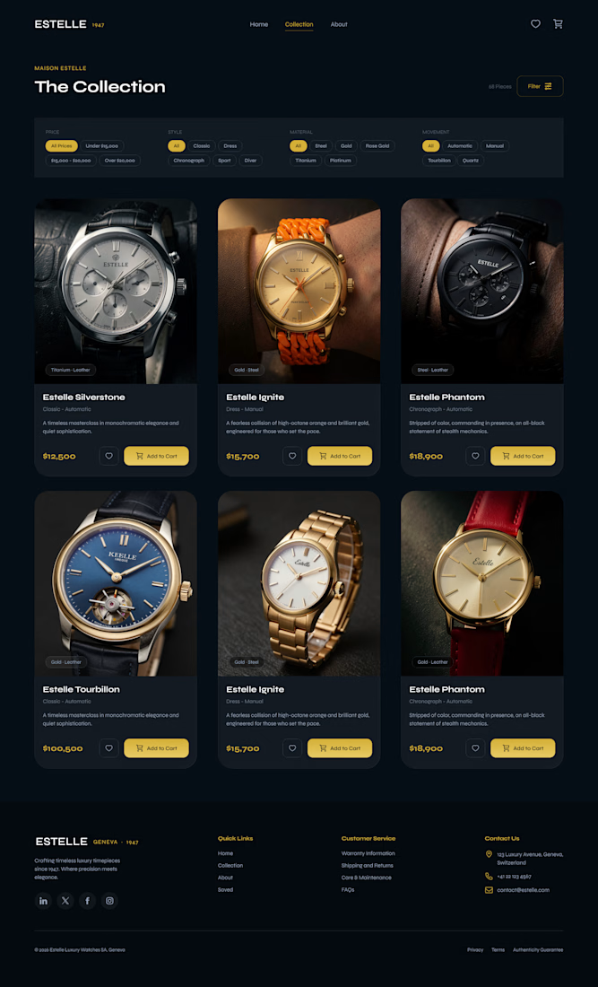
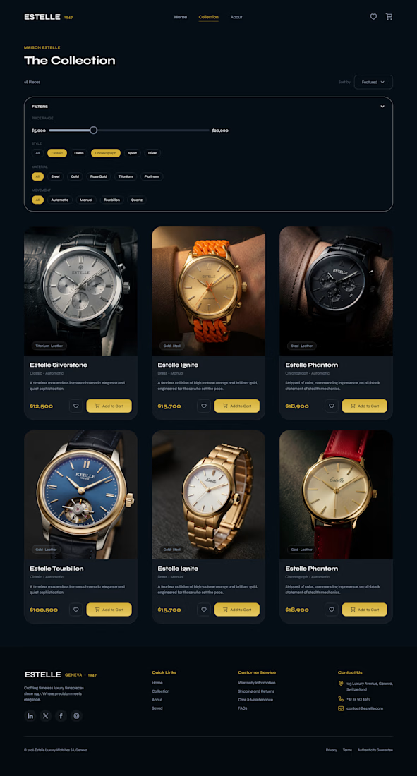
I'm currently refining the collection page for a luxury e-commerce website and testing two functional approaches for the filter states.
Since both filter menus can be fully collapsed to maintain a clean, minimalist layout, the decision comes down to user control and functionality.
Option A (Image 1):
Uses segmented button ranges for pricing (e.g., "Under $15k", "$15k - $20k").
Lacks a dedicated "Sort By" option.
Option B (Image 2):
Introduces a continuous, fluid price slider for custom budget targeting.
Integrates a "Sort By" dropdown (Featured, Newest, Price High-to-Low) to give users full control over how they view the collection.
From a usability standpoint, Option B feels like a massive step up, especially for high-ticket items where buyers want precise control over how they browse.
What are your thoughts? Does the slider offer a better premium feel, or do you prefer the simplicity of quick-tap price buttons?
Let’s discuss in the comments! 👇
#UXDesign #UIDesign #WebDesign #EcommerceUX #ProductDesign
The network for creativity
Join 1.25M professional creatives like you
Connect with clients, get discovered, and run your business 100% commission-free
Creatives on Contra have earned over $150M and we are just getting started









Related posts


EarthHub – A Platform for Nature Expeditions ⛰️
Stumbled upon this project in my hard drive, had to publish!


Top to bottom nice work


this is really nice 100%. nice job

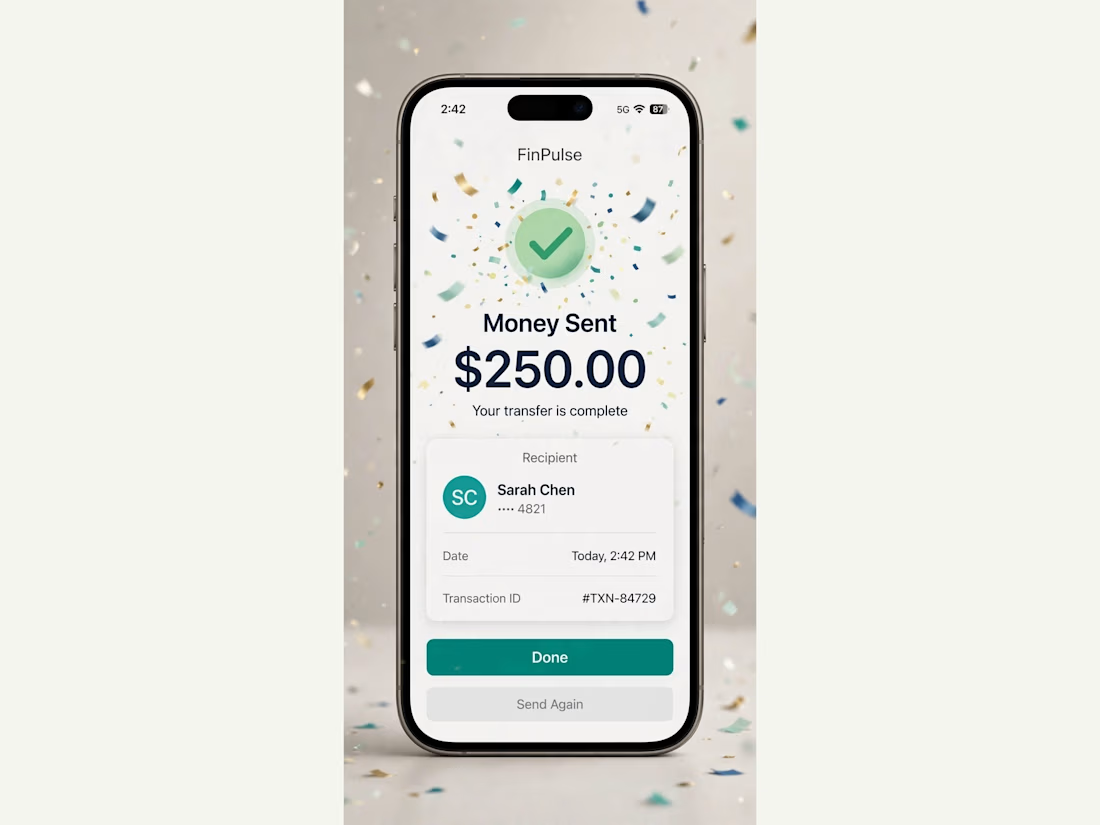
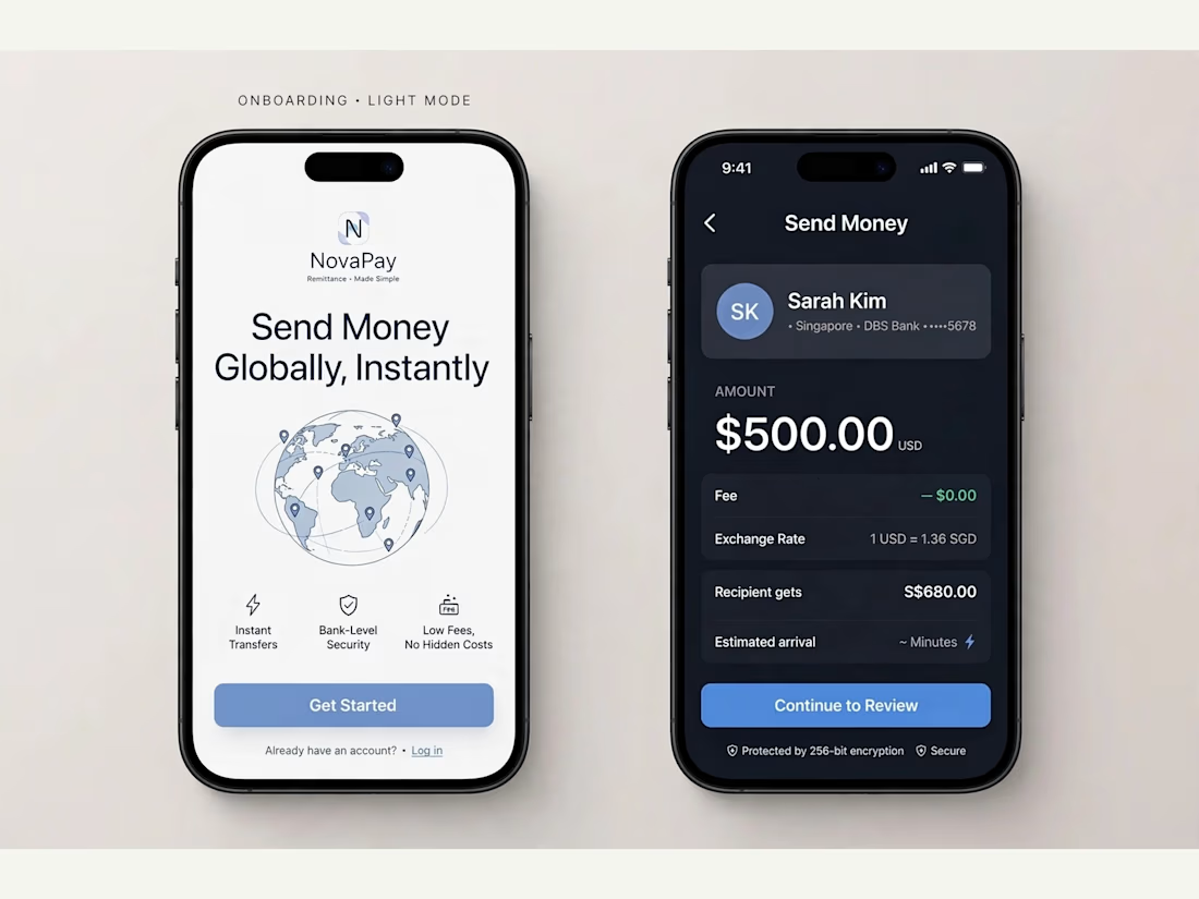
FinPulse — Premium Cross-Border Remittance App
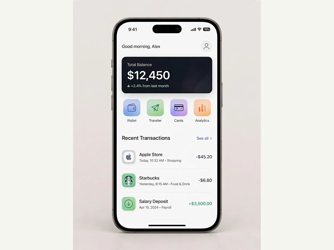
Designed a trustworthy FinTech mobile app for global money transfers.
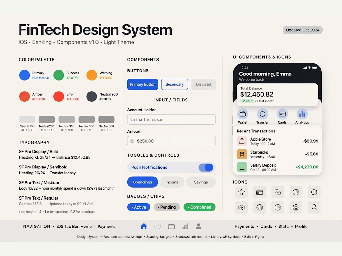
Process: Started with user flow & wireframes for 3-tap transfer, then built a scalable design system in Figma with 100+ components.
Outcome: Final UI focuses on clarity and trust — from onboarding to Home Dashboard ($12,450 balance), Send Money, and Money Sent success state. Built for conversion and speed.
Tools: Figma, iOS Design System, SF Pro
Tags: Mobile App, FinTech, UI/UX, Product Design



Really solid FinTech mobile design. Clean, trustworthy, and the user flow sounds well thought out. Great outcome on the final UI!