The network for creativity
Join 1.25M professional creatives like you
Connect with clients, get discovered, and run your business 100% commission-free
Creatives on Contra have earned over $150M and we are just getting started
Back to feedPost
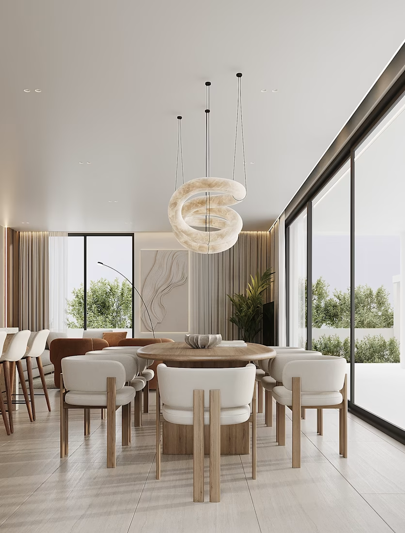
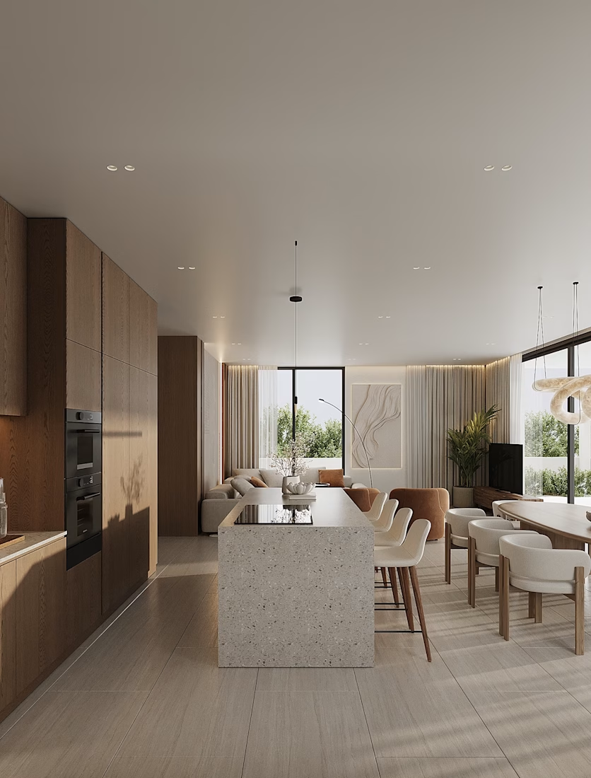
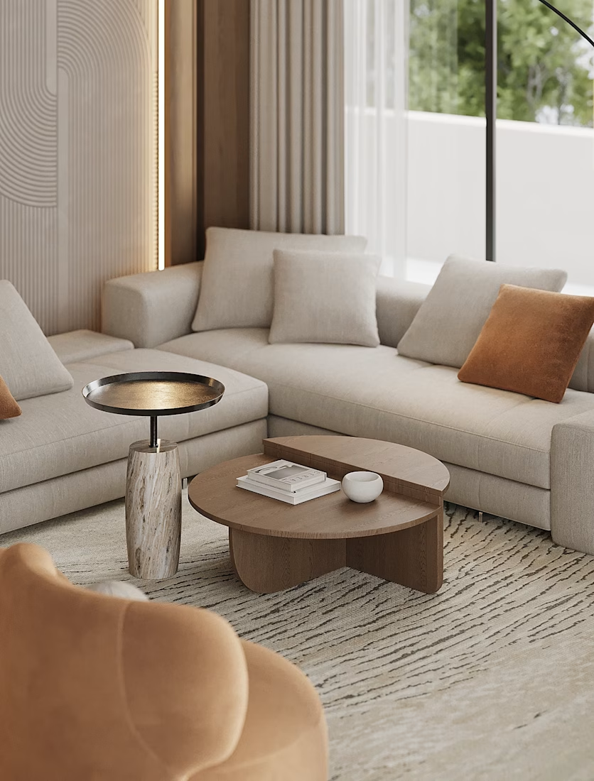
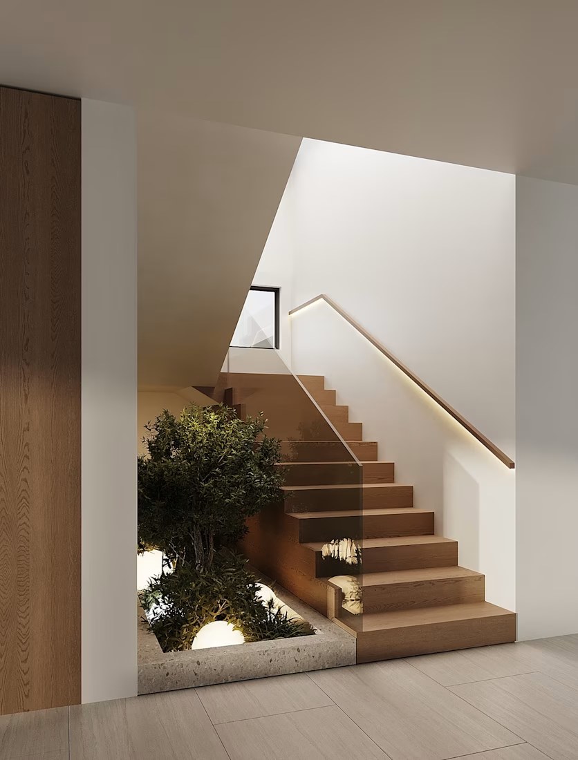
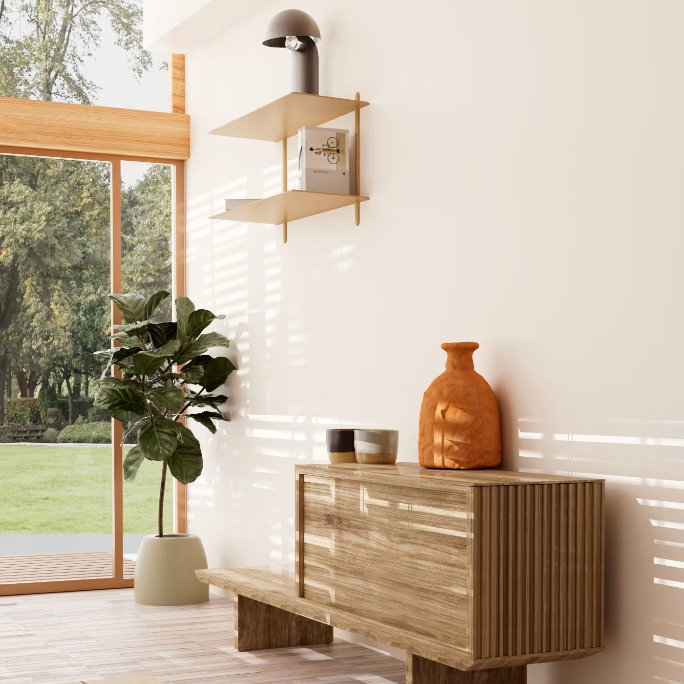
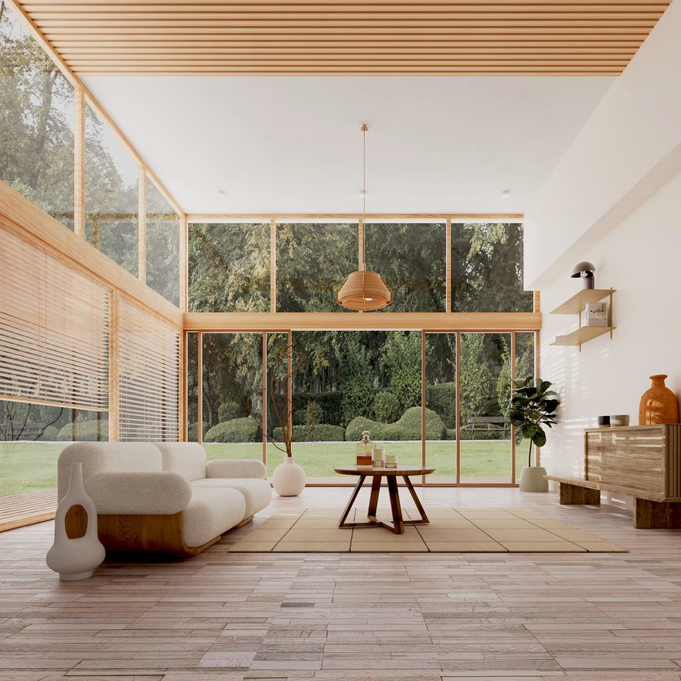
Japandi style renders. Modelled with Cinema4D, not Ai here 🧠




thank you!

Looks very nice! I'd say if you zoomed in the second picture a bit more so it reduces the amount of floor texture visible, the composition would sit a bit better!
thank you for the tip ;)

fell like taking real photo, nice detailing.
thank you!
The network for creativity
Join 1.25M professional creatives like you
Connect with clients, get discovered, and run your business 100% commission-free
Creatives on Contra have earned over $150M and we are just getting started





Related posts

Good COFFEE - True 3D Product Animation
Converted a simple coffee cup concept into a premium true 3D animation for DTC brands.
What I focused on:
• Smooth 360° rotation with realistic depth
• Studio lighting + subtle steam for premium feel
• Clean black background for ad-ready look
• Optimized for social ads and product pages
Tool: Blender-style 3D workflow
DM if you need similar clean 3D product visuals for your brand!


Nice

Day 3 🎃
Let's go!!
What's new:
- New enemy models (still WIP)
- Zombie and skeleton body parts now break apart and scatter on the ground
- Scene lighting and a glow effect
- Slide and camera control


The Kitchen Brings the Open-Plan Home Together
A well-designed kitchen should be practical, comfortable, and naturally connected to the rest of the home.
For this 63 sq.m apartment in Cyprus, I focused on creating an open-plan kitchen, dining, and living area that feels warm and spacious without feeling crowded.
I developed the layout and worked through the kitchen design, furniture placement, materials, lighting, and final camera views before rendering.
The main challenge was making the limited space feel comfortable while keeping it functional. Wood finishes, soft neutral tones, and warm lighting helped create a clean, calm, and welcoming interior.
With 3D visualization, design ideas can be explored and refined before construction begins, making it easier to understand how the space will come together.
What catches your attention first?
• Kitchen layout
• Wood finishes
• Lighting
• Furniture arrangement
• Neutral color palette
Location: Cyprus
Type: Apartment
Area: 63 sq.m
Tools: 3ds Max · Photoshop
#InteriorDesign #LivingRoomDesign #ArchitecturalVisualization #3DRendering #ResidentialDesign