The network for creativity
Join 1.25M professional creatives like you
Connect with clients, get discovered, and run your business 100% commission-free
Creatives on Contra have earned over $150M and we are just getting started


The network for creativity
Join 1.25M professional creatives like you
Connect with clients, get discovered, and run your business 100% commission-free
Creatives on Contra have earned over $150M and we are just getting started
Related posts


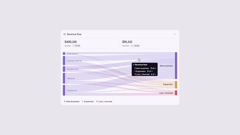
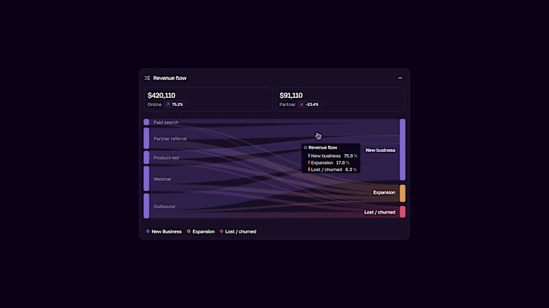


A launch film for a health product has to earn trust before it can impress.
For this AI health assistant, I created the motion design that brings the product into everyday life: calm pacing, soft glass surfaces, and an interface that lives inside real scenes.
Check it out. Would love to hear what you think.

Love the calm, thoughtful approach. It feels natural and helps build trust in the product.

Carousel Animation vs Thumbnail
Description: A quick test to see how the animation and thumbnail work together. What do you think?


5 voted
71%
2 voted
29%

7 votes
Closed

Nice test Salman! The thumbnail to carousel transition works really well - that blue gradient is smooth and the character cards pop nicely. The animation preview feels clean and engaging, definitely works together with the thumbnail. Great After Effects execution!🔥♥️


