The network for creativity
Join 1.25M professional creatives like you
Connect with clients, get discovered, and run your business 100% commission-free
Creatives on Contra have earned over $150M and we are just getting started
Back to feedPost

A design for an upgrading restaurant


The network for creativity
Join 1.25M professional creatives like you
Connect with clients, get discovered, and run your business 100% commission-free
Creatives on Contra have earned over $150M and we are just getting started








Related posts

A concept feed designed by Business Wifey Agency
The Project
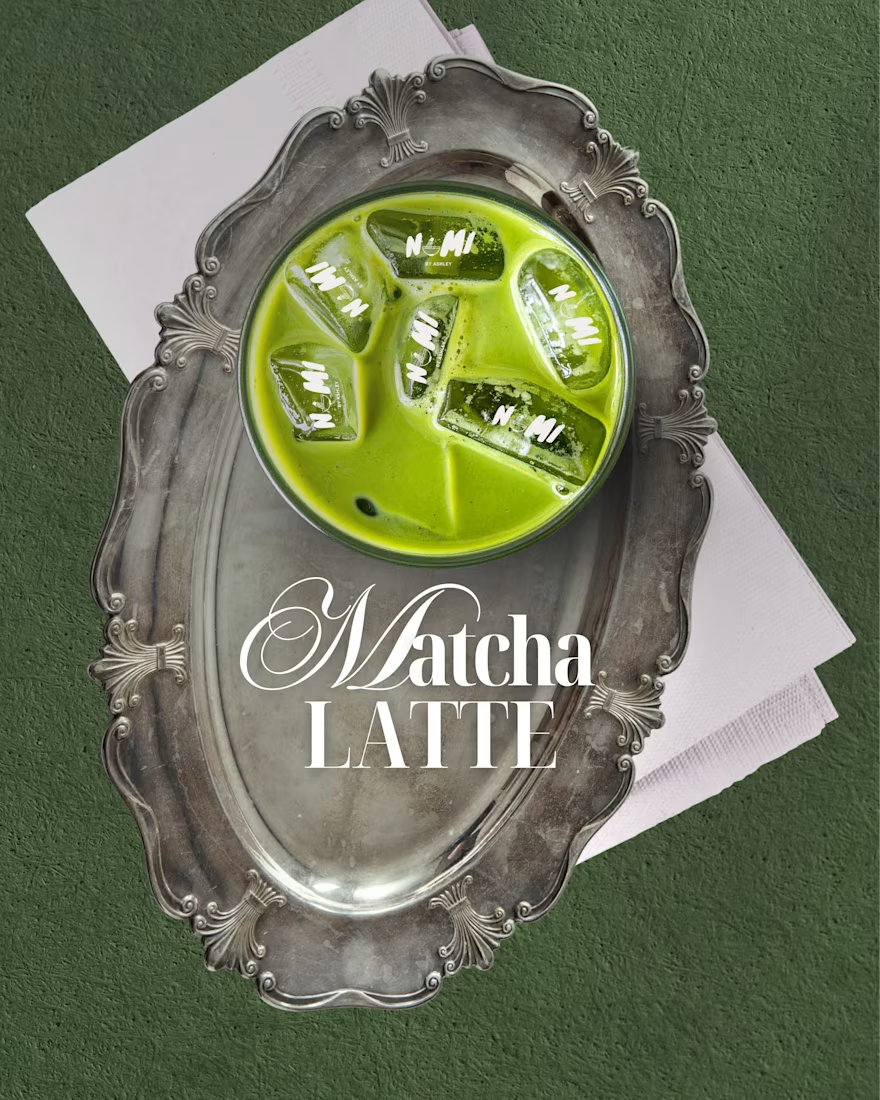
Nami Matcha is a matcha bar brand we fell in love with and couldn't resist designing for. This is not their official branding. This is BWA doing what we do best: taking a vibe, a product, and a personality, and turning it into a full visual identity that makes people stop and stare.
Because honestly - who doesn't love matcha?
What We Created
A complete social media design system built around Nami Matcha's playful yet premium aesthetic. Every post was designed to feel like the brand already existed, already had a loyal audience, and already knew exactly who it was talking to.
The feed covers every content pillar a beverage brand actually needs:
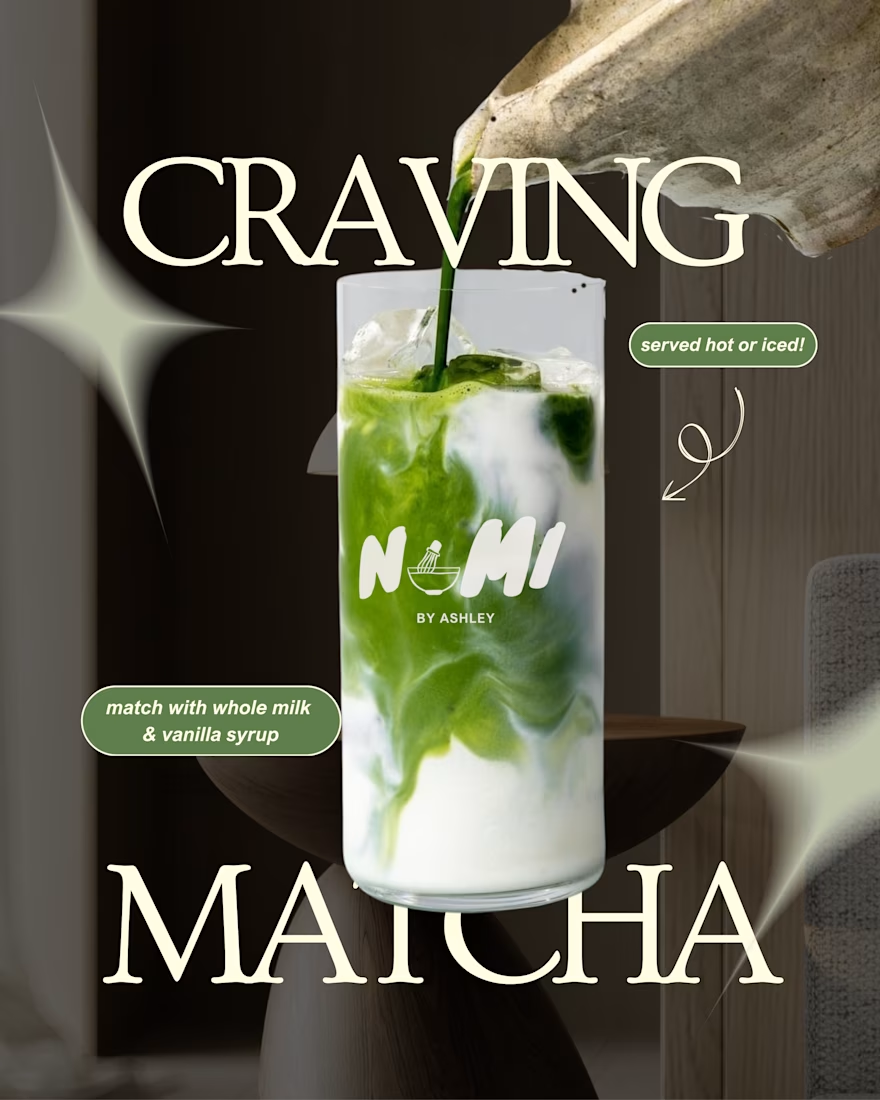
Product Content → Editorial-style drink photography posts with bold typography and on-brand copy that makes you want to order immediately.
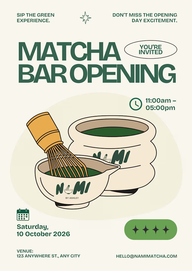
Event & Launch Design → A full matcha bar opening poster and pop-up event flyer - the kind of content that makes people save the date and show up.
Engagement & Viral Content → "Born to / Forced to," "Take What You Need," "Matcha Mode: ON" - the kind of posts that get shared, saved, and commented on because they feel real, not promotional.
Promotional Posts → Buy 1 Get 1 offers and product deals designed to convert, not just perform.
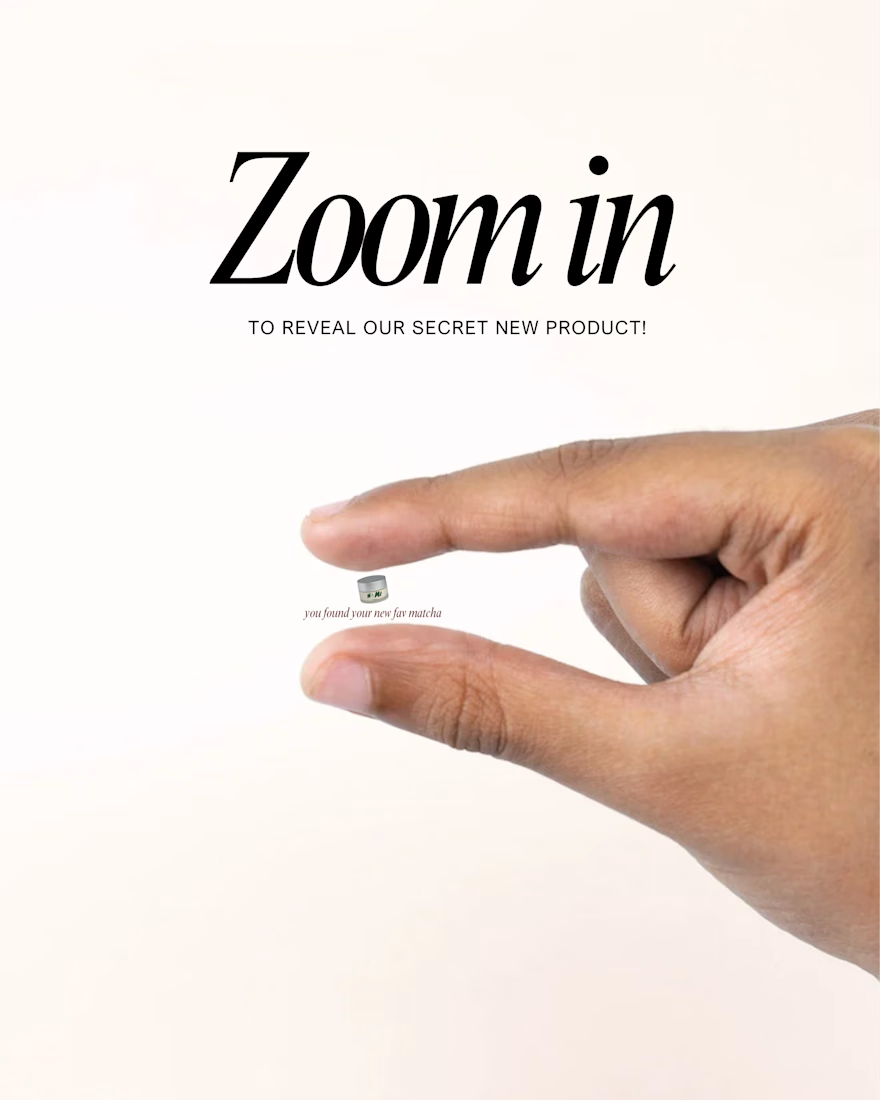
Brand Storytelling → From the fuel gauge concept to the receipt mockup, every piece tells the Nami Matcha story in a way that feels completely native to the platform.
The Result
A 10-post feed that looks like a fully launched brand - cohesive, confident, and completely scroll-stopping. This is what BWA brings to every client: the ability to make a brand feel real before it even launches.
Note
This is a concept project created independently by Business Wifey Agency to showcase our design capabilities. Nami Matcha is not an official BWA client and this is not their confirmed brand identity - we simply loved the concept and built it out because great design doesn't wait for a brief.
Skills & Tools Used
Brand Design · Social Media Design · Content Strategy · Feed Curation · Typography · Visual Storytelling

Love how the whole feed feels like a real brand launch. The mix of product, promotional, and engagement content works really well.


the archive interactions feel smooth. next.js doing a lot here

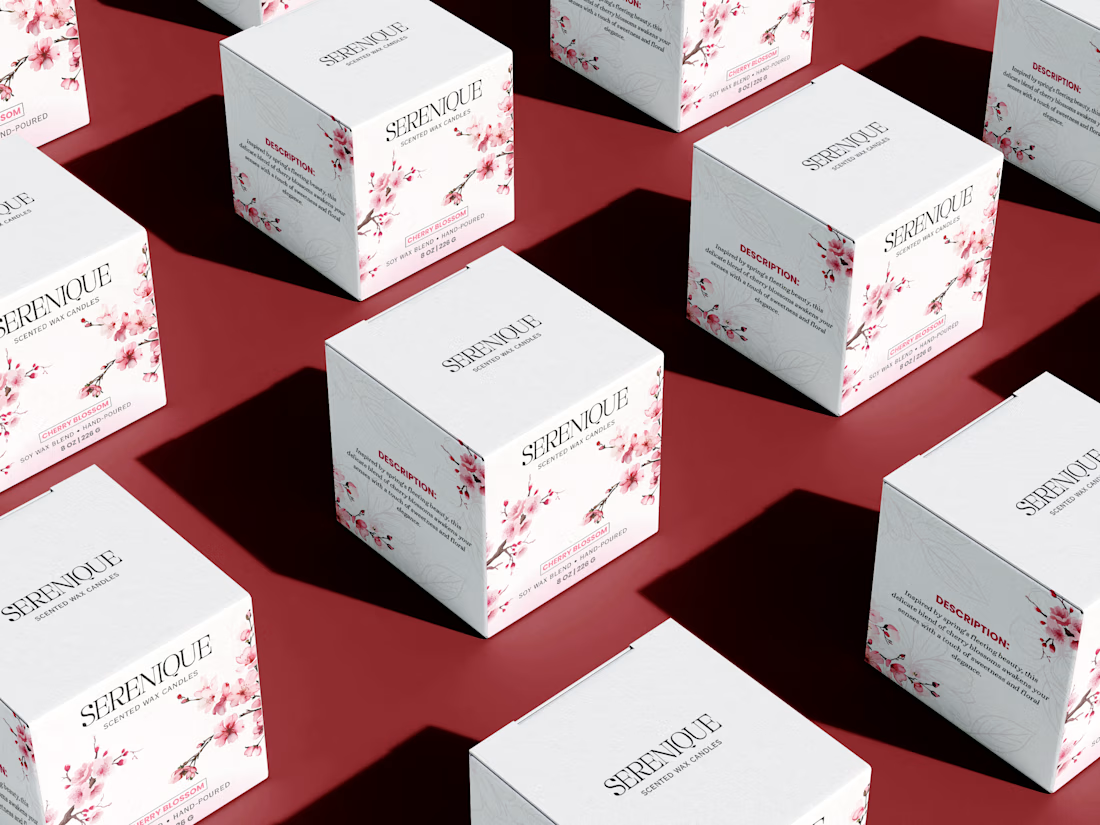
Sharing my Serenique candle packaging design.
A minimal and elegant packaging concept focused on creating a calm, premium feel while keeping the product presentation clean and balanced.
Would love to hear your feedback on the packaging design - what do you think? 🤍

the cherry blossoms on the white boxes look so nice against the red. did you draw the flowers yourself?