The network for creativity
Join 1.25M professional creatives like you
Connect with clients, get discovered, and run your business 100% commission-free
Creatives on Contra have earned over $150M and we are just getting started
Back to feedPost

NOVA — Product Launch Motion Graphics Concept
Project Type: Speculative Product Launch Video Role: Motion Graphics Designer & Visual Designer
Duration: 20 seconds
Project Overview
NOVA is a speculative AI productivity product created to demonstrate my approach to product-launch storytelling and motion design.
The concept focuses on introducing a modern technology product through a short, engaging visual narrative—from the initial brand reveal to the product introduction, key features, and final call-to-action.
Creative Direction
I designed the video around a premium, futuristic visual language with clean typography, animated product presentation, subtle lighting effects, UI-inspired elements, and smooth transitions.
The goal was to communicate the product's value quickly while maintaining a polished visual identity suitable for a modern technology brand.
What I Focused On
Product reveal and visual storytelling
Product-focused composition
Motion graphics and animated typography
Feature presentationSmooth transitions and pacing
Premium technology branding
Product-focused composition
Designing for short-form product marketing
Clear call-to-action
Concept Goal
The objective was to create a launch video that feels concise, modern, and engaging while showing how motion can transform a simple product introduction into a memorable brand experience.
This is a self-initiated concept created as a demonstration of my motion graphics and product storytelling capabilities.


The network for creativity
Join 1.25M professional creatives like you
Connect with clients, get discovered, and run your business 100% commission-free
Creatives on Contra have earned over $150M and we are just getting started
Related posts

What if one of the most meaningful messages you ever receive… is written by a version of you that no longer exists?
That question became Dear Future my submission for the #Base44Challenge.
We save photos.
We save messages.
We save memories.
But we rarely preserve who we were in that exact moment what we were thinking, hoping for, afraid of, or becoming.
So I designed a digital time capsule where your words don’t just get stored.
They wait for you.
With Dear Future, you can:
✦ Write a letter to your future self or someone else
✦ Add memories and images
✦ Choose the exact future date it should return
✦ Personalize your capsule with colours and seals
✦ Seal it so it can’t be read or edited before its opening date
✦ Watch the countdown inside your personal archive
✦ Return later and experience the letter as something preserved not just another notification
But the biggest design challenge wasn’t creating a way to send a letter later.
It was designing the wait.
As a Senior Product & UI/UX Designer, I wanted every interaction to support that idea.
The archive.
The physical capsule metaphor.
The vintage television.
The sealing ritual.
The countdown.
The responsive mobile experience.
None of them are there just for decoration. Together, they turn anticipation into part of the product.
I designed the UX, visual system, interaction language, responsive experience, storytelling, and complete product flow then built and shipped the working experience with @Base44.
This project reminded me why I love product design:
A good interface helps someone complete a task.
A meaningful experience makes them feel something while doing it.
Dear Future Words outlive the moment.
Experience the project ↓
Dear future capsule
Would you write something for yourself five years from now?


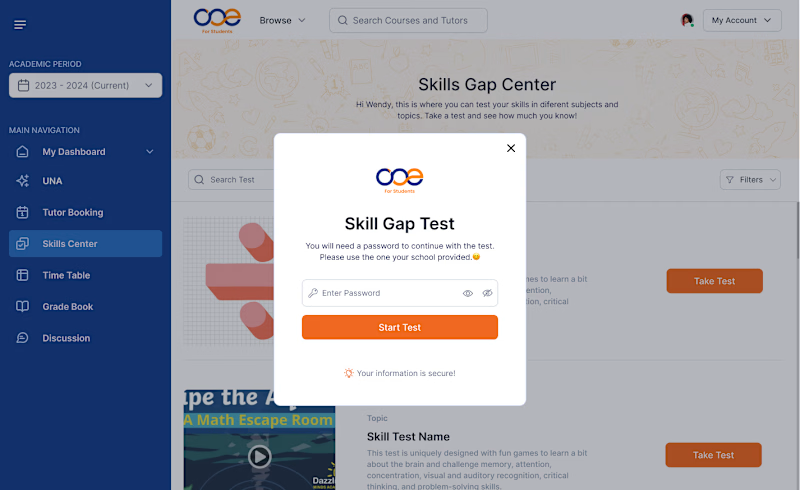
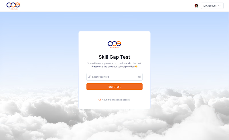
Which Skill Gap Test experience would you choose? 👀
I designed two different experiences for the same Skill Gap Test.
Option A: A modal inside the dashboard — users stay in context.
Option B: A dedicated page — a cleaner, distraction-free experience.
If you were using this platform as a student, which experience would you prefer?
A or B? Why? 👇
#UIDesign #UXDesign #ProductDesign
4 voted
36%
7 voted
64%
11 votes
Closed

Dedecated Page is more professional and minimalistic ❤️

Conversion-Optimized Webinar Funnel
Generating an impressive 1,025 total sign-ups through the application of the right strategy, the funnel proved to be a high-converting powerhouse built to capture attention and drive massive audience action.


For a webinar funnel, I’d look at the next step after registration too: calendar adds, reminder delivery and actual attendance by traffic source. That helps distinguish a page that attracts sign-ups from a journey that brings the right people into the session. Are you tracking attendance alongside registrations here?