The network for creativity
Join 1.25M professional creatives like you
Connect with clients, get discovered, and run your business 100% commission-free
Creatives on Contra have earned over $150M and we are just getting started
Back to feedPost
A lot of people think the hardest part of web design is creating a crazy hero section or adding impressive animations. But honestly, the more real projects you work on, the more you realize how difficult seemingly “simple” things can get.
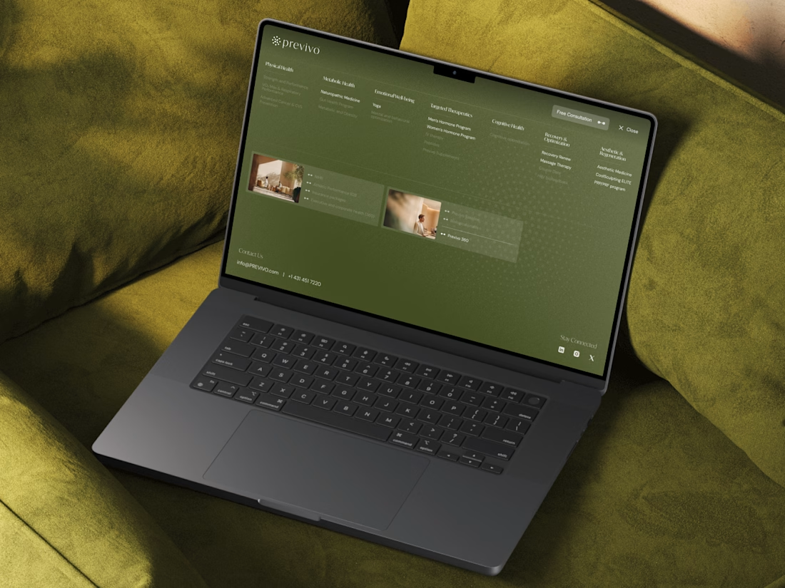
Recently, I was working on a new header and footer system for a large healthcare company in Canada that I actively support. And this was one of those tasks that looks easy until you actually get into it.
The platform has a huge number of programs, pages, categories, and user paths. So the challenge wasn’t really about visuals. It was about figuring out how to organize all of that in a way that still feels natural for the user.
How do you make dozens of important links feel clear instead of overwhelming? How do you help people get where they need faster without turning navigation into a mess? And then you also have to make sure everything works properly across different screen sizes and devices.
That’s the kind of UX work I genuinely enjoy the most. Because at some point, design stops being about decoration - and becomes much more about structure, clarity, and decision-making.
If you’re building a complex platform or service website and need help simplifying the experience, feel free to connect!
Love this!
Thank you, Madob!
The network for creativity
Join 1.25M professional creatives like you
Connect with clients, get discovered, and run your business 100% commission-free
Creatives on Contra have earned over $150M and we are just getting started
Related posts
Love this
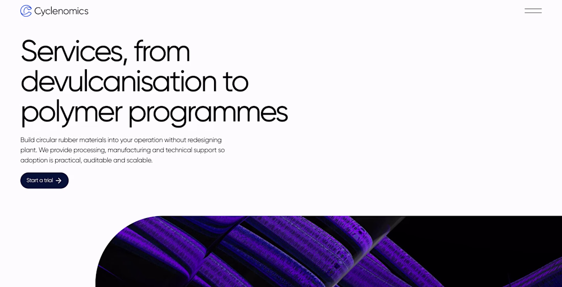
I honestly really like how this project looks.
Clean layout, sharp typography, nice spacing, and a visual direction that feels simple but strong.
It’s not overloaded with effects or random details. Just a clean Webflow build with a clear structure and good visual balance.
But here’s the funny part.
The project is still unfinished. At some point, the client just stopped replying, even though everything was moving well from our side.
So it probably won’t become a full portfolio case.
But I still think these screens deserve to be shared.
A few visuals from a project that never reached launch, but still turned out pretty nice.

amazing work
Looking for website designer
Trending
Claude
Claude has entered the design space. How are you using Claude Design?
Contra University
Learn from expert creatives how to earn more using next-gen AI tools.
creativeaiflow
Creative AI workflows are evolving. What tools do you use, and what are their strengths and weaknesses?
portfolioreview
The best portfolios tell a story, not just show a grid. Share yours for feedback.
freelancerlife
Freelancer life is wins, pivots, and everything in between. What’s yours right now?
