The network for creativity
Join 1.25M professional creatives like you
Connect with clients, get discovered, and run your business 100% commission-free
Creatives on Contra have earned over $150M and we are just getting started

The network for creativity
Join 1.25M professional creatives like you
Connect with clients, get discovered, and run your business 100% commission-free
Creatives on Contra have earned over $150M and we are just getting started











Related posts




Great 👍🏻

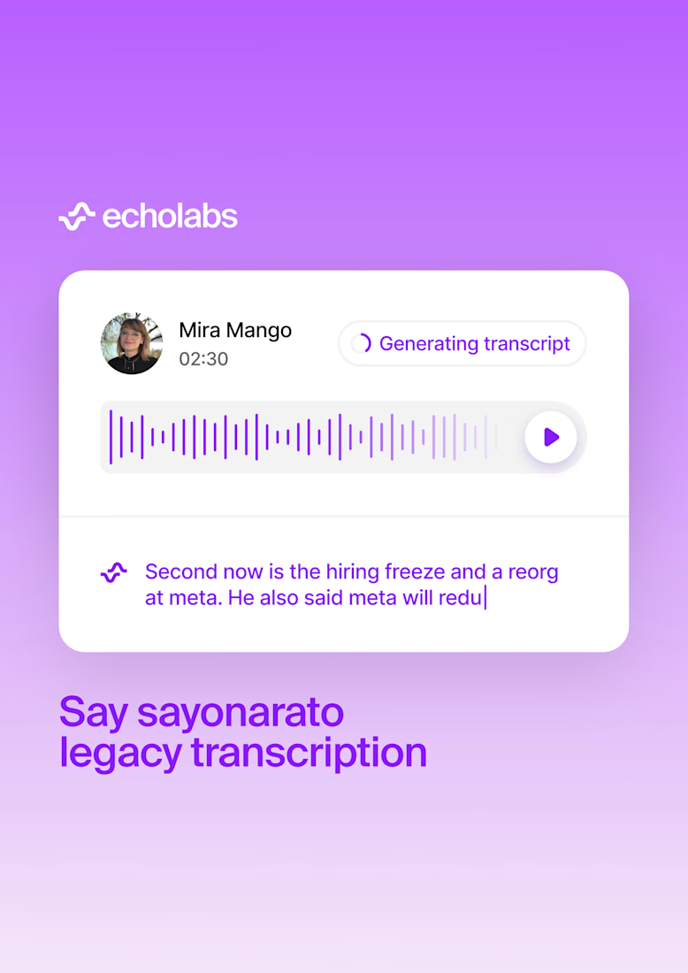
Our EchoLabs branding pairs a simple white symbol and wordmark with a more expressive visual world. Lavender, a compact transcription card and a vivid portrait give the applications range while keeping a recognisable core.



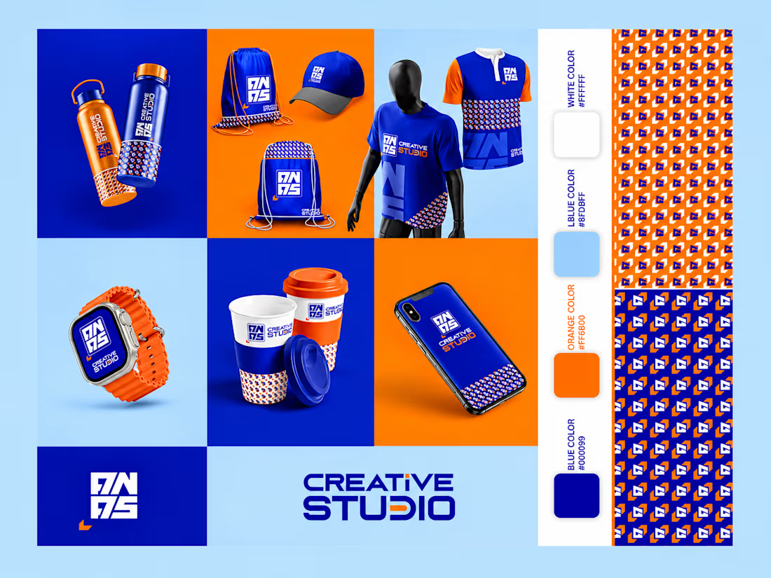
I created a bold, modern, and visually distinctive brand identity for Creative Studio, combining vibrant blue and orange colors to create a strong and memorable visual presence. The branding features a custom logo, typography, a consistent pattern system, and a complete range of branded mockups, including apparel, bottles, bags, cups, a smartwatch, and a smartphone.
The design focuses on visual consistency, creative expression, and a contemporary aesthetic, bringing the brand to life across multiple touchpoints. Every element is thoughtfully designed to establish a cohesive identity that reflects innovation, creativity, and professionalism.
Project Focus: Brand Identity, Logo Design, Visual Branding, Color Palette, Pattern Design, Typography, and Product Mockups. Brand Design Label Design Product Design



Nice