The network for creativity
Join 1.25M professional creatives like you
Connect with clients, get discovered, and run your business 100% commission-free
Creatives on Contra have earned over $150M and we are just getting started
Back to feedPost

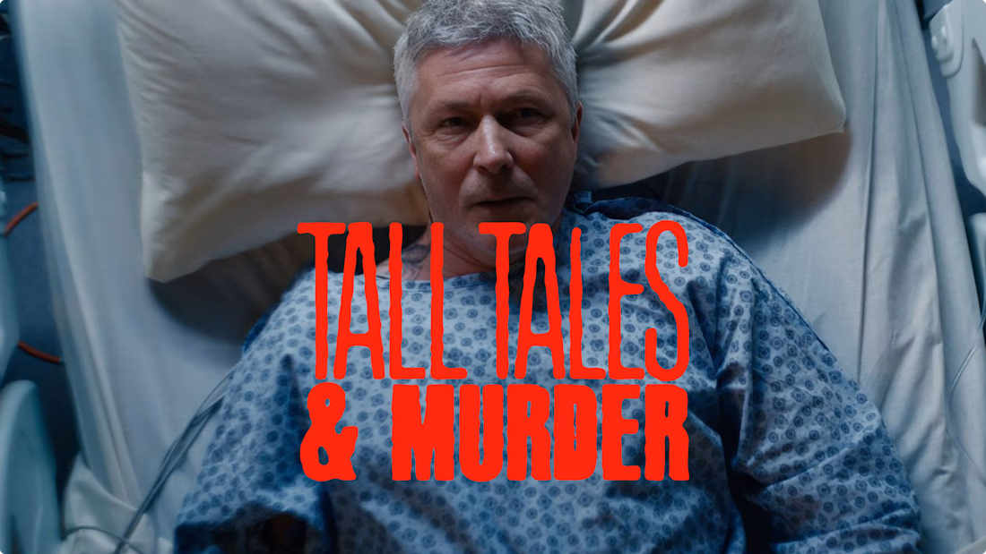
Ticked another bucket-list project off this year, this time, a title treatment for a new TV Crime Drama launching soon.
Tall Tales & Murder, starring Ella Lily Hyland (Black Doves), Aidan Gillen (Game of Thrones), Philippa Dunne (Derry Girls) and Packy Lee (Peaky Blinders).
If you know me, you’ll know how obsessed I am with film and TV, so this was a no-brainer project to work on.
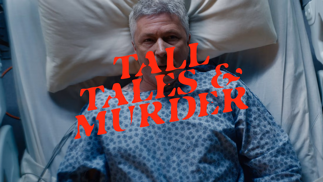
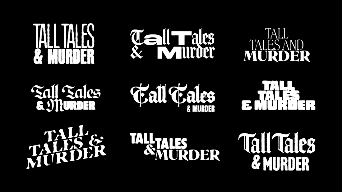
We explored a ton of custom title treatments for the show and, honestly, loved creating all of them. Here are a few quick shots from the exploration process.
I’ll be sharing the full project as part of our upcoming site update soon.

Perfect :)

Title treatments carry a constraint most lettering escapes: whatever you draw has to survive a 200px streaming tile with a platform badge and a progress bar parked on top of it, so the prettiest exploration rarely wins. Did you end up drawing a separate stacked lockup for that, or did one of these hold at both sizes?
Luckily I had the poster to work with from the outset so it meant I could test different variations. But I had ti create two variations. A landscape and a stacked version to cover all needs. :)

That constraint makes the exploration feel even more intentional—I’d be curious to see which treatment survives best when the lockup has to work at both sizes.

Title treatment work for a show with that cast is a proper brief. The grid of explorations shows how much range you found in the type - the distressed red version reads very crime, but the elegant stacked ones have real prestige drama energy.

Great Great work!

The variety in the title explorations is great, but that red treatment over the hospital shot really stands out. It feels unsettling without leaning into the usual crime-drama clichés, which makes it much more memorable.

Ohhh how much I love typography work like this!! It genuinely makes me love design more and more lol

That blood red type does crime scene without a single splatter, very restrained. A title treatment that survives a tiny streaming thumbnail and still keeps its menace is the real flex, most lettering falls apart at that size.


title design for a real show, good one to tick off
The network for creativity
Join 1.25M professional creatives like you
Connect with clients, get discovered, and run your business 100% commission-free
Creatives on Contra have earned over $150M and we are just getting started

Challenges
View all


Related posts

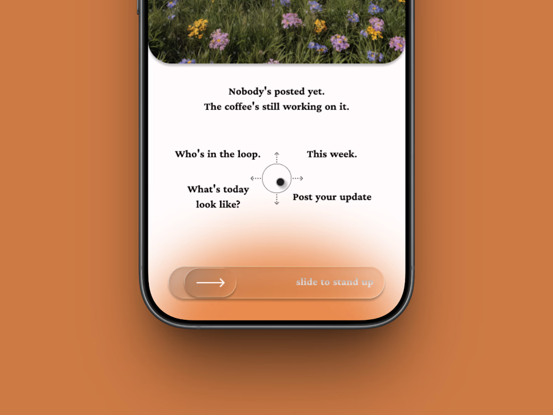
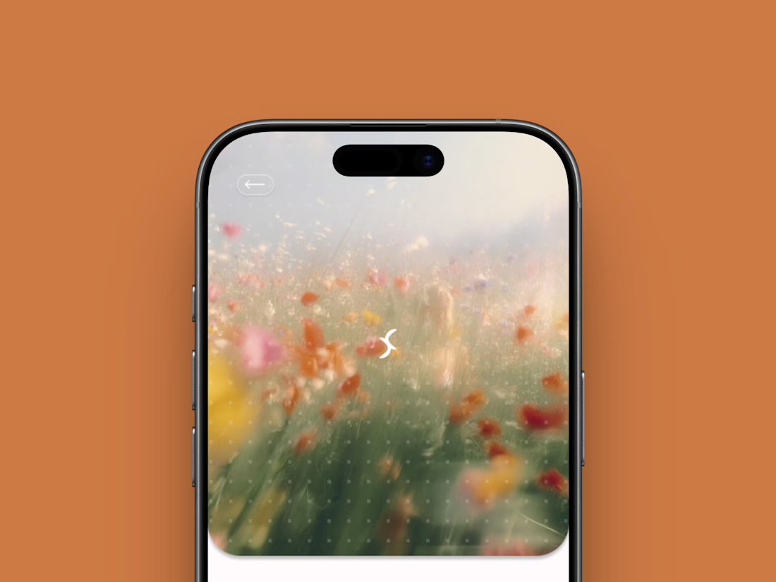
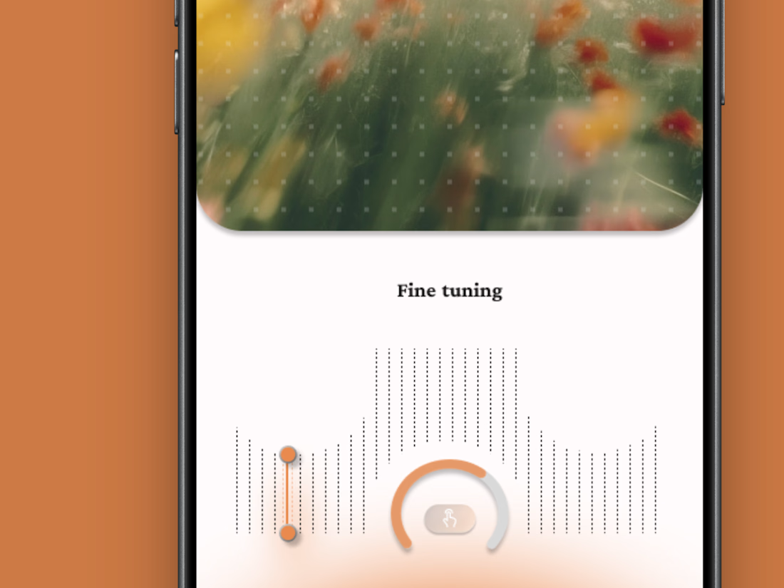
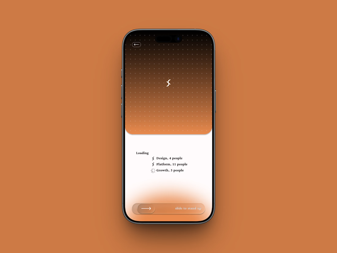
Friday app: Loopin
A fictional async standup app where the meeting is one gesture: slide to stand up.
Film-photo window up top, a four-way compass below, and a loading state that resolves your team one row at a time.
Concept project.


some visuals from iki, a matcha shop i’m currently working on 🍵
one of the most interesting parts of this project has been figuring out how to turn an abstract concept into something people can actually see and feel.
from the typography to the illustrations and overall visual language, every element is an opportunity to give the brand more personality and make it feel like its own world.
still exploring, but i’m really enjoying where this is going.
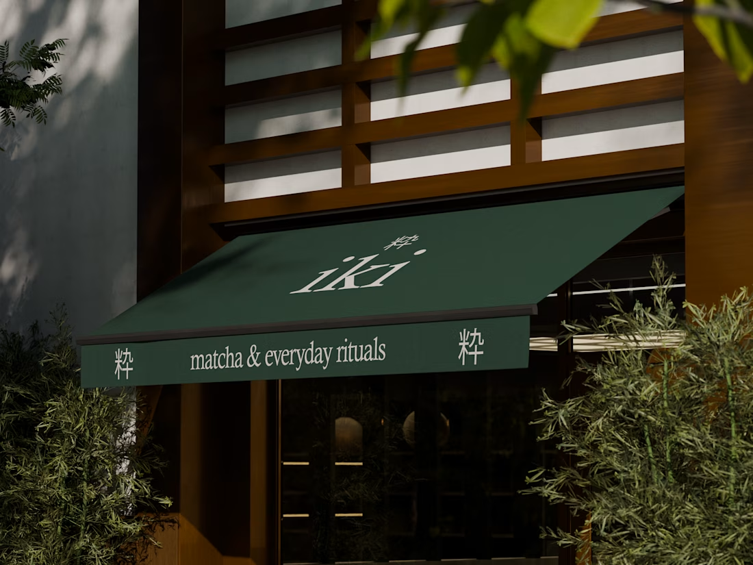
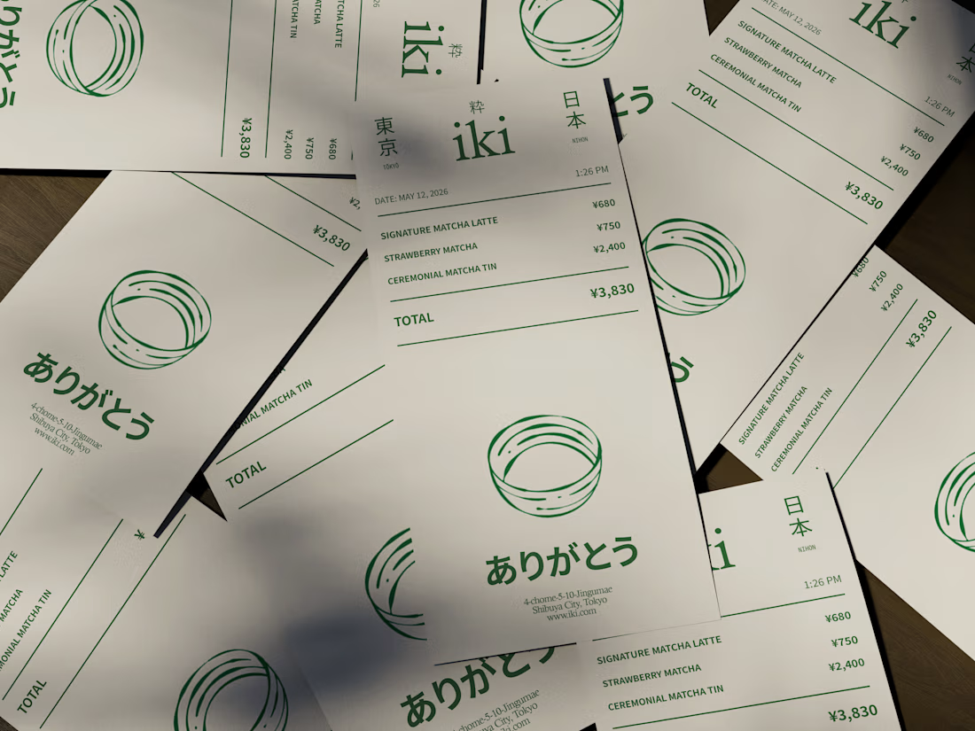
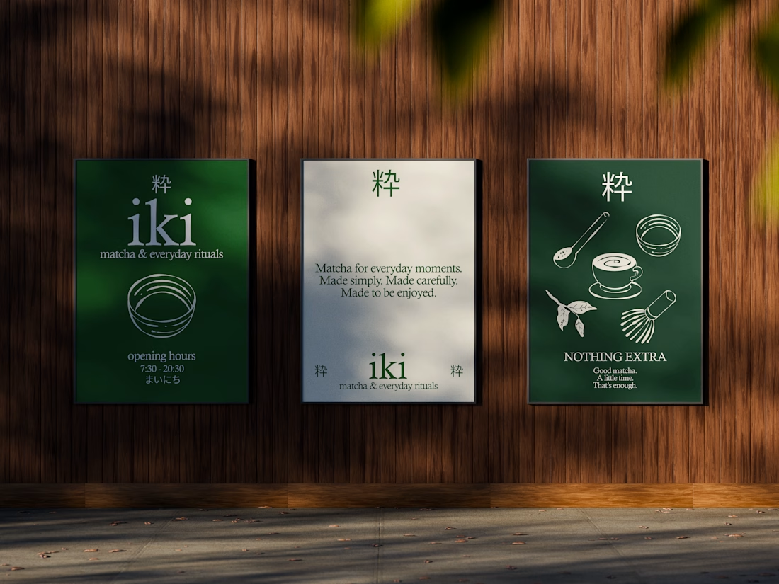
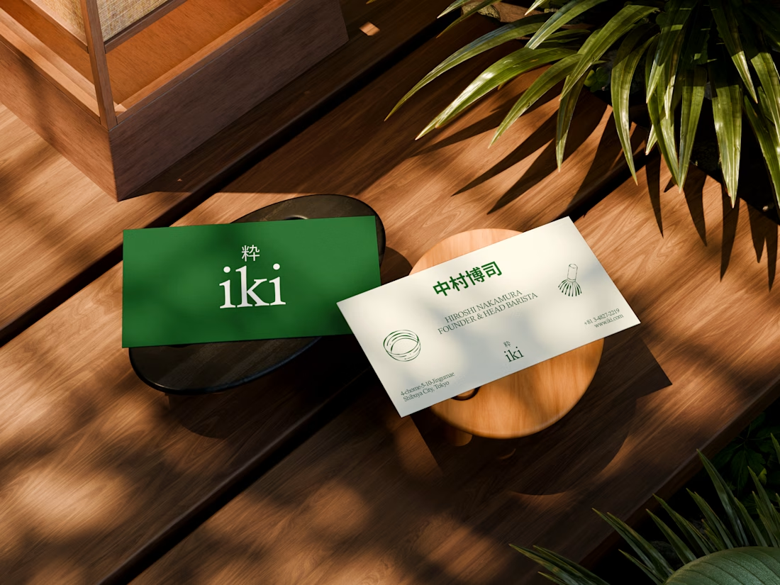


the illustration direction feels like it could take over the whole shop interior, not just the cups. thats usually where these projects fall apart

Recent brand showreel ✨
Identity and pitch deck for Infranova AI. Dark, bold, and a lot of purple.

Great 😍