The network for creativity
Join 1.25M professional creatives like you
Connect with clients, get discovered, and run your business 100% commission-free
Creatives on Contra have earned over $150M and we are just getting started
Back to feedPost

A quarterly update is easier to read when the numbers don’t get buried in a paragraph. In this fictional before-and-after, I pulled out revenue, growth, and new customers, then made the next step easy to spot.
Have a deck that needs the same cleanup? I’ll format up to five PowerPoint or Google Slides slides for $15, with one revision. Message me with your slide count and deadline, or see the service: https://contra.com/s/MkULUA7s-power-point-and-google-slides-cleanup
The network for creativity
Join 1.25M professional creatives like you
Connect with clients, get discovered, and run your business 100% commission-free
Creatives on Contra have earned over $150M and we are just getting started





Related posts

Trust us with your shortform edits.
Can't wait to share the great works we created for Jarret!
Officially crossed the $15k mark too (Contra doesn't create milestone videos for that).
Hoping to reach $25k soon!


Congrats on crossing $15K, T-Studios! 🎉

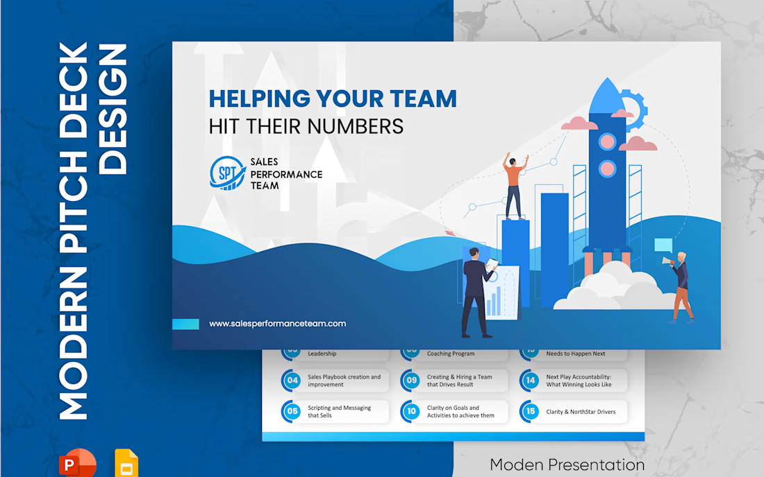
Sales Performance Team: a sales deck that gets to the point 📈
Service decks often try to explain everything. Buyers only want to know one thing: will this help my team?
How I designed it:
→ The cover answers that right away: Helping your team hit their numbers
→ All 15 services on one clean grid of numbered cards, easy to scan
→ Bright blue and white for a confident, energetic feel
→ A target visual on the proof slide, with results as short stat lines
A sales deck should feel like a conversation, not a brochure.



Just dropped my second UX & Conversion Copywriting concept on Contra! 📊
Pricing pages are where most SaaS and FinTech sign-ups stall. When tiers are packed with accounting jargon or hidden-fee anxiety, solo founders bounce instead of starting a trial.
For this self-initiated VeloceLedger concept, I focused on turning hesitation into clarity:
• Identity-Driven Tiers: Replaced vague labels like "Basic" with "Best for..." taglines so freelancers self-identify their plan in seconds.
• Zero-Risk Trial Microcopy: Explicitly reassured users they’ll auto-downgrade to the free tier when the 14-day trial ends ("zero surprise charges").
• Interactive Plan Helper: Built a 1-question prompt to eliminate choice paralysis right on the page.
Check out the full case study on my profile, what’s the #1 thing that makes you hesitate on a SaaS pricing page? 👇