The network for creativity
Join 1.25M professional creatives like you
Connect with clients, get discovered, and run your business 100% commission-free
Creatives on Contra have earned over $150M and we are just getting started
Back to feedPost

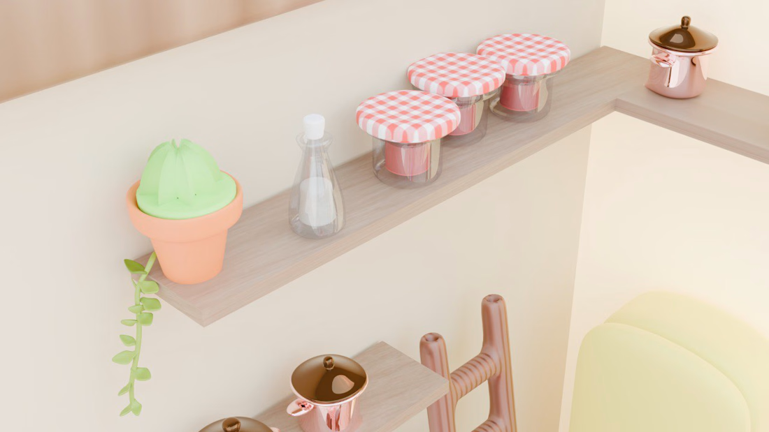
Just a part of kitchen.I love how the glass actually turned out.

The network for creativity
Join 1.25M professional creatives like you
Connect with clients, get discovered, and run your business 100% commission-free
Creatives on Contra have earned over $150M and we are just getting started




Related posts

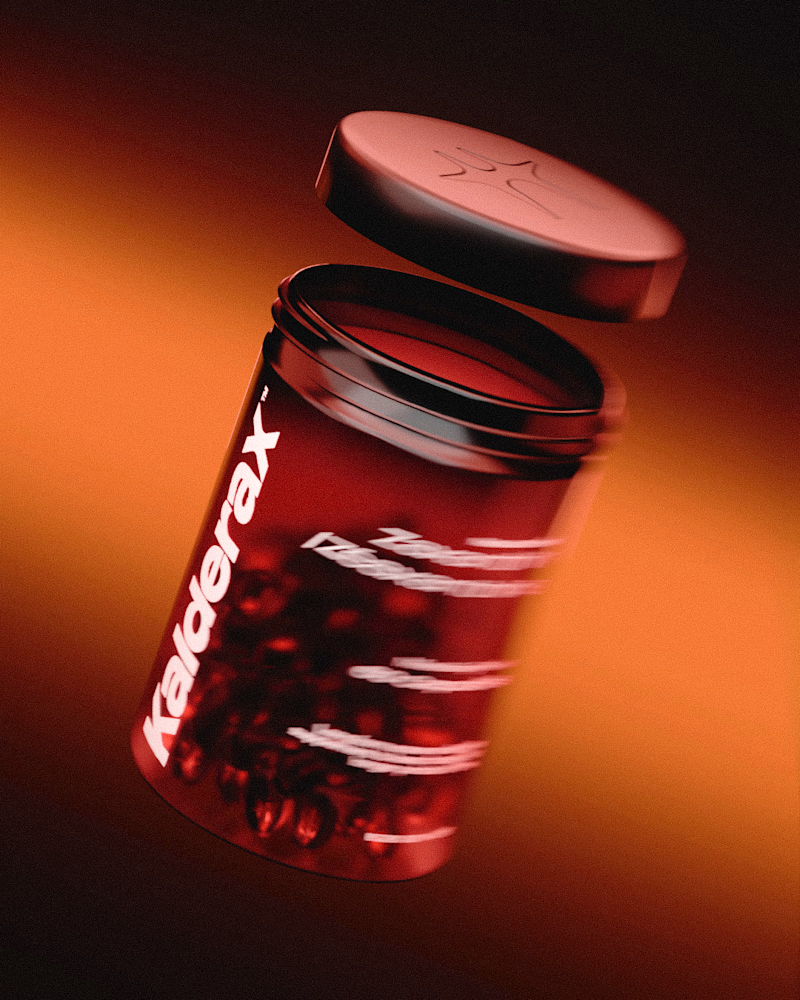
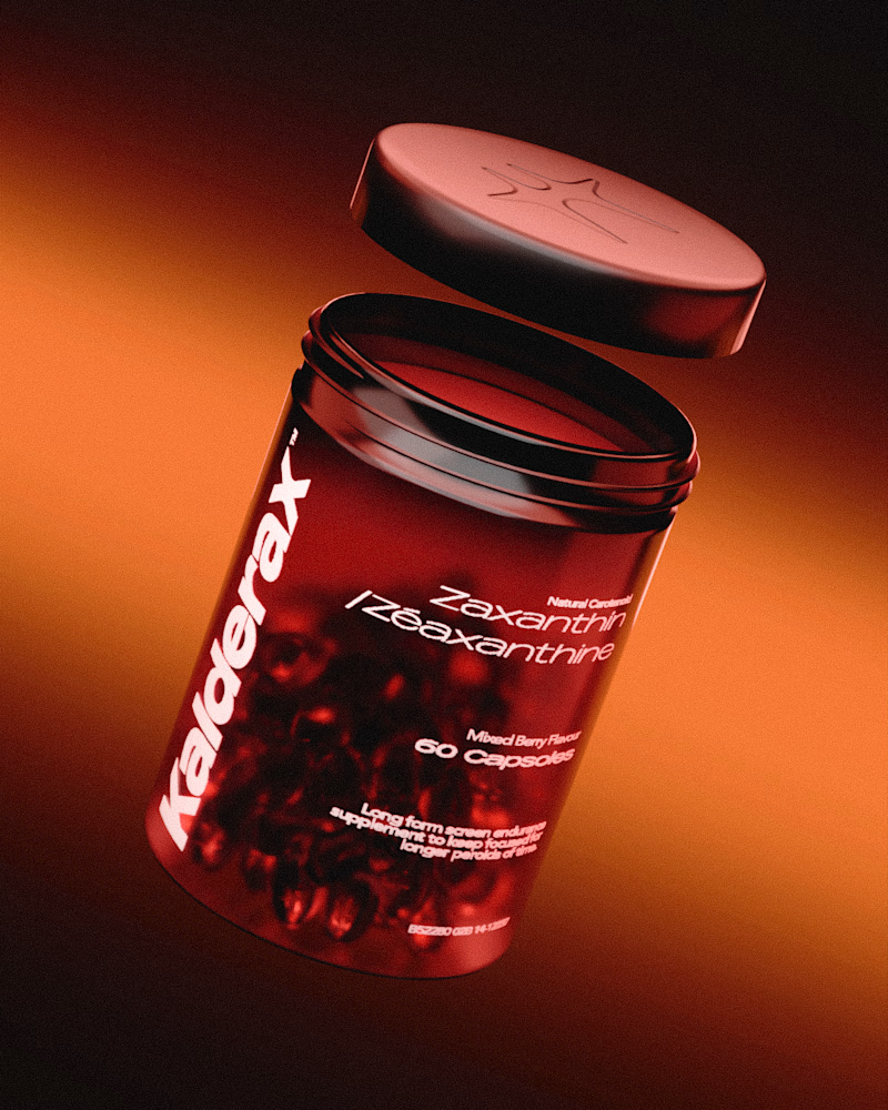
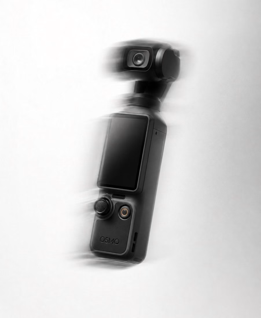
I spent the last week challenging myself to design, brand and 3D model a minimal supplement. I experimented with compositing nodes to add a blur in some renders, which one do y'all like more?
14 voted
44%
18 voted
56%
32 votes
Closed


the second?

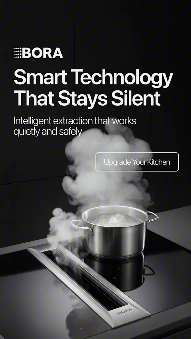
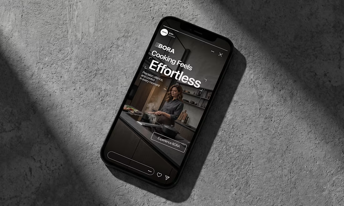
BORA – Ad Creative Concept
Most kitchen appliance ads sell you the warm family dinner. I wanted to try the opposite.
Built this BORA concept as a portfolio piece, treating the product like architecture instead of tech – dark marble, concrete, no hands, no food styling. Just a pot, steam, and silence.
The steam does all the movement in the motion piece. Typography stays out of the way – one line, low CTA, nothing fighting the composition. Turns out when you strip out the lifestyle, the price point sells itself.