The network for creativity
Join 1.25M professional creatives like you
Connect with clients, get discovered, and run your business 100% commission-free
Creatives on Contra have earned over $150M and we are just getting started
Back to feedPost

98% of customers research on their own before they buy.
So if they can't find clear info about your product, why would they choose you?
The network for creativity
Join 1.25M professional creatives like you
Connect with clients, get discovered, and run your business 100% commission-free
Creatives on Contra have earned over $150M and we are just getting started



Related posts

What should a beekeeping website explain before asking someone to choose a hive?
For Bee Girl, I designed and built a complete Shopify website around a clear journey: meet the colony, understand what’s inside a nucleus hive, compare the options, and connect with the beekeeper.
Honey yellow, hive black, warm cream, and bold typography bring the same visual language across desktop and mobile layouts.
One design decision that ties it together: the page explains the colony and its five frames before introducing the hive-quantity choices. Education gives the product selection context.
I handled the complete website project for the client through Fiverr, using Shopify. This video walks through the homepage.
Which would you explore first—the hive options, field classes, or the beekeeper’s story?
Explore the full Bee Girl case study: https://contra.com/p/WqNFR67b-bee-girl-shopify-website-design-for-beekeeping
If you’re building a Shopify website for a specialist business, I’m available for website design and development projects.


What stands out to me is how naturally the storytelling leads into the product selection. You're not just showing people what to buy, you're helping them understand why. That's a smart UX decision, and the execution looks super clean.

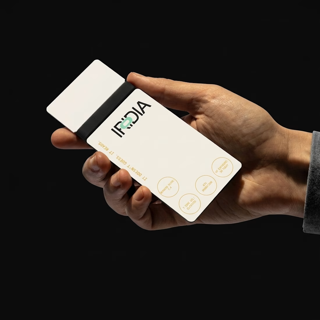
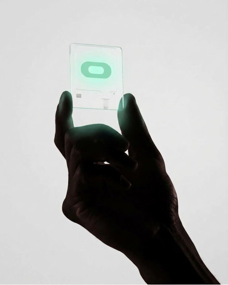
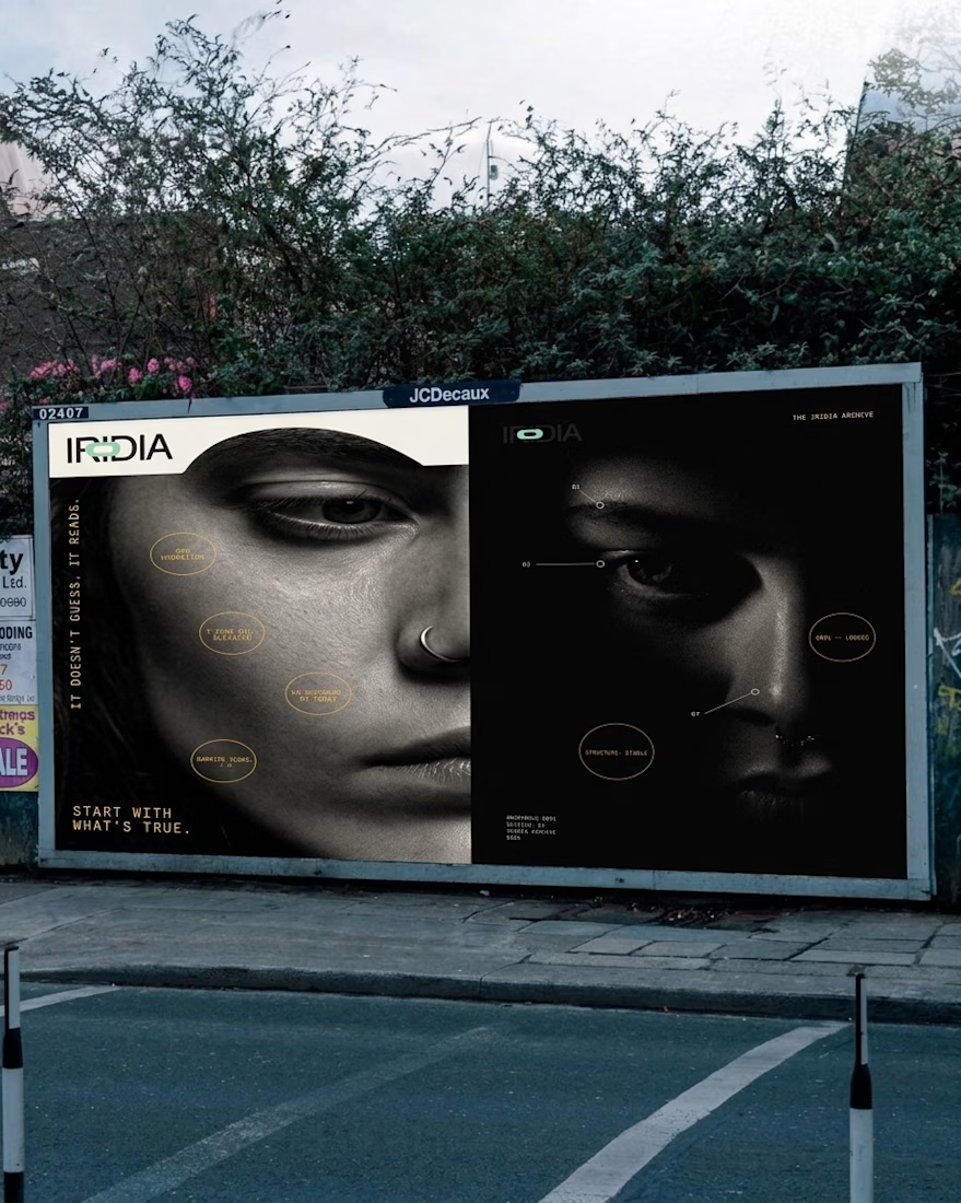
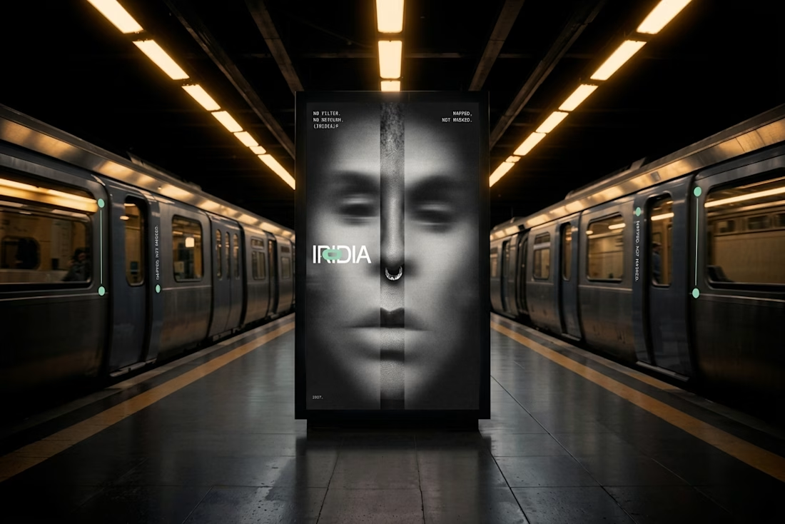
What do you do with a brand that’s 80% done and nobody asked for it?
I have a whole folder of them.
A name here, a palette there, a few campaigns that never saw daylight.
One of them finally got the full treatment. The Iridia case study drops soon.

The Problem
Many auto repair businesses rely on word of mouth and social media to reach customers. But customers often want to know what services a repair shop offers, where it's located, and how to contact them before making a decision.
Why I Built It
I built this website to solve that problem by giving customers one place to explore the business, understand its services, and find the information they need.
The Solution
The website includes:
Services: Showcases the auto repair services offered.
Testimonials: Builds trust through customer feedback.
FAQ: Answers common customer questions.
About: Introduces the business and its experience.
Contact: Makes it easy for customers to reach the business.
The goal is to help auto repair businesses build trust, strengthen their online presence, and make it easier for potential customers to choose their services.


The FAQ is a useful addition.

