The network for creativity
Join 1.25M professional creatives like you
Connect with clients, get discovered, and run your business 100% commission-free
Creatives on Contra have earned over $150M and we are just getting started
Back to feedPost

Title:
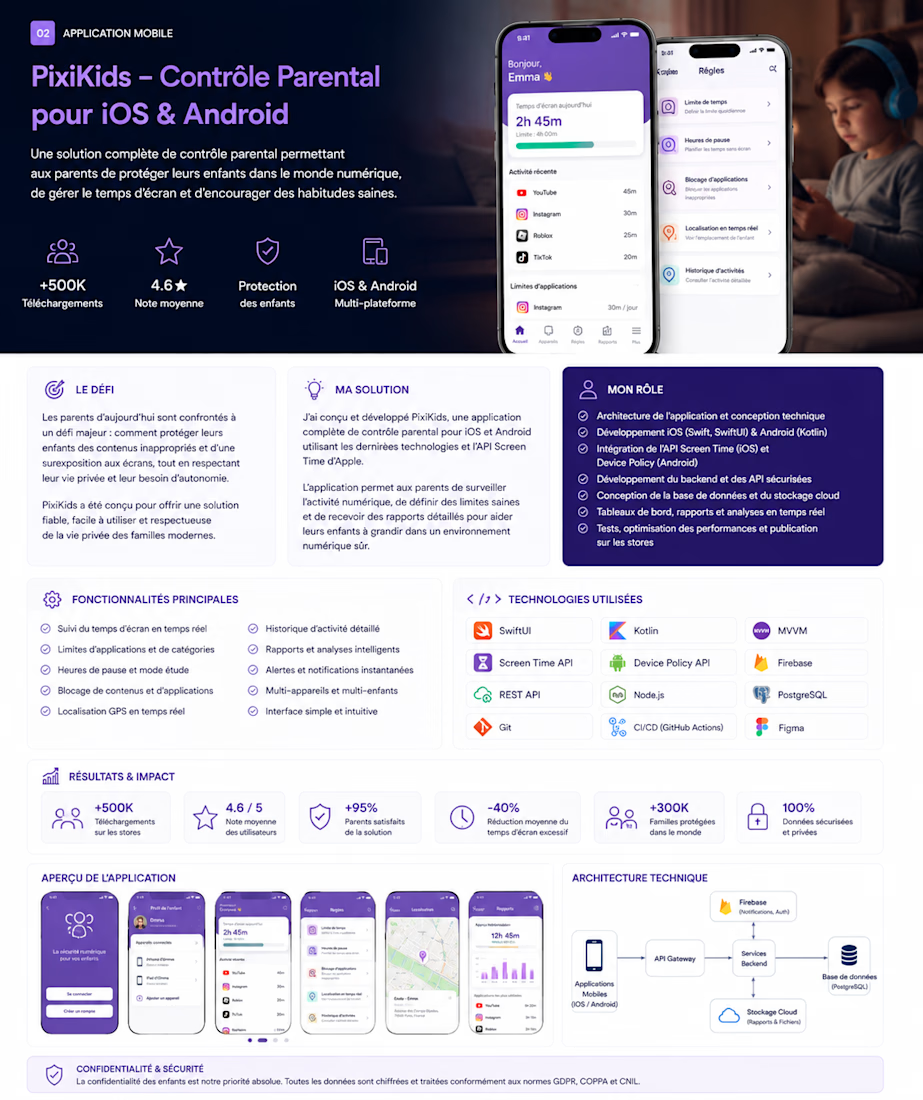
PixiKids — iOS & Android Parental Control Platform
Short description:
Designed and engineered a cross-platform parental control solution for families, combining screen-time management, application restrictions, activity insights, location features, notifications, and secure cloud synchronization.
Our contribution:
Native iOS and Android engineering, application architecture, backend/API integration, database and cloud design, performance optimization, testing, CI/CD, and store-release engineering.
Services/tags:
Mobile Development · iOS · Android · SwiftUI · Kotlin · Firebase · Backend Development
The visual is excellent for Contra because it immediately communicates real product complexity + mobile engineering.


The network for creativity
Join 1.25M professional creatives like you
Connect with clients, get discovered, and run your business 100% commission-free
Creatives on Contra have earned over $150M and we are just getting started





Related posts

Testing my app! 🧰🚀 Everything is finally coming along.
I’ve been working on this project for a little over two weeks. Initially it was just me working with one AI agent, but I was still manually coding most of it, so I was moving like a turtle 🐢very slow.
Then I decided to implement Codex into my project to automate more of the development and it has been amazing. Now I can focus more on prompting, testing, reviewing the code and making the technical decisions instead of manually coding everything.
I also created my own AGENTS.md bible with all my project rules and instructions to make sure Codex follows them as the final authority when working on my code.
The idea is simple: create one useful and intuitive ecosystem of tools that Shopify merchants can add to their stores to help customers make purchasing decisions faster and with more confidence.
Still testing, building and adding more tools. Let’s see where this goes! 🚀
And if anyone finds the idea interesting. I’m definitely open to collaborations, ideas or partnerships. Feel free to reach out!


Seeing you shift from hand coding to Codex and let the agent handle the grunt work really speeds up iteration.


I’m exploring different concepts for a project. Which proposal did you like the most?
5 voted
42%

7 voted
58%

12 votes
Closed

Geometric one looks better good job🎉🎉❤️❤️

Overview
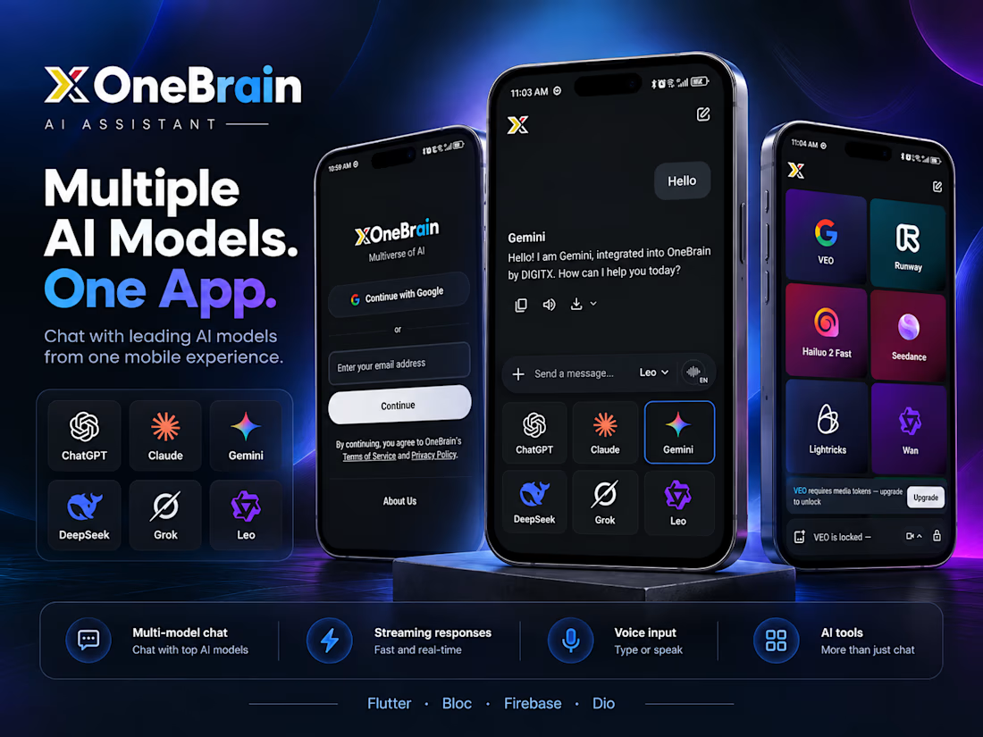
OneBrain is a mobile AI super-app by DIGITX that ends the habit of switching between ChatGPT, Gemini, Claude and a pile of single-purpose generators. You sign in once with Google or email, and the same app gives you a model-switching chat and a creation studio for images, video, voice and text utilities. The studio is built for generations that take a while: you can start a render, leave the app, and come back to a finished result.
Key Features
Multi-Model Chat (Unique): ChatGPT, Claude, Gemini, DeepSeek, Grok and Leo sit in one picker. Switch models mid-conversation without leaving the thread.
Streaming Responses: Replies arrive token by token, and each one can be copied, read aloud or downloaded.
Voice Input: Type or speak, with language selection built into the message bar.
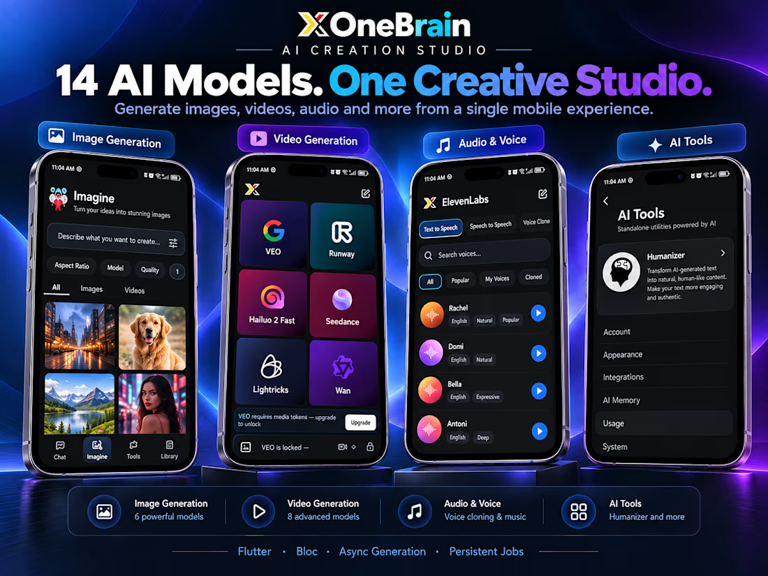
Imagine (Image Generation): Six image models, with controls for aspect ratio, model and quality. Results land in a filterable gallery of images and videos.
Video Generation (Unique): Eight video models in one grid: VEO, Runway, Hailuo 2 Fast, Seedance, Lightricks and Wan, among others. Premium models like VEO are gated by media tokens, with an upgrade prompt shown in context.
Audio & Voice Studio: ElevenLabs-powered text-to-speech, speech-to-speech and voice cloning, with a searchable voice library split into Popular, My Voices and Cloned.
AI Humanizer: A standalone tool that rewrites AI-sounding text so it reads like a person wrote it.
AI Memory & Usage Controls: Personal memory settings, usage tracking, integrations and appearance options, all in one settings area.
Persistent Library: Every generation is saved in one place.
Tech Stack
Flutter · Dart · BLoC · Firebase · Dio · Async Generation Pipeline · Persistent Job Queue · ElevenLabs · Google Sign-In
Results
Shipped to the Play Store as a working multi-model AI app: six chat models, 14 image and video generators, voice cloning and a text humanizer, all in one native mobile experience.