The network for creativity
Join 1.25M professional creatives like you
Connect with clients, get discovered, and run your business 100% commission-free
Creatives on Contra have earned over $150M and we are just getting started
Back to feedPost

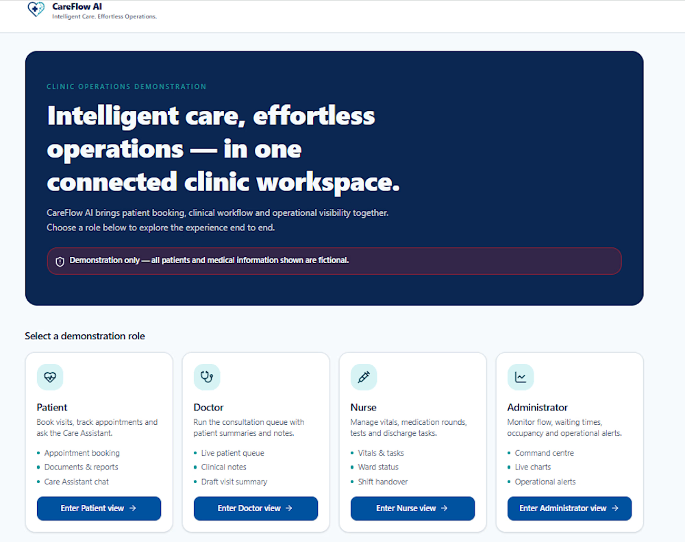
A hospital workflow brings together patients, doctors, nurses and administrators. I built CareFlow AI in Lovable to explore how those experiences can work together.
The demo includes appointment booking, dedicated role-based workspaces and an operational dashboard, using fictional data.
Explore it here:
https://careflow-command-centre.lovable.app
I’m available for freelance projects involving workflow automation, dashboards and web app prototypes.
Have a process you’d like to simplify? Let’s connect.
#Lovable #WorkflowAutomation #WebDevelopment #OpenToWork

The network for creativity
Join 1.25M professional creatives like you
Connect with clients, get discovered, and run your business 100% commission-free
Creatives on Contra have earned over $150M and we are just getting started











Related posts


EarthHub – A Platform for Nature Expeditions ⛰️
Stumbled upon this project in my hard drive, had to publish!


Top to bottom nice work

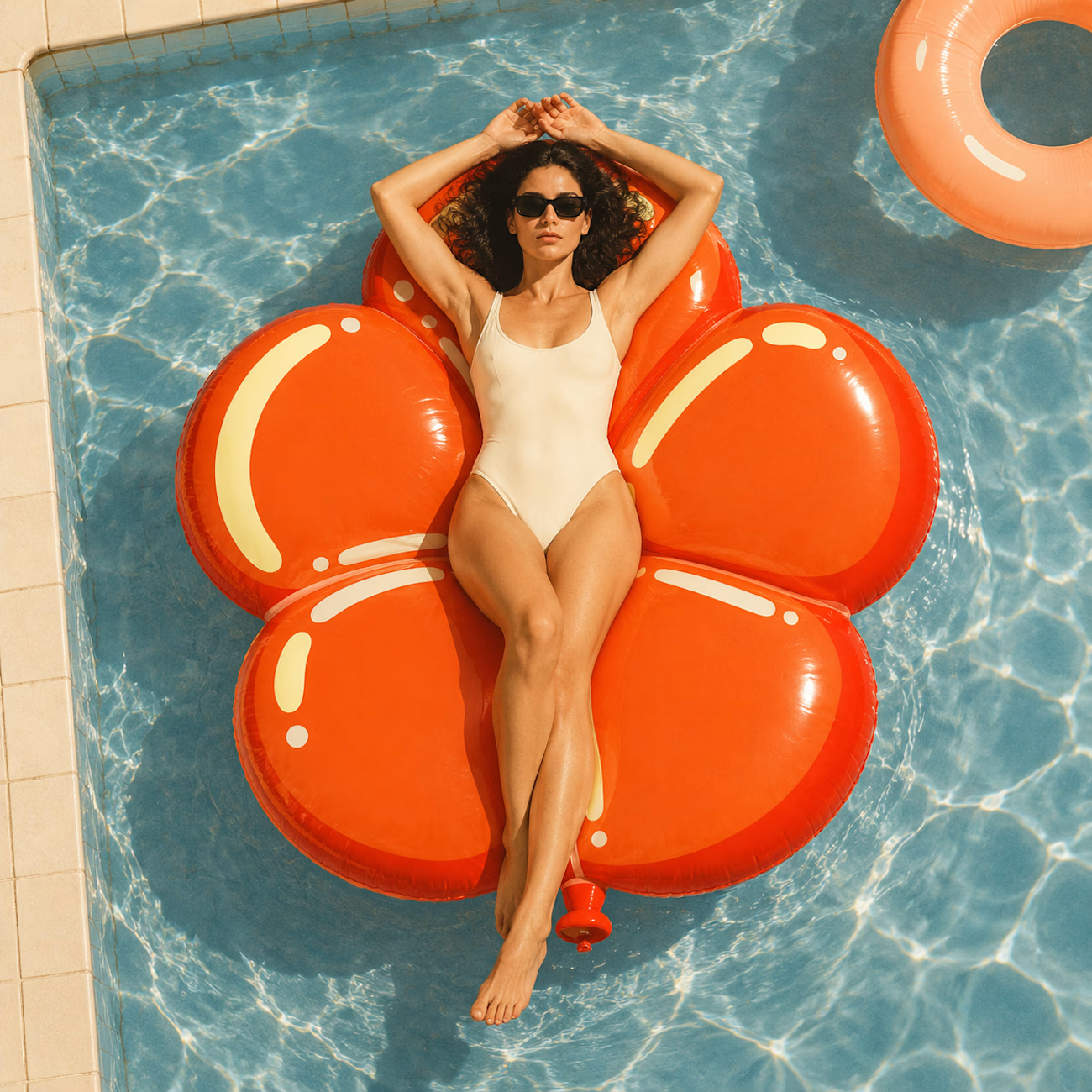
The most serious brand I’ve ever worked on mails you a phone shaped like a shell.
Deadpan voice. Inflated letters. One strange object a month.
STILL LIFE SERVICE, case study out now.
Would you open the box?

I'd open the box for sure! Inflated letters with a deadpan voice is such a fun mix.


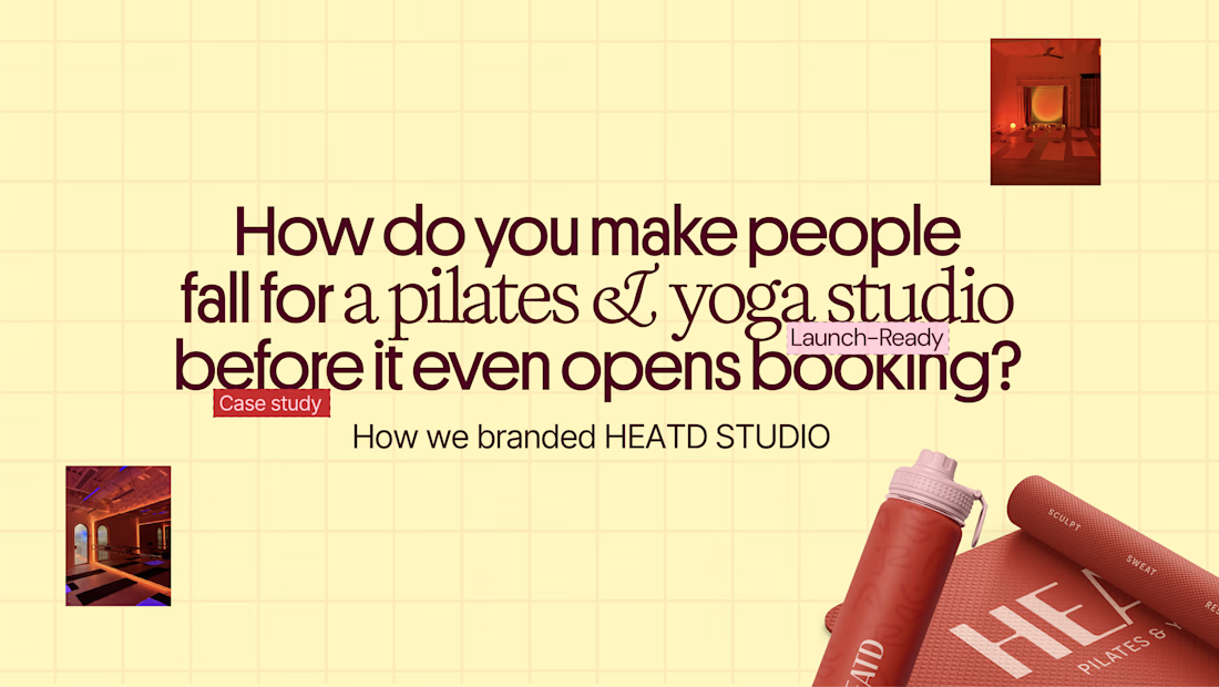
HEATD is a heated Pilates and yoga studio in Mableton, Georgia. The name already said it all, so we made one decision from day one: the heat would be the whole brand 🔥
Amazing project and amazing team.
Collab with @gerbzagency


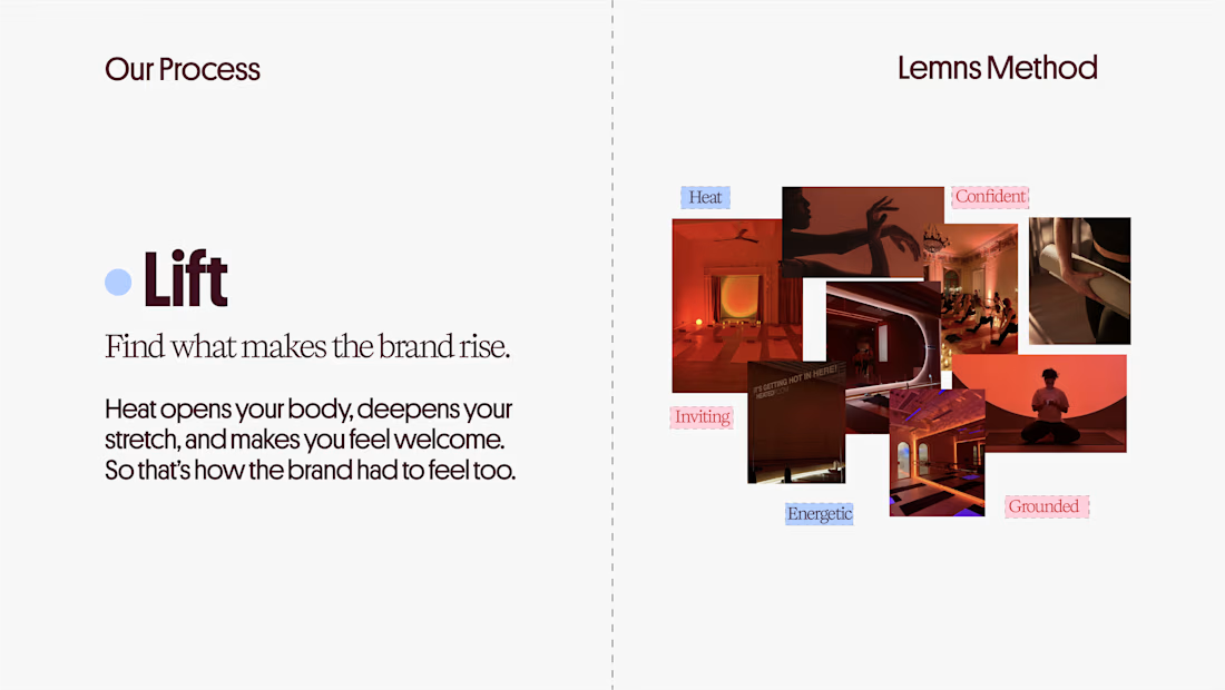
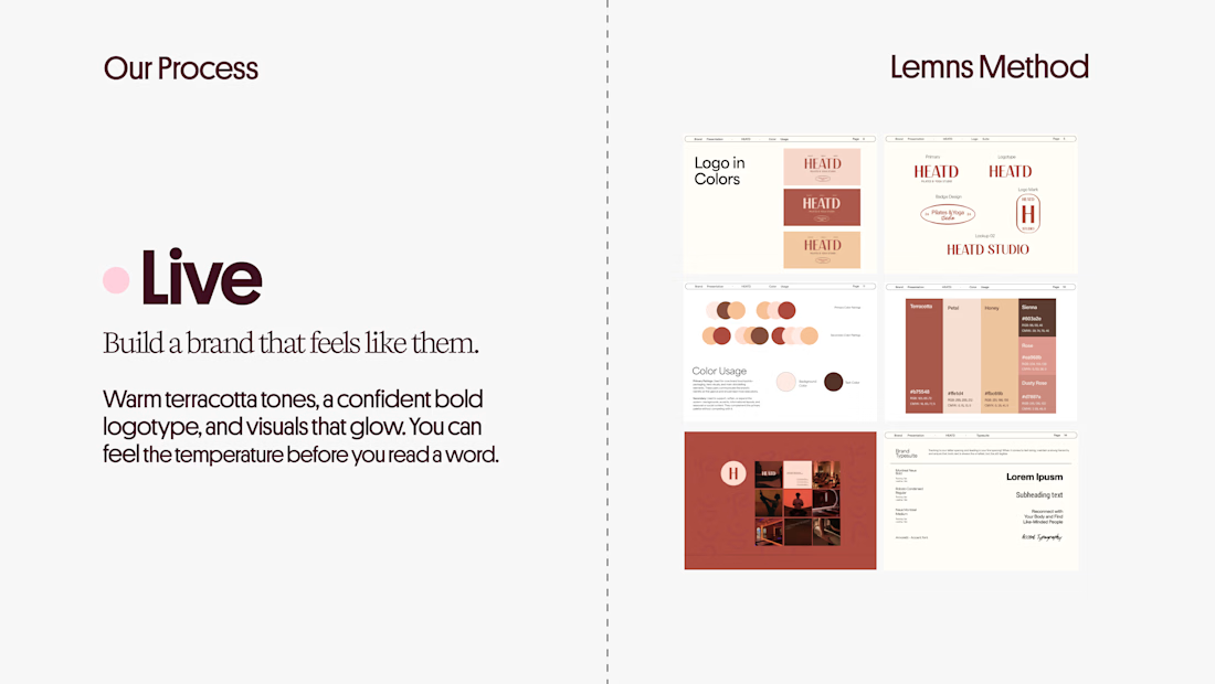
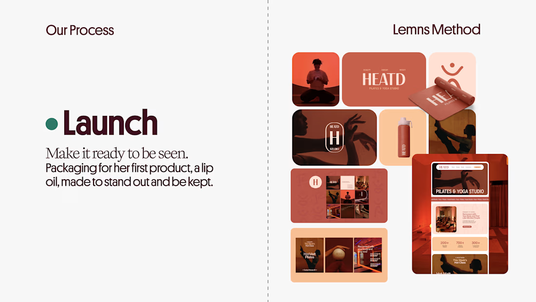

Curious how the terracotta palette got settled here: did the colour come first and the type follow, or the other way round? The heat idea reads as much through the warm tones as through the name itself.