The network for creativity
Join 1.25M professional creatives like you
Connect with clients, get discovered, and run your business 100% commission-free
Creatives on Contra have earned over $150M and we are just getting started
Back to feedPost
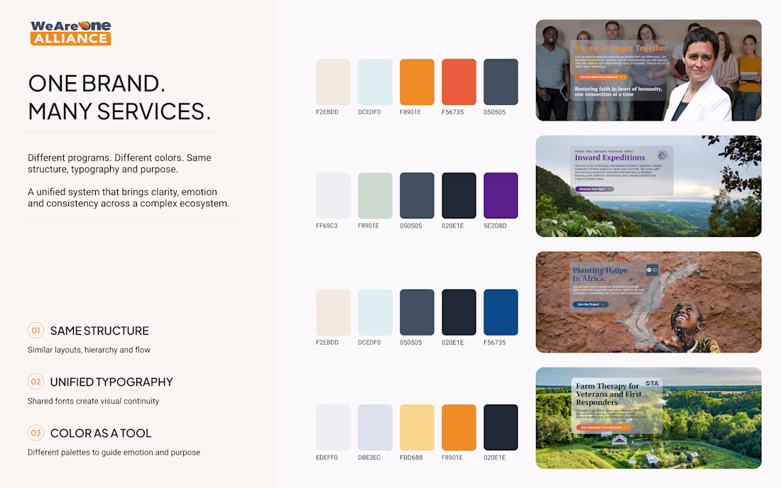
Large websites don’t always need one strict color palette everywhere.
The We Are One Alliance website is a great example of how different programs can have completely different moods and colors — while still feeling like one brand.
The main identity stays consistent through:
– typography
– structure
– spacing
– hierarchy
And color becomes a way to separate experiences, guide emotion, and make navigation feel more intuitive.
Sometimes consistency is not about using the same colors.
It’s about creating a recognizable system.
This is cool brr One of the best design have seen so far today... Keep up the great work
This is a smart way to frame it. Shared layout rhythm and type scale as the anchor, color as the differentiator. That "Inward Expeditions" palette especially shows how much emotional range you can get without breaking the system.
Great 👍
Well done
The network for creativity
Join 1.25M professional creatives like you
Connect with clients, get discovered, and run your business 100% commission-free
Creatives on Contra have earned over $150M and we are just getting started
Related posts
Great work
I built a social network that tells you to touch grass. 🌱
It's called Touch Grass.
Try it yourself ↓
https://buffet-crayon-23938188.figma.site/
Technology keeps moving us forward, but it also keeps us glued to screens. So I wanted to build something that gently pushes in the opposite direction.
Every user gets their own planet.
Upload photos you've taken in nature and watch your world come back to life. Miss a few days and it slowly starts fading again.
Every planet belongs to a real person. Explore the galaxy and discover worlds that other people are growing through their own photos and memories.
Built the entire thing in @Figma Make.
Made for the @contra x @Figma #ConfigMakeathon
X Link: https://x.com/russ_seid/status/2064573470357500338?s=20
Linkedin Link: https://www.linkedin.com/posts/rustem-seidametov_configmakeathon-contra-makeathon-ugcPost-7470339571613040641-vVp0/?utm_source=share&utm_medium=member_desktop&rcm=ACoAADKBObkBHA2DOG2-JkJBzSGYJVlLfkAV4B4
Project Link: https://www.figma.com/make/0WW9byuQ0tDSPy4RY19p00/Touch-Grass?t=GS2PE7diSOrtYCW4-1
Niceeeee
🔗 Try Live:
https://oculus-last-45120554.figma.site
🔗 Figma Community: https://www.figma.com/community/file/1646335128776764074
━━━━━━━━━━━━━━━━━━━━
Introducing Rangoli Studio 🌸
Every morning my mother draws Rangoli
on our doorstep in Bengaluru.
I always watched but could never
recreate her art.
So I built Rangoli Studio —
where anyone can create traditional
Indian Rangoli patterns dot by dot.
THE PROBLEM:
Traditional Rangoli art is disappearing
in the digital world. No tool existed
to experience this 5000 year old tradition.
Until now.
HOW IT WORKS:
✨ Choose your favorite festival
✨ Follow the dot guide
✨ Connect dots to build your pattern
✨ Pour the Powder to celebrate
✨ Download and share your creation
BUILT WITH:
🛠 Figma Make
🛠 Figma Weave
🛠 Prompt engineering — zero coding
#ConfigMakeathon #RangoliStudio @figma
Trending
Claude
Claude has entered the design space. How are you using Claude Design?
Contra University
Learn from expert creatives how to earn more using next-gen AI tools.
MagicPath
The canvas is infinite, and exploration is becoming the workflow. How are you using MagicPath?
creativeaiflow
Creative AI workflows are evolving. What tools do you use, and what are their strengths and weaknesses?
freelancerlife
Freelancer life is wins, pivots, and everything in between. What’s yours right now?