The network for creativity
Join 1.25M professional creatives like you
Connect with clients, get discovered, and run your business 100% commission-free
Creatives on Contra have earned over $150M and we are just getting started
Back to feedPost

Everyone's obsessed with prompts. I'm still obsessed with the thinking behind the work.
Wrote something about why AI proficiency ≠ design growth and why the whiteboard test still matters more than any tool in your stack.
If you can't explain why a decision is right for this user, in this context, with this constraint, AI just helps you ship the wrong thing faster.
Full read here 👇
🔗 rahulg.framer.website/blogs/ai-won-t-save-you-your-craft-will

The network for creativity
Join 1.25M professional creatives like you
Connect with clients, get discovered, and run your business 100% commission-free
Creatives on Contra have earned over $150M and we are just getting started



Related posts

I like digital products that have a personality.
Not necessarily a loud one.
And not necessarily one you notice immediately.
Two products can offer similar functionality, use familiar navigation patterns, and follow the same usability principles, yet feel completely different.
A lot of that comes down to visual direction.
Typography, color, composition, imagery, and even the density of an interface can shape how a product is perceived.
A music marketplace might benefit from a more expressive visual language that reflects the creative industry and encourages exploration.
A financial platform designed for professionals might take a more restrained approach, with structured data, precise hierarchy, and fewer visual distractions.
But even within the same industry, different audiences and brand positioning can call for entirely different design approaches.
What feels distinctive and engaging to one audience might feel distracting or inappropriate to another.
And I think that's where digital art direction becomes particularly interesting.
But personality doesn't stop at the visual layer.
It's also in how the product behaves.
How does it communicate an error?
How does it guide someone through an unfamiliar task?
Does it feel conversational and approachable, or precise and professional?
Even small interactions can reinforce the character established through the visual design.
The challenge is making those decisions feel connected.
A playful interface paired with overly technical, impersonal communication can feel inconsistent. Just as a highly professional visual direction can lose some of its credibility through poorly considered interactions.
To me, the most convincing digital products have a personality that extends beyond their appearance.
You recognize it in the visual language, the interactions, and the way the entire experience comes together.


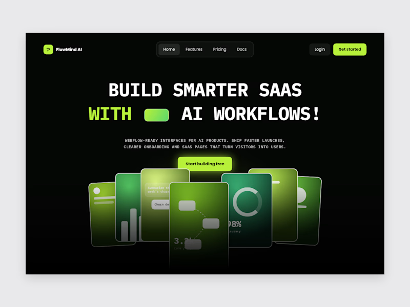
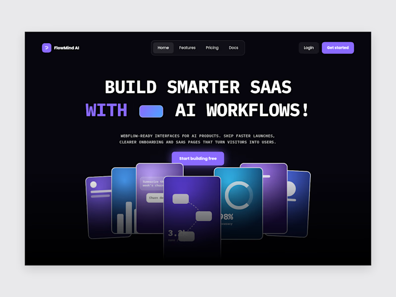

Violet/blue look pretty

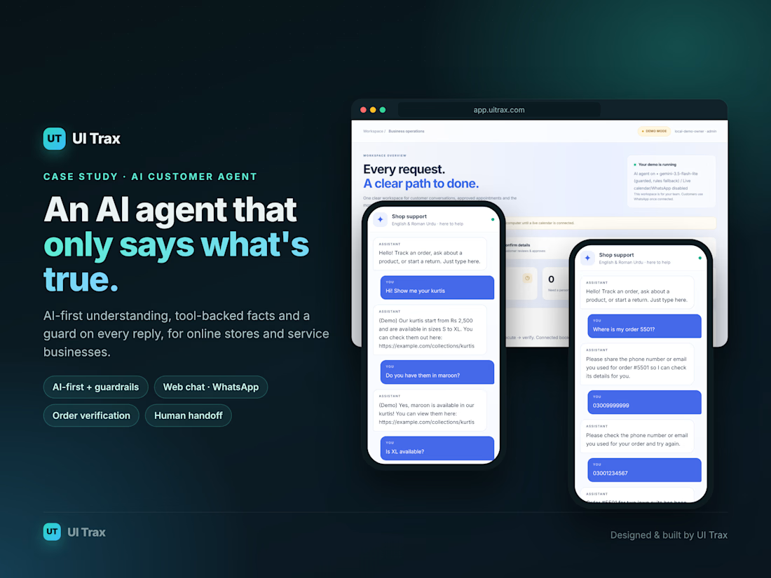
Worth a read if you're building AI support for e-commerce.
UI Trax gets the hard parts right: answers grounded in real store data, order lookups only after verification, a guard on every reply, and a clean handoff to humans with an AI summary.
Reliable AI agents come from architecture, not just prompts. This case study shows it.
#AIAgents #Ecommerce #CustomerSupport #AI
Check it out

The verification step before an order lookup caught my attention. For patient intake, I would similarly verify identity before retrieving records and limit the handoff summary to what staff need. I would also flag uncertainty rather than presenting an unverified summary as fact.