The network for creativity
Join 1.25M professional creatives like you
Connect with clients, get discovered, and run your business 100% commission-free
Creatives on Contra have earned over $150M and we are just getting started
Back to feedPost

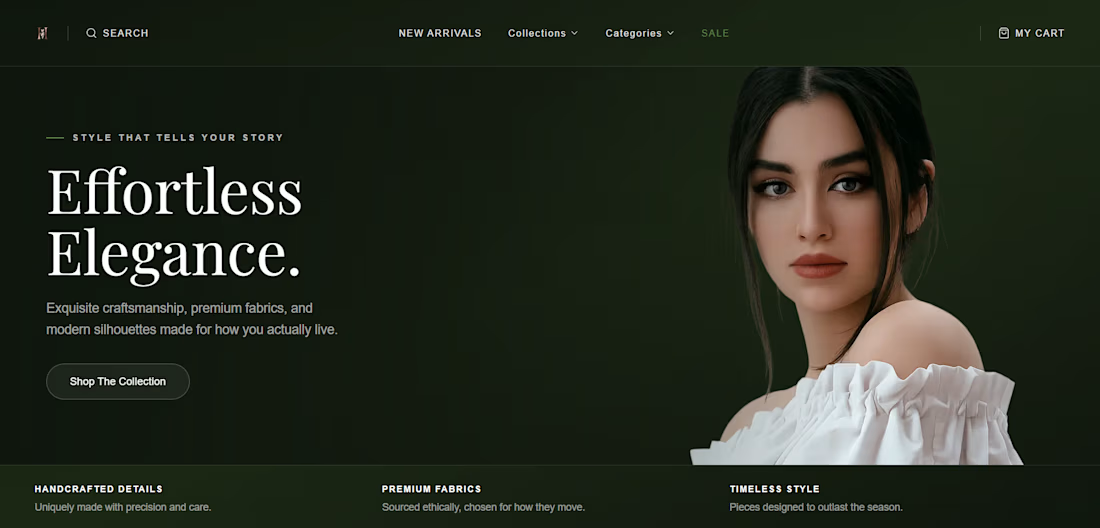
Building a women's fashion ecommerce experience has reminded me that great design isn't just about aesthetics it's about how it performs on every device.
From large desktop screens to the smallest mobile phones, every section is being designed with a responsive, mobile-first approach. Smooth navigation, optimized product grids, intuitive shopping flows, and fast-loading pages all contribute to an experience that feels seamless for every customer.
When developing ecommerce websites, I focus on:
1. Mobile-first responsive design
2. Clean, scalable UI with Next.js and Tailwind CSS
3. Fast page performance and optimized images
4. Smooth animations that enhance, not distract from, the shopping experience
5. Accessible and intuitive user interactions
6. SEO-friendly architecture for better discoverability
A beautiful ecommerce store should do more than look good it should make browsing, discovering products, and checking out effortless on any device.
I'm excited to keep refining this project and exploring ways to create premium digital shopping experiences that combine performance, usability, and elegant design.


The network for creativity
Join 1.25M professional creatives like you
Connect with clients, get discovered, and run your business 100% commission-free
Creatives on Contra have earned over $150M and we are just getting started
Related posts


Look what we’re cooking up again 🔥
Dark ambient web3 vibe, totally dope. Coming soon.
👀 Ready to explore our new case study?



That's Nice

A cinematic portfolio concept for a film and motion studio, designed to feel more like an editorial reel than a standard agency website.
The site uses a dark visual system, oversized typography, smooth scrolling, restrained motion, and a full-screen project index to make the work feel premium before the user reads a word. The focus was on pacing, atmosphere and confidence: fewer sections, stronger visuals, cleaner movement.
Built as a responsive Next.js prototype with Framer Motion and Lenis-style smooth scrolling, including hero, selected work, about and contact sections.



The layout has a beautiful, confident flow. The only worry is that the tiny text size in the services list makes it hard to scan. Users might accidentally skip over it.

Designed a modern Finance Mobile App that turns complex banking into a simple, delightful experience.
Clean UI with real-time balance overview, quick transactions, multi-currency support, spending insights, and seamless money transfer features.

clean and intuitive 👏




Trending

Claude
Claude has entered the design space. How are you using Claude Design?

Contra University
Learn from expert creatives how to earn more using next-gen AI tools.
fifaworldcup2026
The World Cup is here and the whole world's watching. How are you designing for the world stage?
creativeaiflow
Creative AI workflows are evolving. What tools do you use, and what are their strengths and weaknesses?
freelancerlife
Freelancer life is wins, pivots, and everything in between. What’s yours right now?