The network for creativity
Join 1.25M professional creatives like you
Connect with clients, get discovered, and run your business 100% commission-free
Creatives on Contra have earned over $150M and we are just getting started
Back to feedPost


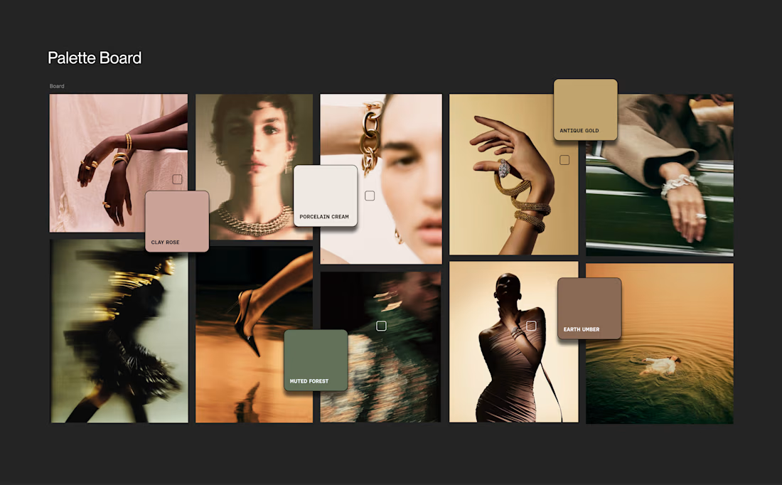
The Ecomm jewellery space has some of the most uninspired brands, websites and product photography...
Now that the wave of lab diamonds is dying, can we get back to actual design, things with character and emotion.
"Cheap diamonds here" can't be your entire brand strategy...
Here is the direction we are taking our client
The network for creativity
Join 1.25M professional creatives like you
Connect with clients, get discovered, and run your business 100% commission-free
Creatives on Contra have earned over $150M and we are just getting started








Related posts

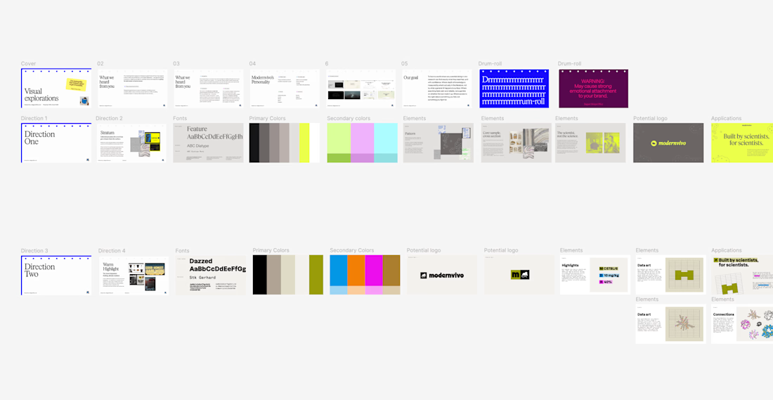
after presenting more brand directions than I can count, one thing I’ve learned: I never jump straight into showing the visuals.
first I want to establish what we're actually trying to solve.
what we heard from the client. what they want to be known for. where they sit in the market. what needs to feel different.
then the big idea, and how it translates into type, colour, imagery and graphic elements.
only then the designs.
context changes how you judge the work.


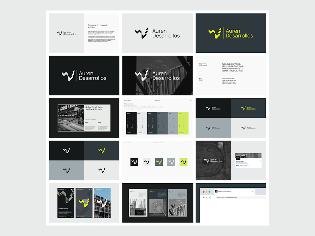
Not every direction makes it to the final brand.. this was one of the directions we explored for Auren Desarrollos, a new construction and development company we’re currently working with on its branding and website.
I’ll be sharing the final result soon, and I think the difference will be interesting to see.
What do you think?



Great!


For Vetti, a pet-health startup, our team made orange the signature colour and kept it out of the product’s data states.
Orange could carry the brand in a campaign. Inside the product, the colour attached to a score needed its own meaning. Using the same colour for recognition and an alert would ask someone to work out which job it was doing.
So the guidelines gave the data palette a separate role. Scores came with plain-language states, and the alert-copy rule was to state the observation, then give the next step.
Those decisions belong together. A calm sentence can be undermined by a colour treatment that suggests urgency.
If you’re reviewing an identity for a product, put a marketing layout beside a screen that communicates status. Ask what each colour means in each place.

This is beautiful work, and the orange colour choice was a good one, it really ties it all together ♥️