The network for creativity
Join 1.25M professional creatives like you
Connect with clients, get discovered, and run your business 100% commission-free
Creatives on Contra have earned over $150M and we are just getting started
Back to feedPost
I was at Whole Foods and noticed Partake Foods had both old (right) and new (left) packaging on the shelf.
The old packaging was playful and fun, it really stood out. The new look is clean and modern, great online, but on the shelf it blends in.
Lots of brands are simplifying to look “modern,” but in the process, some personality gets lost. The design isn’t bad, but when everything looks the same, how do you stand out?
What do you think of the new look?
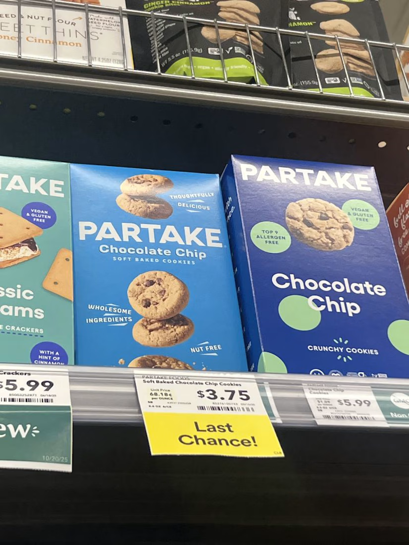
@Samantha Glassman the old pack is the one on the right? I love both to be honest, but the one on the right, you could replace the cookie for a shampoo or a dog treat and it will work as well because the layout is veeery basic, I think it lacks personality.
@Samantha Glassman is the "last chance" one the old one? I actually have only seen the new branding!
I do like the one with the circles, it makes it easier to read for me. since I have dietary restrictions, the one that says "vegan & gluten free" and "top 9 allergen free" is more clear to me than the one that just says "nut free"
@Madi 💫 the one that says last chance is actually the new branding! I agree the old one just stands out more and is a lot more readable
The network for creativity
Join 1.25M professional creatives like you
Connect with clients, get discovered, and run your business 100% commission-free
Creatives on Contra have earned over $150M and we are just getting started
Trending
Claude
Claude has entered the design space. How are you using Claude Design?
Contra University
Learn from expert creatives how to earn more using next-gen AI tools.
MagicPath
The canvas is infinite, and exploration is becoming the workflow. How are you using MagicPath?
creativeaiflow
Creative AI workflows are evolving. What tools do you use, and what are their strengths and weaknesses?
freelancerlife
Freelancer life is wins, pivots, and everything in between. What’s yours right now?