The network for creativity
Join 1.25M professional creatives like you
Connect with clients, get discovered, and run your business 100% commission-free
Creatives on Contra have earned over $150M and we are just getting started
Back to feedPost

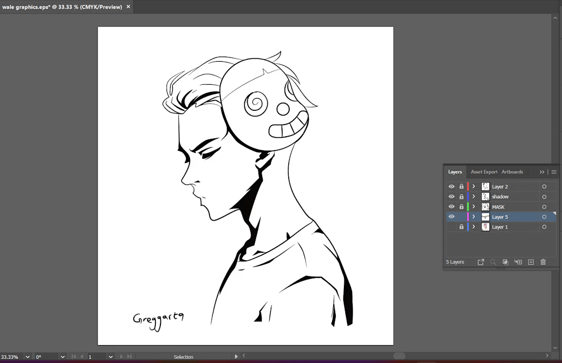
First illustration of the year. Taking my time with this one — no rush, just enjoying the process. Art always feels like home.

The network for creativity
Join 1.25M professional creatives like you
Connect with clients, get discovered, and run your business 100% commission-free
Creatives on Contra have earned over $150M and we are just getting started

Challenges
View all


Related posts

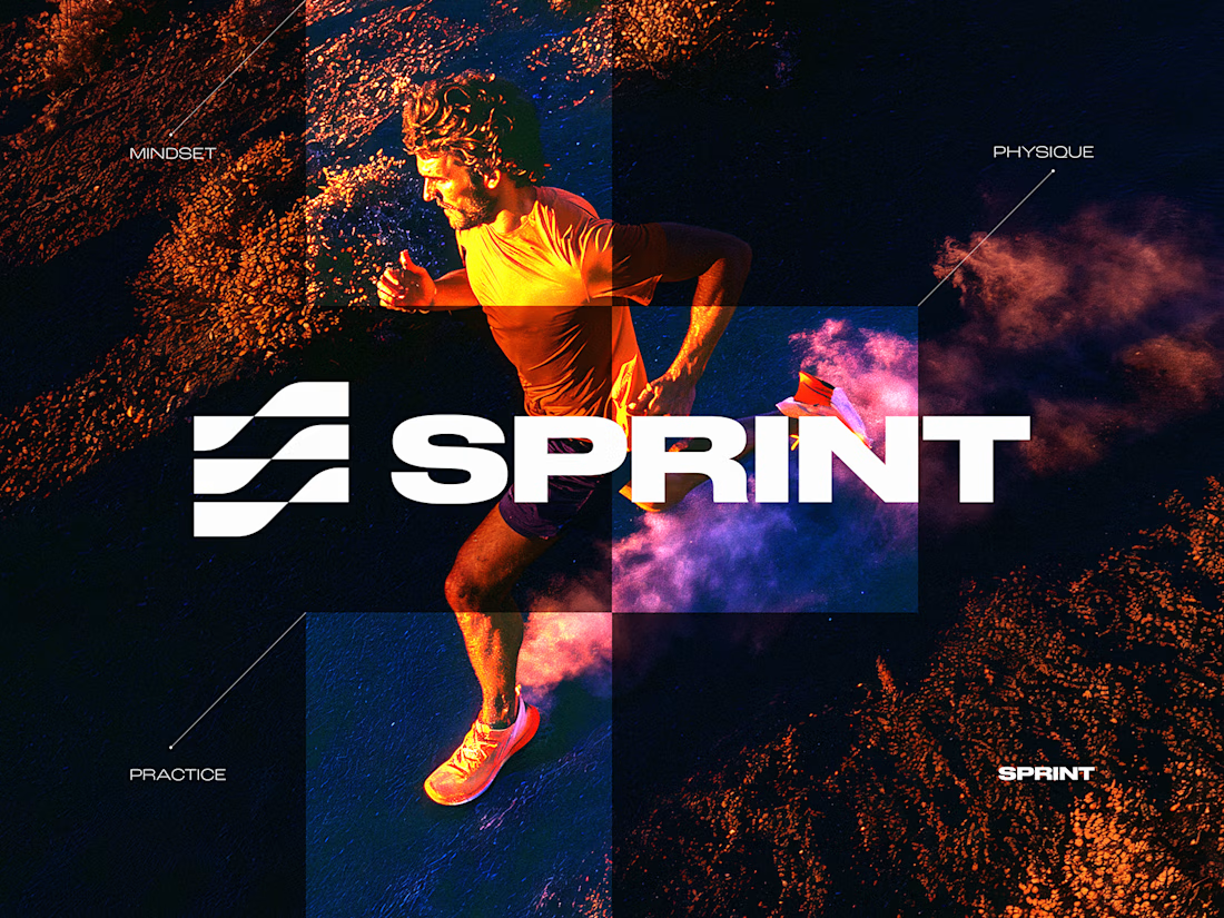
SPRINT — Experimental Brand Visual
A visual experiment built around an unused logo concept from a recent branding project.
The design was created manually, while exploring how AI-driven aesthetics are increasingly influencing contemporary visual language, even when AI itself isn’t part of the design process.
Logo design, art direction and visual exploration.



💯

Is sketching part of your creative workflow or we've forgotten what it feels to be human?
Depending on the projec's scope, I normally like to explore my ideas on paper before I come up with the best solution.
And no, they're not perfect.
They are rough and messy, my goal is so...

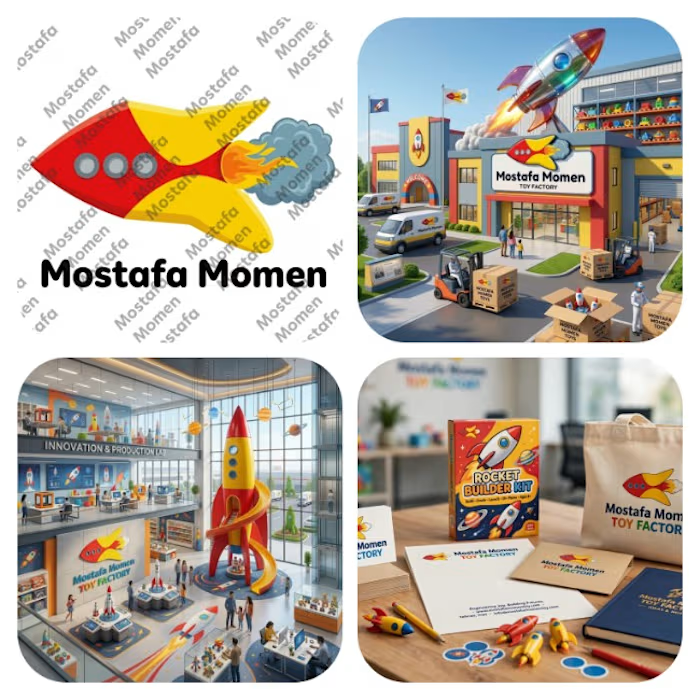
That's my modern minimalist joyful logo that's my case study for it Everything has its joy and kids toys has its own I design this logo because I want to try something different
This logo is mix between vibrant pure yellow and red colors with bold curvy cartoony rocket with cartoony fire and smoke
this logo focus on emotion fun and joy it help to solve the problem of (building trust, showing professionalism & value of brand, memorization, recognition) specially creating attention to attract kids and potential clients