The network for creativity
Join 1.25M professional creatives like you
Connect with clients, get discovered, and run your business 100% commission-free
Creatives on Contra have earned over $150M and we are just getting started
Back to feedPost

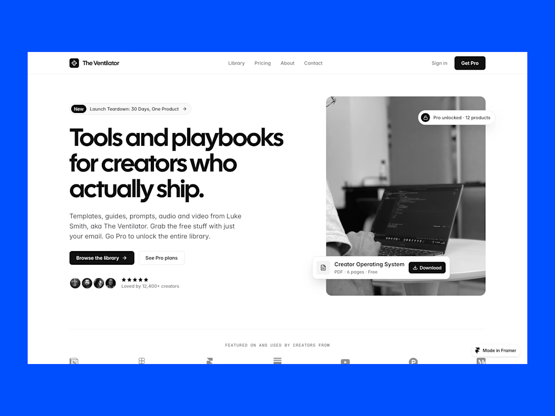
The Ventilator is a Framer template made using FrameAuth - you can set products that can be downloaded by non-users, users and subscribers making it ideal for creating a funnel system.
My goal was to let people sell their products in three tiers and entice visitors to go up a tier.
Visitor comes over to your website.
Gets a free product by entering their email and can be added to your newsletter.
A visitor can then sign up and download assets, files, courses, etc that are for users only.
Once a user finds good value, they can subscribe to access all assets/files.
This is completely made in no code using Framer and FrameAuth. FrameAuth were kind enough to allow me to run this for free via their template creator program.
Try it out here: https://www.framer.com/marketplace/templates/the-ventilator/


The network for creativity
Join 1.25M professional creatives like you
Connect with clients, get discovered, and run your business 100% commission-free
Creatives on Contra have earned over $150M and we are just getting started



Related posts


☕ CORVO is live: a Framer template for coffee roasters & cafés.
16 pages · Shopify shop · subscriptions · gift cards · events & journal CMS · fully responsive
https://framer.link/aYVd6cF


Same projects. Different perspectives.
With INKY, switching between grid and list views changes more than the layout.
The grid gives projects a visual presence. The list offers a more direct way to browse and compare.
Neither is necessarily better.
They're simply two ways of experiencing the same work.
One portfolio. Two perspectives.

Cool 3D assets

Not every website needs more elements.
Sometimes, it needs better decisions.
A thoughtful layout.
A strong typographic hierarchy.
The right images.
Consistent spacing.
A clear navigation.
And enough room for the design to breathe.
These details might seem small, but together they shape how people experience a website.
That's one thing I appreciate about working with Framer: the opportunity to explore layouts, interactions, and visual details while keeping the experience intentional.
For me, good web design isn't about adding more.
It's about knowing what to keep, what to remove, and what deserves attention.
Less noise. More meaning. Better experiences.
What's one small design detail that immediately makes a website feel premium to you?
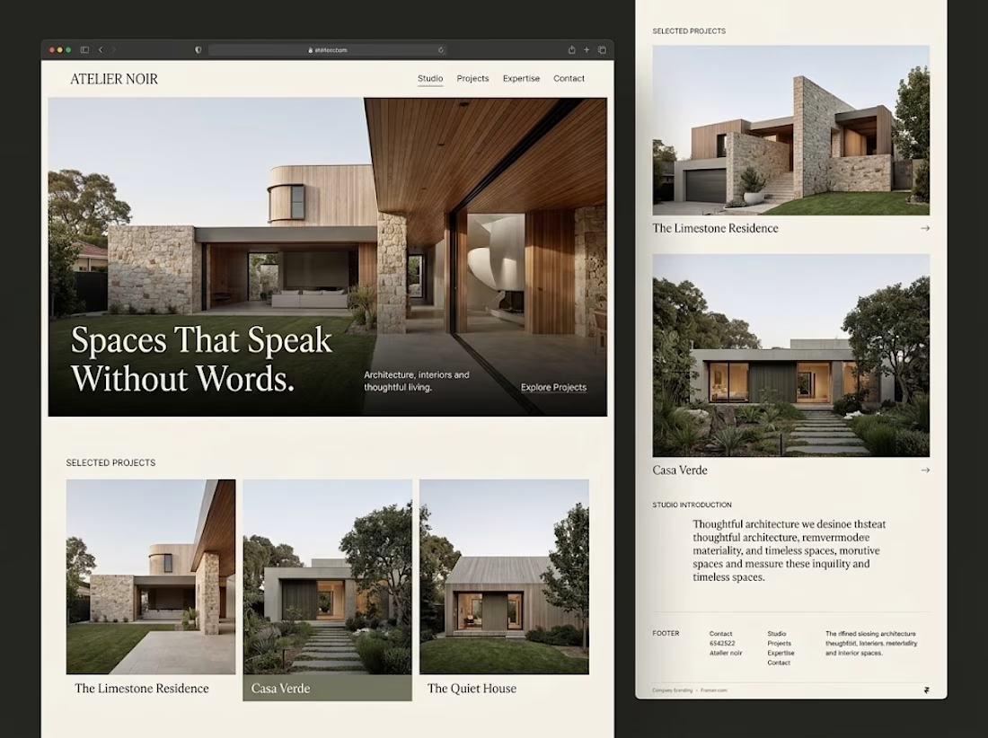

Generous whitespace for me. The serif headline over the photo on your Atelier Noir layout is a good example.