The network for creativity
Join 1.25M professional creatives like you
Connect with clients, get discovered, and run your business 100% commission-free
Creatives on Contra have earned over $150M and we are just getting started
Back to feedPost
Family Yoga Studio — Hero Section Design
A landing page concept designed for a family-focused yoga studio. The goal was to create a calm, welcoming first impression while maintaining a clear visual hierarchy and intuitive user experience.
Goal
Design a hero section that communicates the studio's atmosphere, establishes trust, and encourages visitors to take action without overwhelming them with information.
Design Approach
• Clean and minimal layout focused on readability and clarity
• Strong visual hierarchy that guides attention from the headline to the primary call-to-action
• Custom image masking and typography to create a distinctive brand presence
• Carefully balanced supporting visuals that reinforce the message without competing for attention
Outcome
The result is a modern, aesthetically balanced hero section that highlights the studio's identity while making it easy for potential clients to explore classes and get in touch.
Tools
Figma
Keywords
#WebDesign #UIUXDesign #LandingPage #HeroSection #WellnessDesign #YogaStudio #MinimalDesign #Figma #ProductDesign


Wow this is so cool😍

Thank you 🙏🏻


Amazing Olha 😍
☺️🤗

I litrally love the hero section.. i think u forget to share link
Thank you, Deepak! This is a sneak peek of the upcoming case study. I'm currently finalizing the full project, and it will be live soon. Stay tuned!

I think simplifying some elements and refining the hierarchy would make the design stronger.
Thanks for the feedback, Siddartha! I appreciate your eye. Since I aimed for a unconventional, artistic layout for this studio, I'd love to know which specific elements you think feel too busy or out of hierarchy.
Always open to concrete suggestions

This layout is incredibly soothing! Love the unique image masking and how beautifully the typography complements the overall calm vibe of the studio. Fantastic work on the hierarchy! 🧘♀️
Thank you 🥰

Love the font and colors 😍
Thank you for noticing that! I wanted the typography and colors to reflect the celebration of life and positive energy that yoga embodies. Glad to hear it resonates with you ☺️

Great work!
thank you!

Beautiful hero section! Love the color scheme and your creative idea with a woman in the center doing yoga 🔥
Thank you! So happy to see people connecting with this design )

One thing I find interesting about hero sections is that they have to do a lot of work in a very small space.
Communicate value, build trust, create the right emotional tone, and guide users toward action — all without overwhelming them.
Looks like an interesting challenge 👏
Spot on! Thanks for noticing that, means a lot! 🌱❤️
What I find interesting about hero sections is that users decide within seconds whether a product feels right for them.
Creating a sense of trust, clarity, and calm while still encouraging action is much harder than it looks. Nicely thought through 👏
Thank you 💕

Nice work😊

Amazing

This looks so peaceful. Love it!😍
Thank you 😊

what a lovely Hero! :)
I'm glad you like it 🤗
The network for creativity
Join 1.25M professional creatives like you
Connect with clients, get discovered, and run your business 100% commission-free
Creatives on Contra have earned over $150M and we are just getting started
Related posts


A fresh digital identity, a premium workspace designed for creative professionals.
From an elegant, editorial-style website to a functional mobile app for bookings and studio management, the goal was to make every interaction feel as refined as the space itself.
Clean layouts, timeless typography and a deep green palette bring the whole experience together.


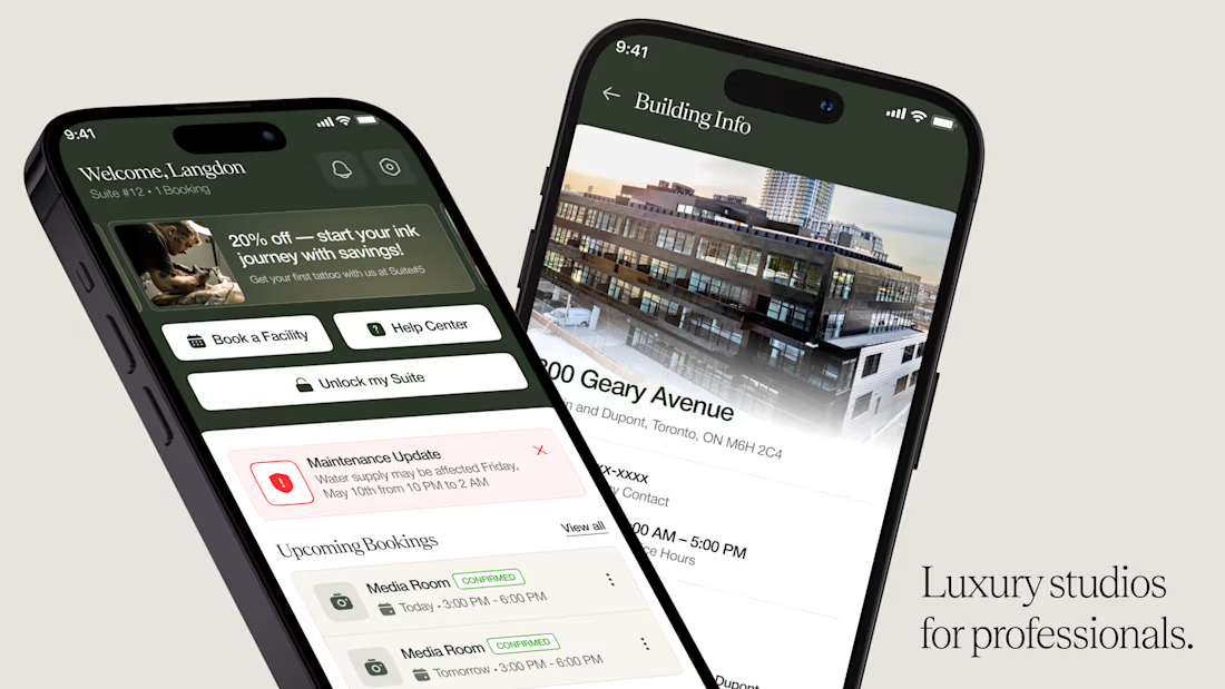
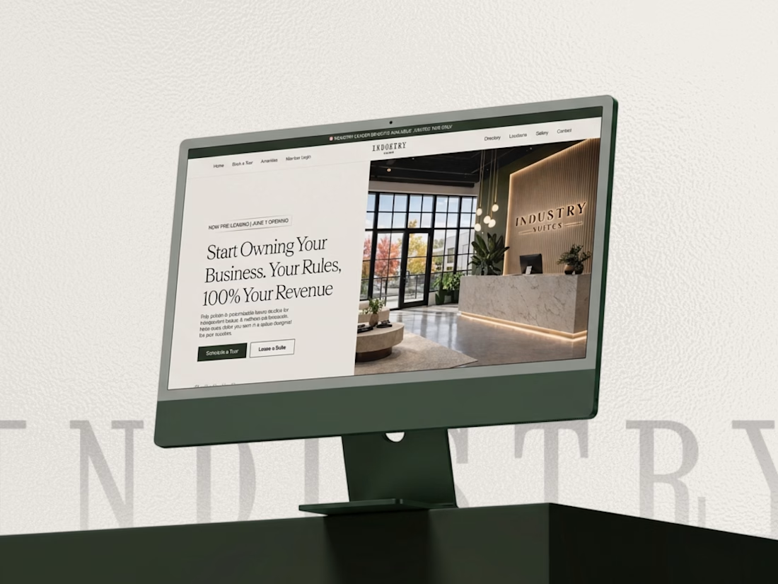

This looks super premium Kabir! Love how you carried the same refined, editorial feel from the website to the mobile app. The clean layouts and booking flow feel exactly like a high-end creative studio should - elegant but functional. The desktop + mobile mockups show the consistency really well. Great execution!

Your design has 3 seconds to earn attention. Which skincare brand wins?
A leads with confidence, energy, and aspiration. B builds trust through nature, freshness, and simplicity.
Great design doesn’t just look good. It makes people feel the brand before they read a word.
A or B? Which would make you stop scrolling?


30 voted
52%
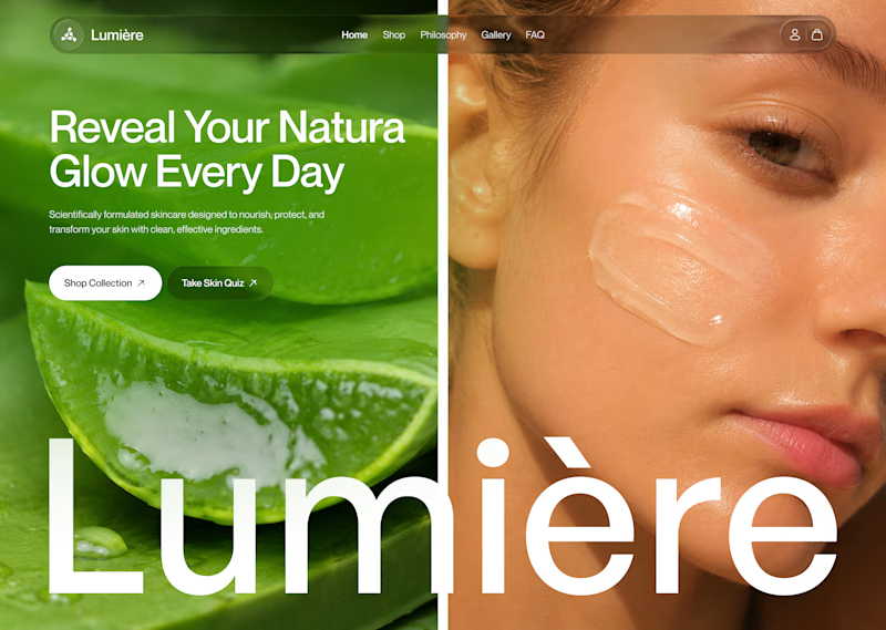
28 voted
48%
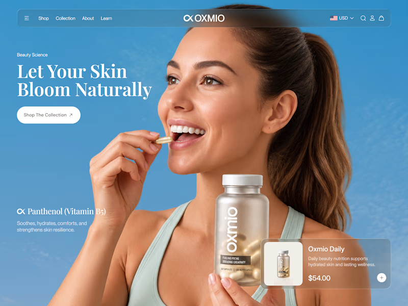
58 votes
Closed


B without questions

Built this free SaaS portfolio template in Framer a few months ago, and it’s been amazing to see the momentum it’s gaining! 🚀
It’s now ranked #18 in Framer’s Marketing category, bringing in more visibility, views, and commissions.
I’ve shared the full case study here, covering the project and how it came together.
Take a look if you’re curious! 🙌
This is amazing Fawaz! 🚀 Ranked #18 in Framer's Marketing category is huge! Love how you turned a free SaaS template into visibility + commissions. That's smart product thinking. Can't wait to read the full case study, congrats on the momentum!


