The network for creativity
Join 1.25M professional creatives like you
Connect with clients, get discovered, and run your business 100% commission-free
Creatives on Contra have earned over $150M and we are just getting started
Back to feedPost

Fundraising Deck Redesign: Turning Revenue Data into an Investor-Ready Story.
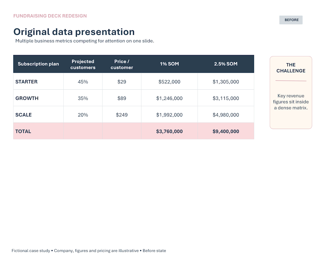
A fundraising deck presented revenue projections in a dense, spreadsheet-style table, requiring the reader to process multiple figures before seeing the overall business story.
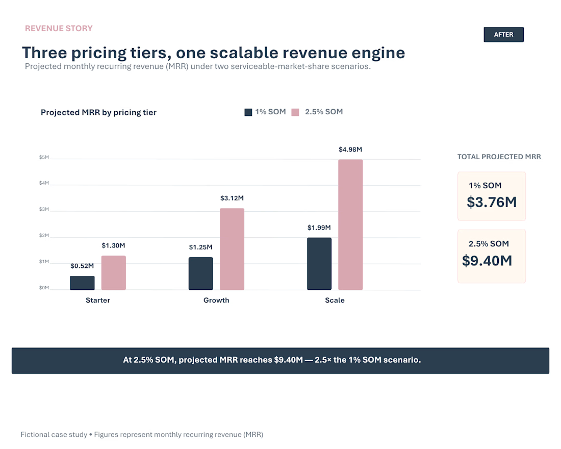
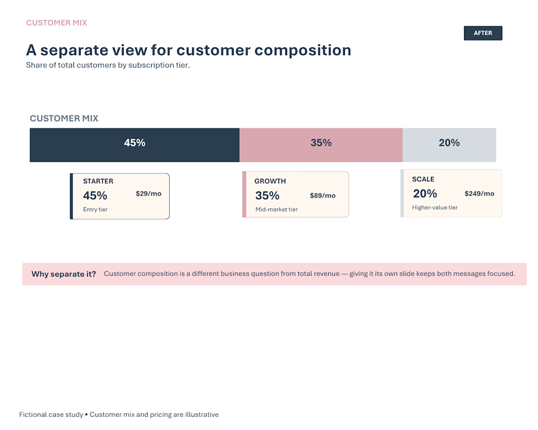
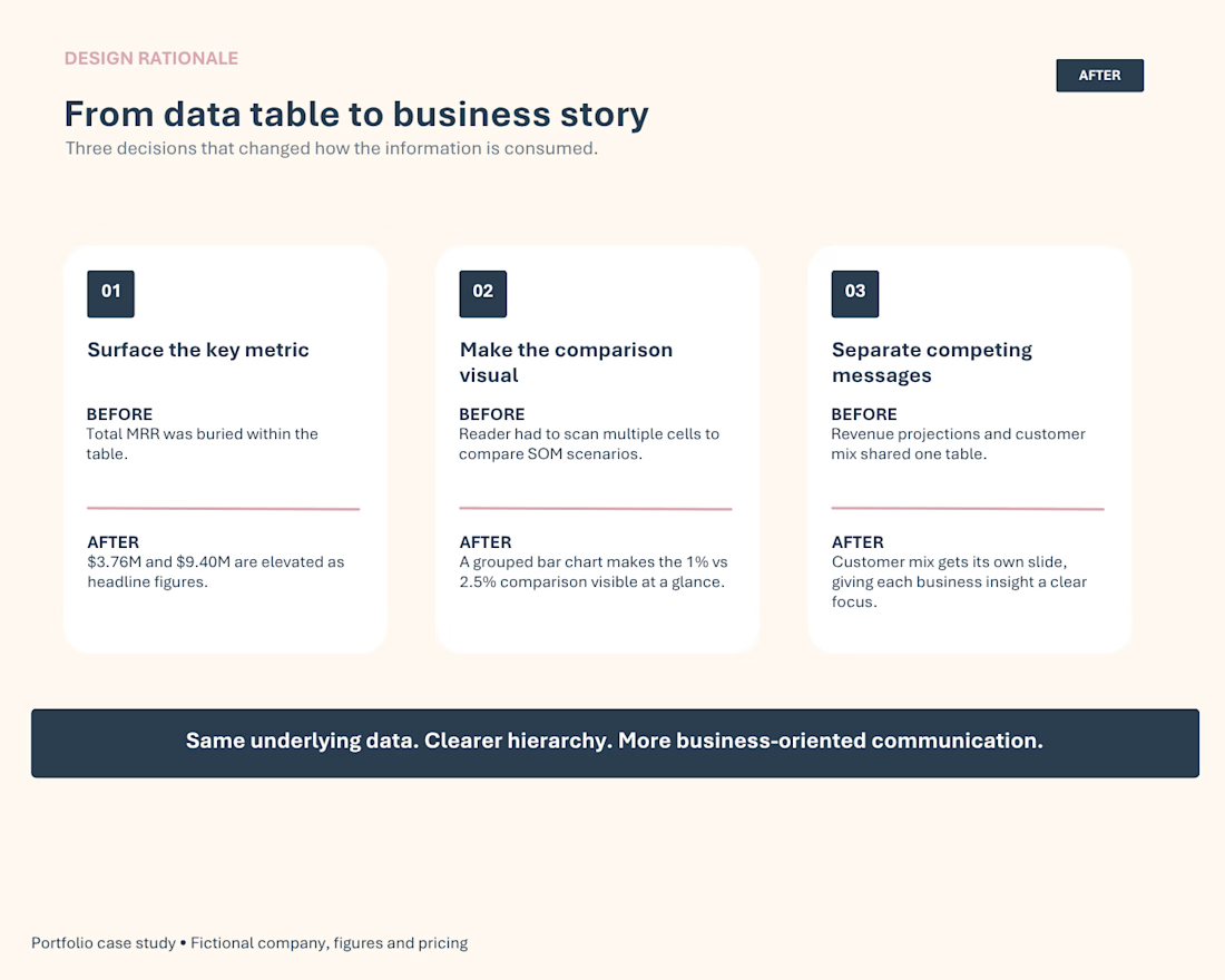
I restructured the information around three communication goals: surface the key revenue metrics, make the 1% vs. 2.5% SOM comparison immediately visible, and separate revenue projections from customer mix.
I replaced the original data table with a grouped bar chart, elevated total projected MRR into headline figures, added a concise data-driven takeaway, and gave customer composition its own focused slide.
The result is the same underlying data, reorganized with clearer hierarchy and a more business-oriented narrative.
Case study created for portfolio demonstration purposes. Company, figures, and pricing are fictional and illustrative.


The network for creativity
Join 1.25M professional creatives like you
Connect with clients, get discovered, and run your business 100% commission-free
Creatives on Contra have earned over $150M and we are just getting started





Related posts


Built the StupidFish Design System from the ground up and covering everything from color, typography, spacing, and components to comprehensive documentation.
Designed and documented for both web and mobile, creating a consistent, scalable foundation that makes product design and development faster and more cohesive.
Check out the full case study here →

Really thorough system, nice job

Rosso Archive — Gallery Website
Rosso Archive is a website for a contemporary art gallery — a calm, editorial space built around a single idea: twenty-four works.
We kept the interface quiet so the images can speak. Monospaced captions, a soft grey palette and generous white space give the archive the feel of a printed catalogue, while small interactions make it feel alive online.
What's inside:
— Index list view with a live preview of the hovered work
— Grid view with a colour-on-hover state for the active piece
— Work detail page with specs, description and related works
— Seamless zoom-in transitions between artworks and screens
Have a project in mind? Let's talk.


Great work, Dmytro!

Designed this interactive 3d dashboard with Opus 5.5 for an industrial company's vehicle and material tracking dashboard
A full 3D simulation of the plant, every truck tracked from gate to dock
Both modes are pixel precise. Which one you like?
4 voted
40%
6 voted
60%
10 votes
Closed

Voted Dark. On a dashboard watching trucks move from gate to dock all day, dark is easier on the eyes, and the 3D bars and route lines glow against it. Light is clean, but dark makes the live movement the focus.