The network for creativity
Join 1.25M professional creatives like you
Connect with clients, get discovered, and run your business 100% commission-free
Creatives on Contra have earned over $150M and we are just getting started
Back to feedPost
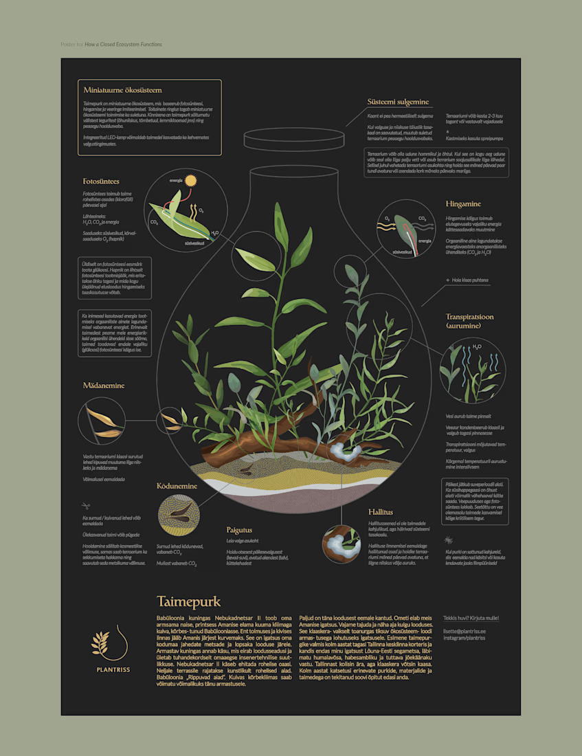
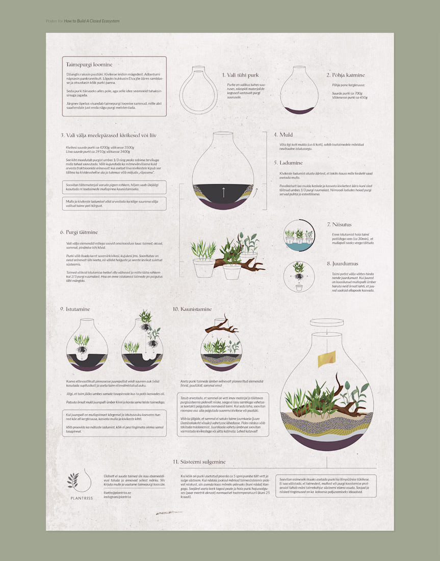
Throwback to one of my favorite poster projects. These two infographic posters were printed and framed for the plant shop that sells closed ecosystems.
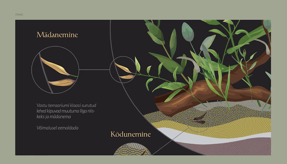
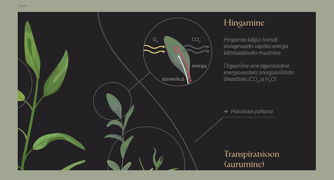
The goal was to clearly convey all the organic processes taking place within the ecosystem and to show how to create one.
I was especially fond of the first poster, which I intentionally made dimmer so that, from afar, it appears visually balanced, and the text only reveals itself upon closer inspection.
Interestingly, this is the only poster the print shop has ever called me about, worried that I’d made a mistake — it was “too dark”! It actually turned out exactly as intended, though. What do you think, should the text have been white instead?
@Paula Pakk beautifully done! I love what you landed on.
@Alex Brown Love to hear that! Thank you!
The network for creativity
Join 1.25M professional creatives like you
Connect with clients, get discovered, and run your business 100% commission-free
Creatives on Contra have earned over $150M and we are just getting started
Trending
Claude
Claude has entered the design space. How are you using Claude Design?
Contra University
Learn from expert creatives how to earn more using next-gen AI tools.
creativeaiflow
Creative AI workflows are evolving. What tools do you use, and what are their strengths and weaknesses?
freelancerlife
Freelancer life is wins, pivots, and everything in between. What’s yours right now?