The network for creativity
Join 1.25M professional creatives like you
Connect with clients, get discovered, and run your business 100% commission-free
Creatives on Contra have earned over $150M and we are just getting started
Back to feedPost

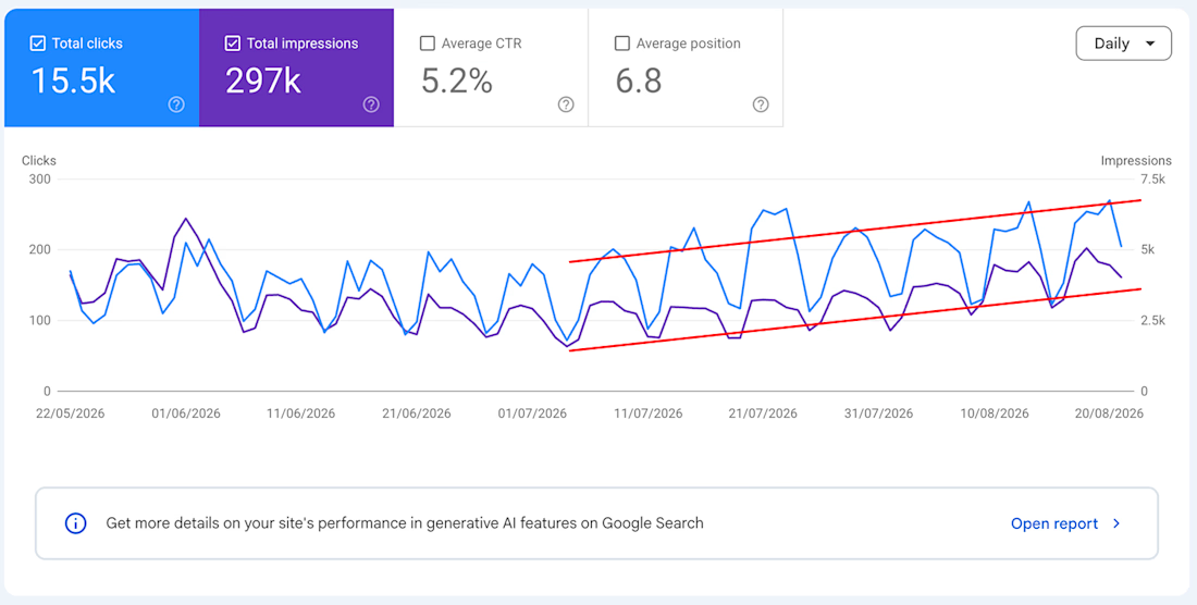
First thing in the morning: coffee and numbers.
Because behind every website there’s a business trying to make money.
Fancy animations are cool.
But seeing those lines go up is cooler.


Well said man, finally someone who gets it!! 🚀
Thanks Tan, appreciate it!

That upward channel on impressions while clicks stay steady usually means you're ranking for more queries than you're winning yet, good problem to have.
the thing is, both clicks and impressions go up, haha
The network for creativity
Join 1.25M professional creatives like you
Connect with clients, get discovered, and run your business 100% commission-free
Creatives on Contra have earned over $150M and we are just getting started











Related posts

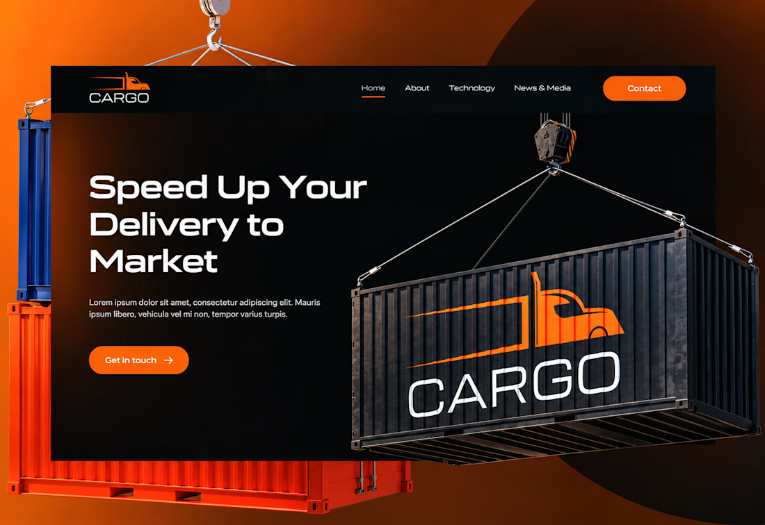
I designed the website for Cargo, a freight and delivery company. Logistics sites usually feel like a wall of grey stock photos. I wanted this one to feel fast, strong, and a little cinematic.
The headline is the pitch. “Speed Up Your Delivery to Market” is short, direct, and tells customers what the company does for them. The wide, geometric typeface feels engineered, like something built to move.
The brand is part of the scene. A shipping container hangs from a crane with the Cargo logo on its side, so the logo lives inside the imagery instead of sitting in a corner.
Orange is the only color that asks for a click. On a near-black background, the “Contact” and “Get in touch” buttons stand out immediately, and the same orange runs through the truck logo, so brand and action feel connected.
Simple navigation. Home, About, Technology, and News & Media. Four links, no clutter, so visitors find what they need fast.

Ye le Jani:
Nailed it Joshua! Love that take - logistics sites ARE a wall of grey stock photos and you flipped it. That orange + black contrast with the suspended cargo container visual is so cinematic and strong. "Speed Up Your Delivery to Market" is a killer headline too, super direct. Fast and bold vibes came through!

Title: Modern Website Portfolio | Clean UI & Visual Design
About this work:
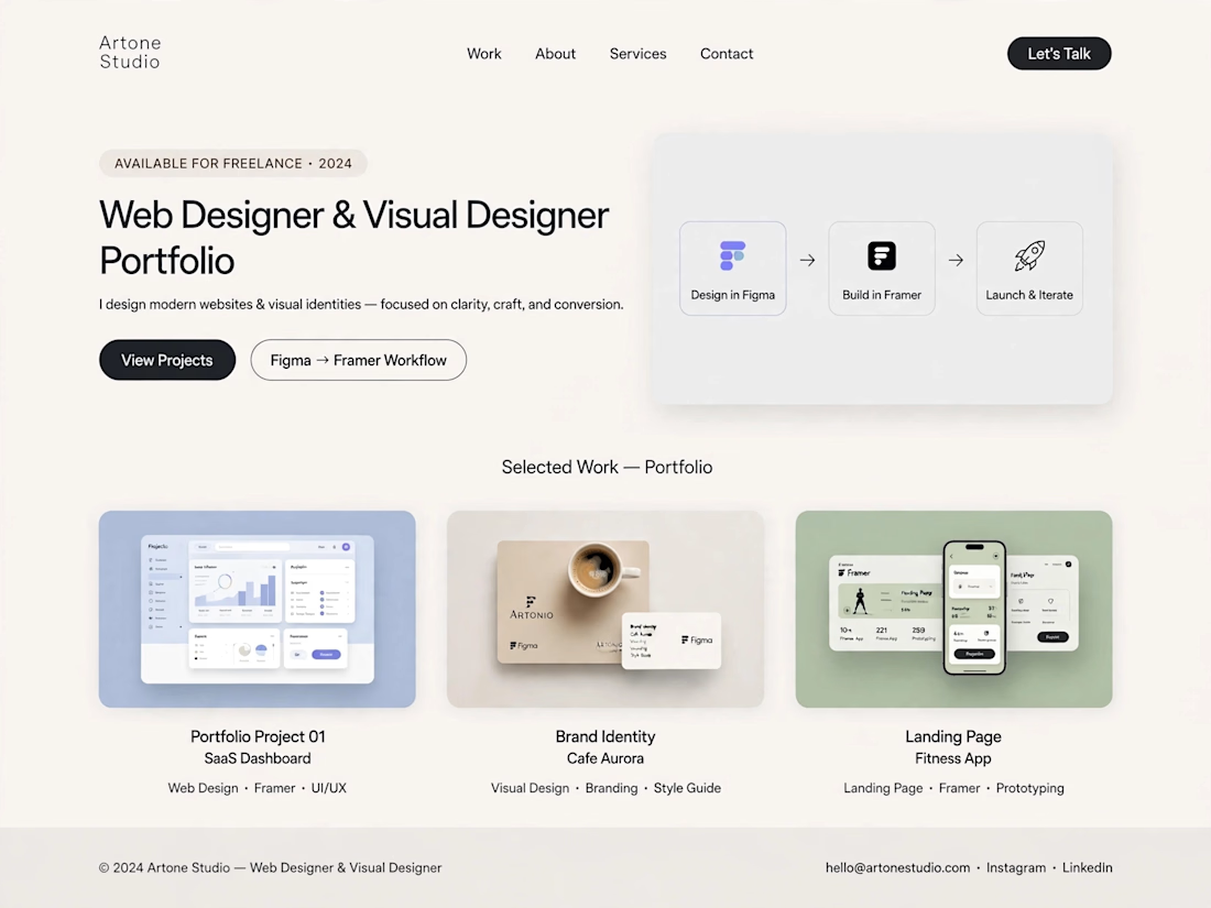
I designed a modern, light-themed portfolio concept with a focus on simplicity, visual consistency, and a smooth user experience. The layout presents a structured design workflow, from initial ideas and interface design to website presentation.
The portfolio includes sample concepts for SaaS dashboards, brand identity, and landing pages, demonstrating how thoughtful layouts and consistent visual styling can help businesses present their services effectively.
Skills: Web Design, Visual Design, UI Design, Landing Page Design
Tools: ChatGPT, Figma, Framer



Not bad but need more improvement

☀️ Good afternoon!
A question for anyone who runs a small business: what do customers ask you most often?
🕒 Opening hours?
💶 Prices?
📋 The menu?
📍 Where you are?
Whatever it is, that’s the first thing your website should answer, in the first few seconds on a phone. I’m curious what your answer is 👇

Great framing, Alexander. Most small business sites bury the one thing visitors actually want. Answering the most-asked question in the first few seconds is such a simple rule and most sites still miss it.