The network for creativity
Join 1.25M professional creatives like you
Connect with clients, get discovered, and run your business 100% commission-free
Creatives on Contra have earned over $150M and we are just getting started
Back to feedPost


The network for creativity
Join 1.25M professional creatives like you
Connect with clients, get discovered, and run your business 100% commission-free
Creatives on Contra have earned over $150M and we are just getting started




Related posts

Which style wins for you? 🤔
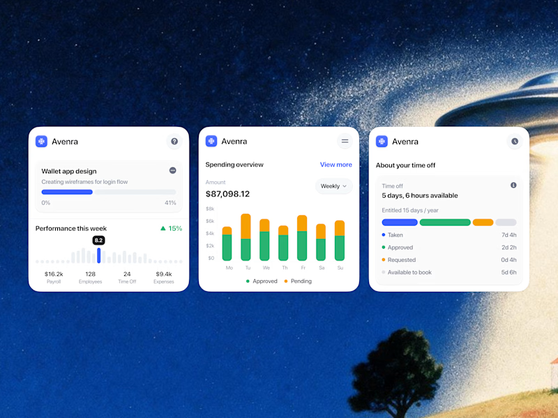
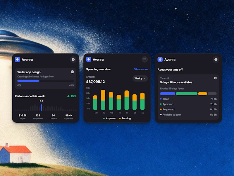
We’re testing out two theme directions for Avenra’s dashboard component cards; featuring real-time spending breakdowns, project progress metrics, and time-off tracking.
Curious to hear your thoughts! 💬

8 voted
42%
11 voted
58%
19 votes
Closed

Energy communities need to manage a lot at once: consumption, generation, members, billing, reports, alerts, and operational changes.
Wattbank explores a clearer SaaS dashboard experience for energy community operators. The interface brings key metrics, energy balancing, participant distribution, billing, reporting, and insights into one workspace that is easy to scan and act on.
The goal was to move away from heavy energy software and create something more visual, human, and operationally useful.

Excel PivotTable — Sales Summary
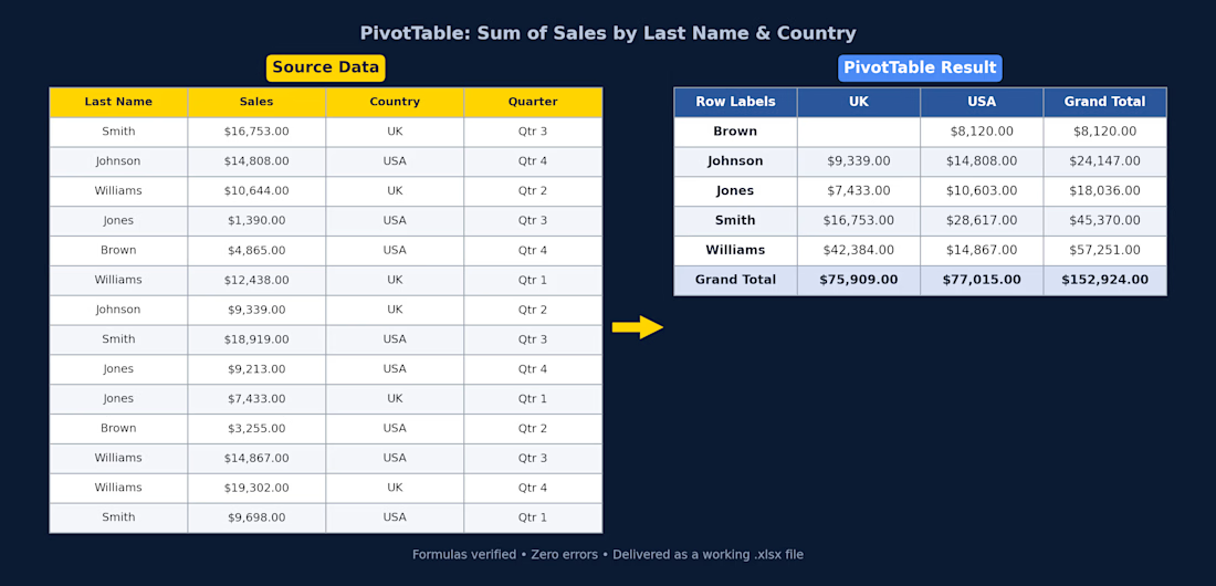
Client had raw sales data (14 rows across UK/USA, split by quarter) and needed it turned into something actually usable. I cleaned it up and built a PivotTable that breaks total sales down by rep and country, with grand totals for both.
What I did:
Structured the raw data into a proper table (consistent headers, currency formatting)
Built a PivotTable summarizing Sum of Sales by Last Name and Country
Used SUMIFS so the totals update automatically if the source data changes — nothing hardcoded
Checked every formula for errors before delivery
Delivered as a working .xlsx file, ready to plug into a bigger report or dashboard.
If you've got messy sales/ops data sitting in a spreadsheet and need it turned into something you can actually read at a glance, this is exactly the kind of thing I can help with.