The network for creativity
Join 1.25M professional creatives like you
Connect with clients, get discovered, and run your business 100% commission-free
Creatives on Contra have earned over $150M and we are just getting started
Back to feedPost

Every brand starts with a correct creative direction.
We started with a minimal, nature- and science-inspired creative direction, pulling references from skincare formulations, clean beauty aesthetics, organic textures, and clinical design. This helped set the foundation for a modern beauty brand that blends makeup and skincare into one cohesive experience.
From there, the brand evolved into a bold, black-and-white visual identity, clean, confident, and highly intentional. The final system feels elevated and modern, while still reflecting the brand’s focus on transparency, function, and simplicity.
If you’re a beauty founder or product-based business owner ready to build a brand with clarity and purpose, my DMs are always open

So cool, Lily!
The network for creativity
Join 1.25M professional creatives like you
Connect with clients, get discovered, and run your business 100% commission-free
Creatives on Contra have earned over $150M and we are just getting started









Related posts

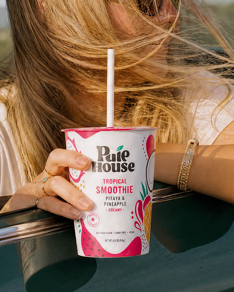
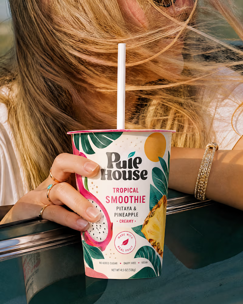
Exploring Two Branding Concepts
I explored two distinct visual directions for Pulp House, focusing on how color, composition, and design elements can shape a brand's identity.
This comparison reflects my approach to creating thoughtful, cohesive visuals that help businesses present their brands with confidence.
1 voted
5%
20 voted
95%
21 votes
Closed

Fun concepts, Mati!

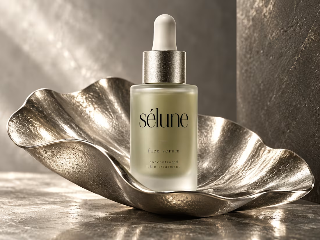
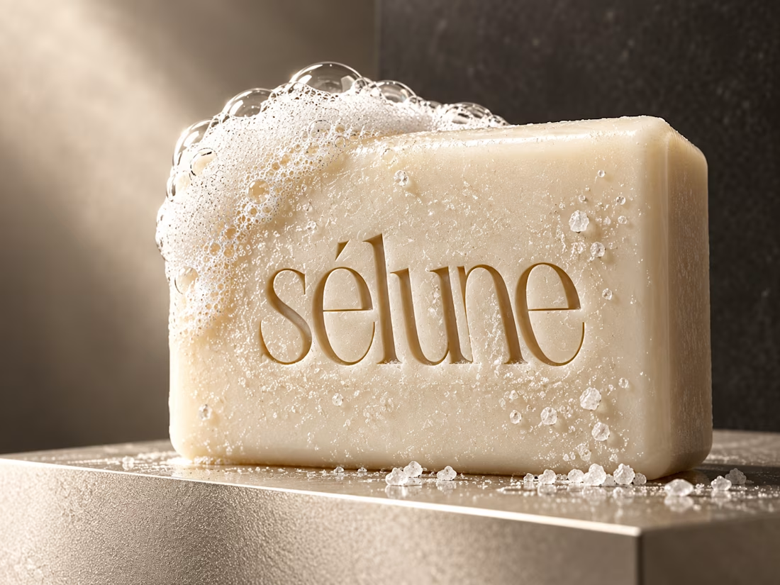
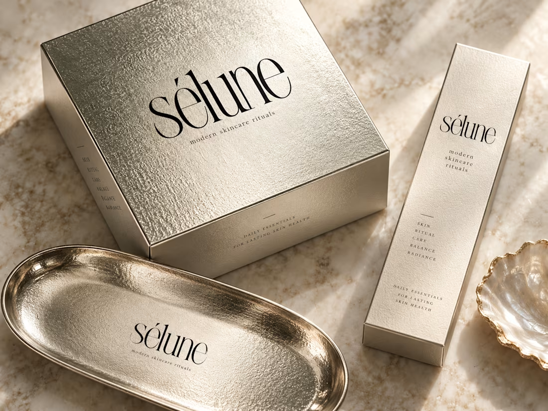
✨ Introducing SÉLUNE — where skincare meets quiet luxury.
What do you think of this direction for a modern skincare brand? ✨



Amaizinh nusrat ♥️♥️🔥

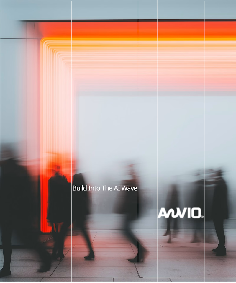
Which creative direction better communicates a Tech-Forward AI Brand Identity for anvio.online ?
25 voted
44%

32 voted
56%
57 votes
Closed

Fast vibrant energy gets my vote. The warm glow feels more human, which is nice for an AI brand.