The network for creativity
Join 1.25M professional creatives like you
Connect with clients, get discovered, and run your business 100% commission-free
Creatives on Contra have earned over $150M and we are just getting started
Back to feedPost

The network for creativity
Join 1.25M professional creatives like you
Connect with clients, get discovered, and run your business 100% commission-free
Creatives on Contra have earned over $150M and we are just getting started








Related posts


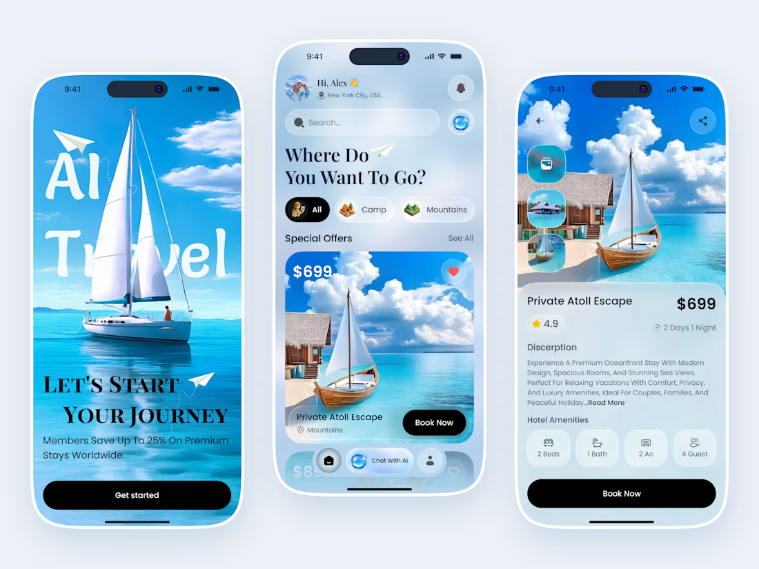

Wanderly — Travel & Destination Discovery Mobile App
A modern travel app concept crafted to inspire exploration and simplify trip planning.
Wanderly brings destination discovery, curated recommendations, travel inspiration, and booking details into one intuitive mobile experience. The interface combines immersive destination imagery, a refined blue-and-white color palette, clean typography, and thoughtfully designed components.
Project Focus
UI/UX design and mobile interface design
Destination discovery and search experience
Travel recommendations and destination cards
Trip details, ratings, and booking flow
Visual consistency and usability


Amazing work

✨ 𝐋𝐨𝐜𝐚𝐧𝐝𝐚 𝐁𝐨𝐮𝐭𝐢𝐪𝐮𝐞 𝐇𝐨𝐭𝐞𝐥 — 𝐑𝐞𝐢𝐦𝐚𝐠𝐢𝐧𝐢𝐧𝐠 𝐇𝐨𝐬𝐩𝐢𝐭𝐚𝐥𝐢𝐭𝐲 𝐰𝐢𝐭𝐡 𝐁𝐚𝐬𝐞𝟒𝟒 🚀
What if a hotel website could do more than just take bookings?
For the #Base44Challenge, I transformed the digital experience of Locanda Boutique Hotel, a real boutique hotel in Germany, into a modern, fully responsive hospitality platform.
✨ Standout Features
🏨 Seamless room discovery and bookings
🤖 AI Concierge for personalised recommendations, itinerary planning, and booking assistance
✈️ Airport transfers, spa treatments, restaurant reservations, and local experiences
👤 Personalised guest dashboard for managing reservations
⚡ Automated booking confirmations and check-in reminders
💎 Smart upsells to unlock additional revenue opportunities
⭐ Automated post-stay review requests and guest engagement
The vision? A hotel experience that feels premium before guests even arrive, while intelligent automation helps staff work smarter behind the scenes.
Built with @Base44. ✨
🚀 Explore the experience and tell me what stands out to you most! If you were running a boutique hotel, which of these features would make the biggest difference to your business?
