The network for creativity
Join 1.25M professional creatives like you
Connect with clients, get discovered, and run your business 100% commission-free
Creatives on Contra have earned over $150M and we are just getting started
Back to feedPost


Patreon's engineering team just published a deep dive on their seven-year TypeScript migration. The part that stuck with me: the typed foundation had to come first, or none of the tooling could be trusted.
Wrote up a how-to on that infrastructure-first approach, including an interactive diagram showing how a small number of core files can do most of the type coverage work across an entire codebase: https://rachel.fyi/posts/gravity-centers-typescript-migration

The network for creativity
Join 1.25M professional creatives like you
Connect with clients, get discovered, and run your business 100% commission-free
Creatives on Contra have earned over $150M and we are just getting started





Related posts

Before design, I was a VC in Silicon Valley. So I built a Framer template for VC funds. It's called FirstCheck.
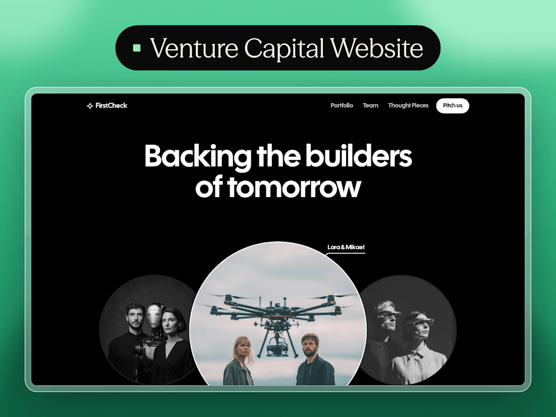
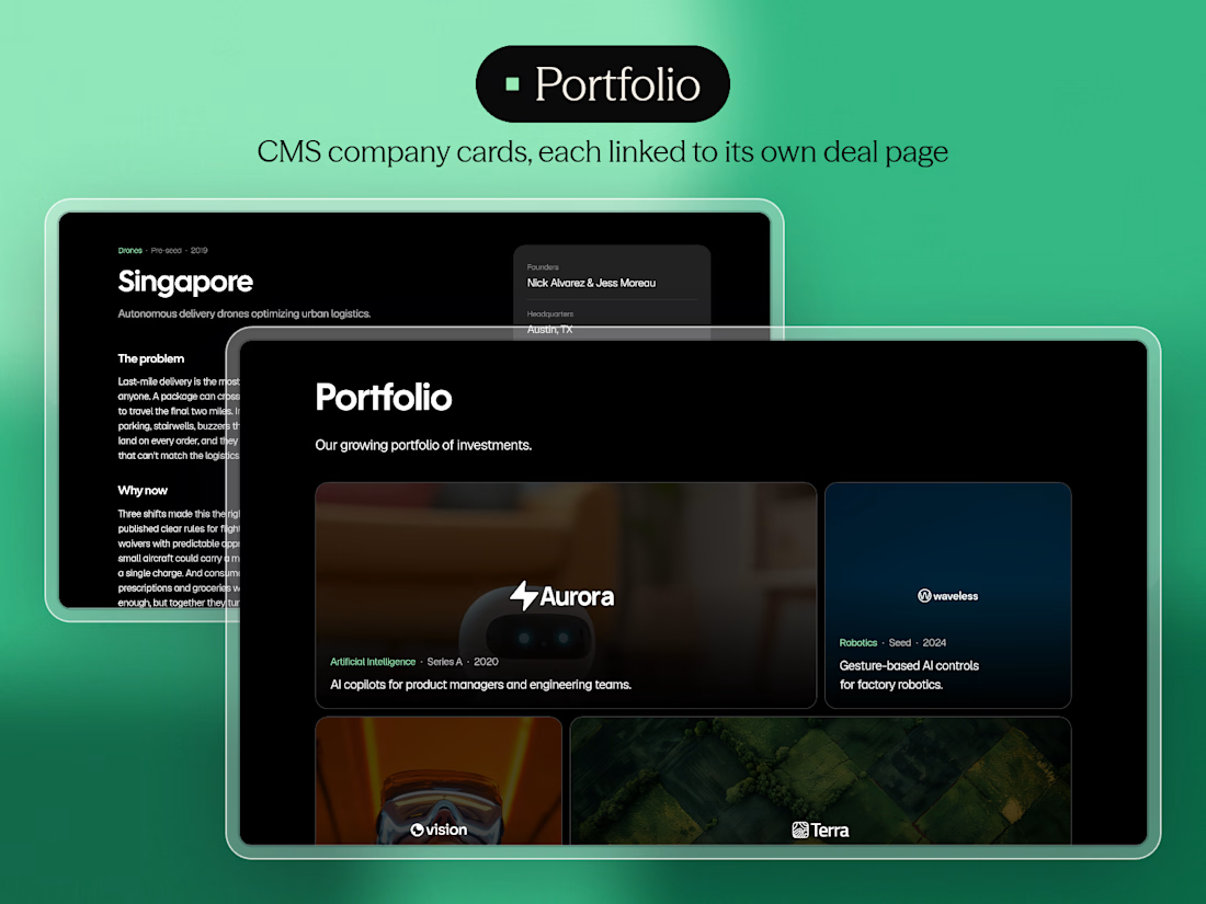

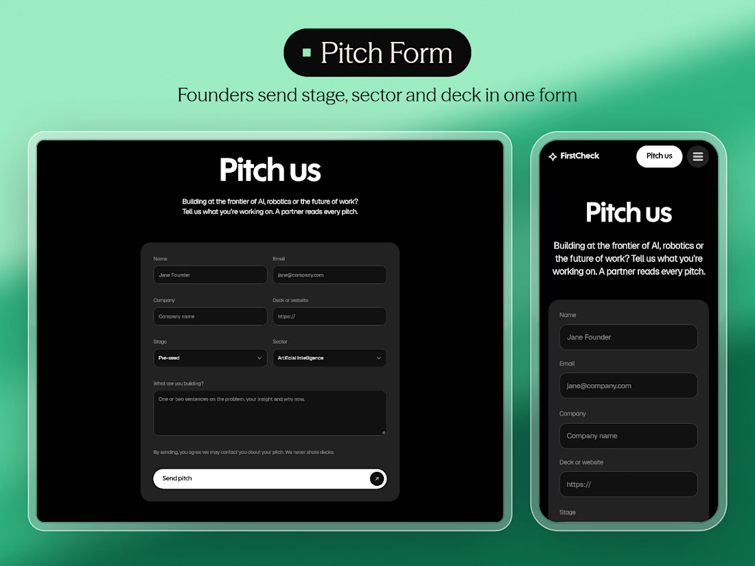

Green on black suits a VC template, and the portfolio grid looks clean. Congrats on the launch, Firdavs.

Testing my app! 🧰🚀 Everything is finally coming along.
I’ve been working on this project for a little over two weeks. Initially it was just me working with one AI agent, but I was still manually coding most of it, so I was moving like a turtle 🐢very slow.
Then I decided to implement Codex into my project to automate more of the development and it has been amazing. Now I can focus more on prompting, testing, reviewing the code and making the technical decisions instead of manually coding everything.
I also created my own AGENTS.md bible with all my project rules and instructions to make sure Codex follows them as the final authority when working on my code.
The idea is simple: create one useful and intuitive ecosystem of tools that Shopify merchants can add to their stores to help customers make purchasing decisions faster and with more confidence.
Still testing, building and adding more tools. Let’s see where this goes! 🚀
And if anyone finds the idea interesting. I’m definitely open to collaborations, ideas or partnerships. Feel free to reach out!


Seeing you shift from hand coding to Codex and let the agent handle the grunt work really speeds up iteration.

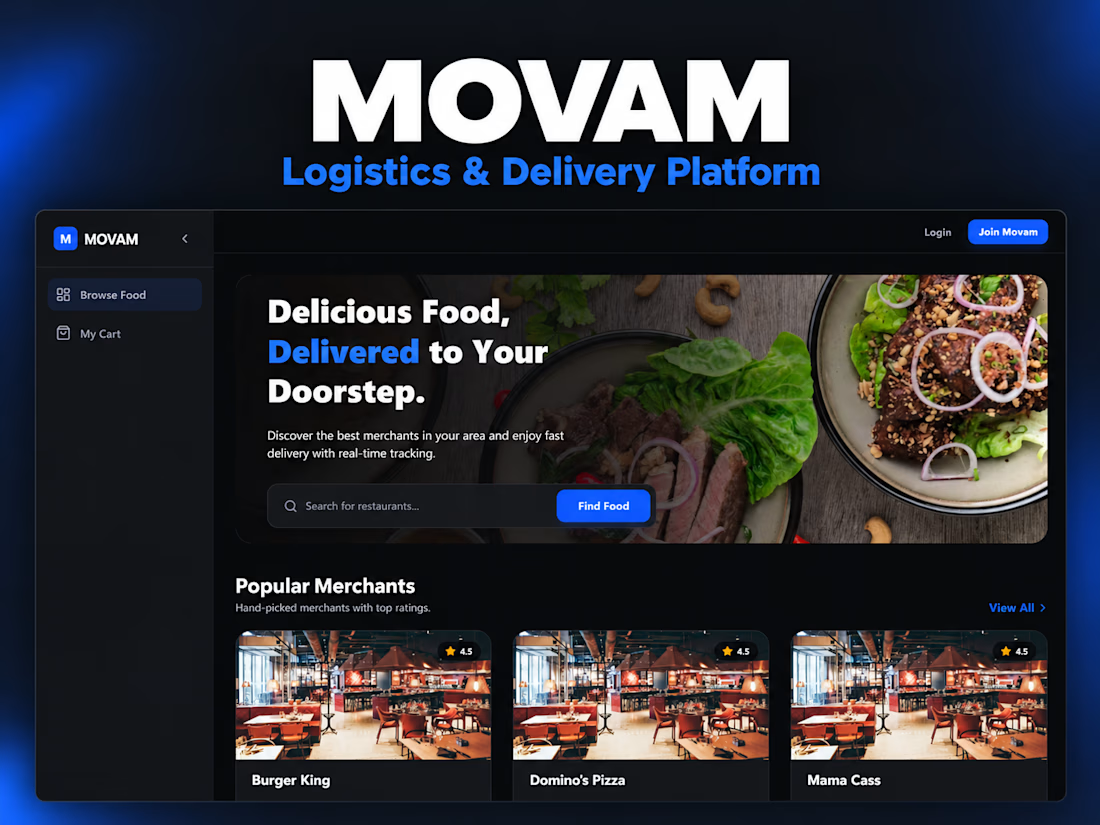
I developed Movam to bring customer ordering, merchant fulfilment, rider dispatch, and platform administration into one application.
I built the backend with Laravel and REST APIs, alongside Vue.js and TypeScript dashboards for customers, merchants, riders, and administrators.
Key features include:
Product browsing, cart, checkout, and order management.
Paystack payment integration, wallets, and OTP-verified withdrawals.
Dispatch logic that assigns deliveries to nearby available riders.
Mapbox integration for location services and delivery-distance calculations.
WebSocket events for order status and rider location updates.
Merchant product management and administrative reporting.
The project demonstrates my ability to translate business workflows into connected interfaces, backend services, and third-party integrations.
Tools: PHP, Laravel, Vue.js, TypeScript, Tailwind CSS, Pinia, Laravel Sanctum, Laravel Reverb, Paystack, and Mapbox.


Combining ordering, fulfilment and dispatch in one app probably trims a lot of manual steps. Laravel APIs feeding Vue TypeScript dashboards keep the data moving smoothly across customers, merchants and riders.