The network for creativity
Join 1.25M professional creatives like you
Connect with clients, get discovered, and run your business 100% commission-free
Creatives on Contra have earned over $150M and we are just getting started
Back to feedPost
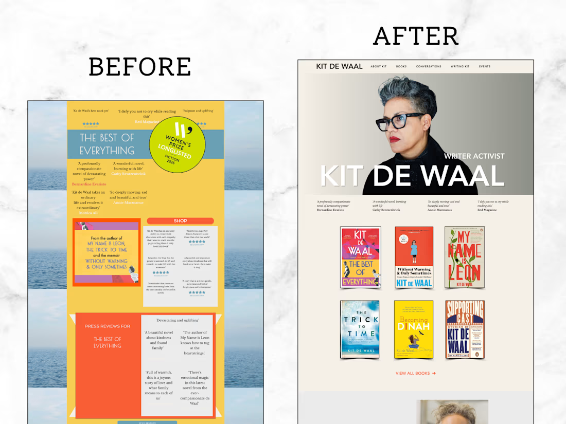
Before/after: from busy and cluttered to the website a Women's Prize longlisted novelist deserves 📚
The before: years of accumulated content. Interviews from 2022 next to news from last week. Three fonts per page. Podcast lists that scrolled forever. A shop button shouting over the books. Everything on the site was true — there was just five years of it, all at once, all at the same volume.
The after: an author website that breathes.
✨ One typographic system: Avenir for the headlines, Baskerville for everything else, set like the pages of a well-made book
✨ A warm parchment palette with one single orange accent, used only where it earns its place
✨ Awards and roles typeset like the prize page of a hardback, not a CV
✨ Every book with its cover, a short synopsis, two quotes and quiet buy links — nothing sold, everything findable
✨ And a second, connected brand for her writing courses: teal, white, plain-spoken, where a writer can find a course, see the price, and enrol without friction
The design brief in one line: warm without being folksy, confident without being corporate. Readers should feel at home. Nobody should feel sold to.
Turns out the highest form of author-website design is subtraction. Her books were always the main event. The site just needed to get out of their way.
What's the best "less but better" transformation you've shipped? 👇

Her books were always the main event, the site just needed to get out of their way is such a good line, wish more clients believed that. My best subtraction moment was cutting a client's homepage from six sections to two, conversions went up almost immediately once we stopped competing with ourselves.

Thank you!!
Oow wow! I can imagine, the shorter and clearer the website the best conversions they will get!
The network for creativity
Join 1.25M professional creatives like you
Connect with clients, get discovered, and run your business 100% commission-free
Creatives on Contra have earned over $150M and we are just getting started








Related posts


Three weeks into building the Pasted website, after the design was approved, an 11-page document arrived with a whole new vision.
It was beautiful work, and it described a different project at the agreed price.
I asked them to decide: keep the approved scope, or pause and price the new idea separately. On day six, they chose the original. We shipped two weeks later.


Offering to price the new vision as its own phase also lets the client see what the idea costs without it feeling like a no. Was a change-order process already written into your contract, or did you build that path on the spot?

Almost every designer I know has a portfolio that's "almost done."
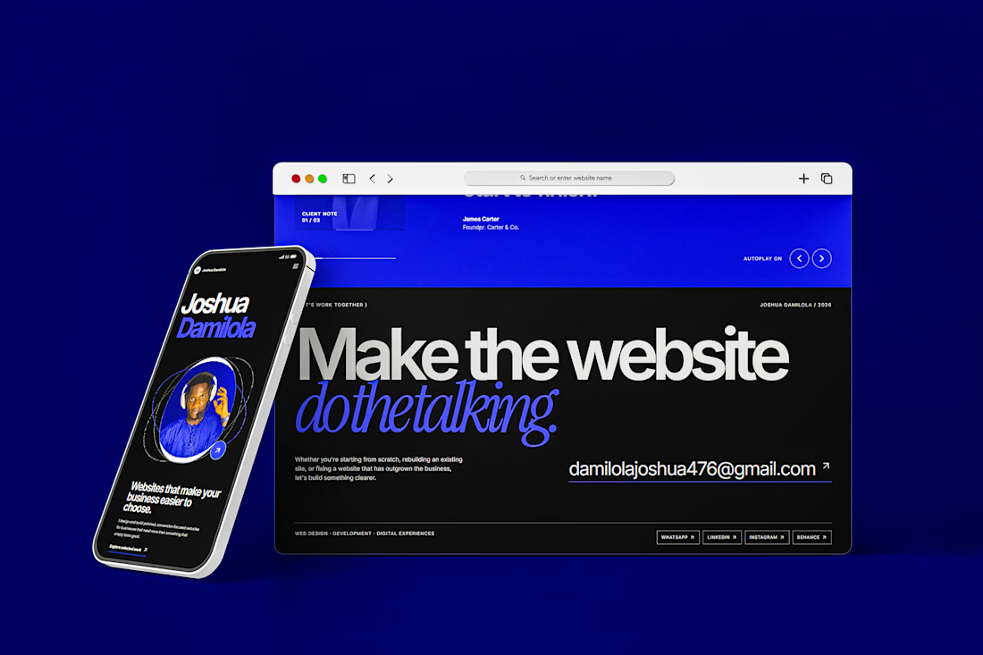
Mine was the same until this week. I spend my days building websites for other people, so my own always came last.
It's finished now, and the idea behind it is simple: the website should do the talking.
If you need a new website or a redesign, have a look at my work. If you'd like to talk it through, book a call with me.
Squarespace DevelopmentSquarespace Website DesignsquarespacedesignWeb DesignAdobe PhotoshopFigmaSquarespace



Loved it . Loooks so creative!

Designing a fragrance website with 2 sections that feels as premium as the product.
Built a fragrance experience where the product takes center stage.
I wanted the website to feel as refined as the fragrances themselves minimal layout, strong typography, immersive product visuals, and subtle interactions that make exploring each scent feel premium.
The goal wasn’t to fill the page with elements, but to give every product enough space to create its own presence.
Built with Next.js, with a focus on responsive design, smooth interactions, and a polished browsing experience.


The product imagery is doing most of the work here. Did you use art-directed mobile crops, or keep one image with a different object position? That can preserve label detail without loading the full desktop asset.