The network for creativity
Join 1.25M professional creatives like you
Connect with clients, get discovered, and run your business 100% commission-free
Creatives on Contra have earned over $150M and we are just getting started
Back to feedPost

Building the Services page for my next Framer template — Reverie.
I initially thought about making the services section a sticky scroll experience.
But the more I thought about the UX, the less sense it made.
When someone visits a Services page, they should be able to see the options, compare them, and quickly understand what fits them.
So I’m going with:
→ Editorial typography-led hero
→ CMS-powered service grid
→ Clear service previews
→ Click into a dedicated CMS detail page for the full experience
→ Subtle interactions instead of animation for animation’s sake
The goal is simple:
Make Reverie feel editorial without sacrificing usability.
Still building.

The network for creativity
Join 1.25M professional creatives like you
Connect with clients, get discovered, and run your business 100% commission-free
Creatives on Contra have earned over $150M and we are just getting started





Related posts

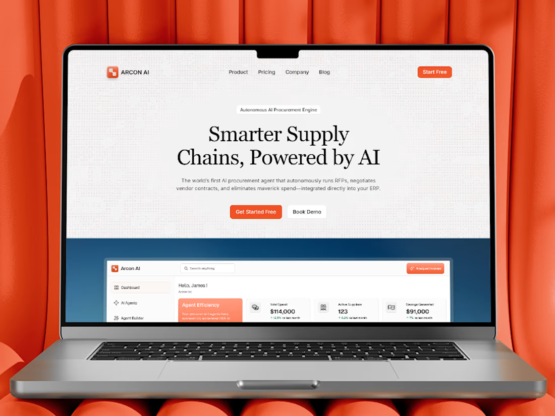
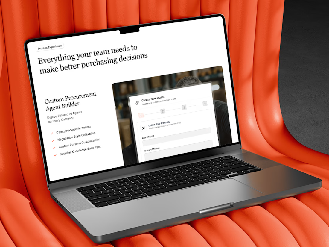
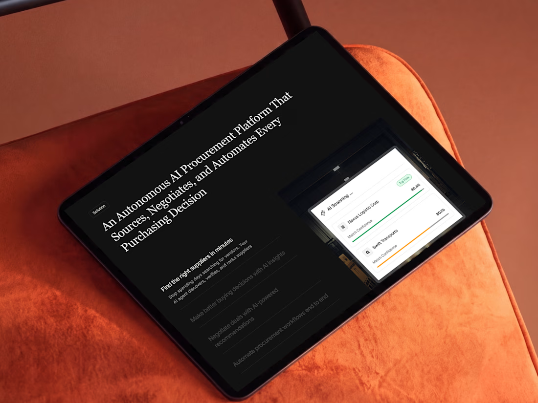
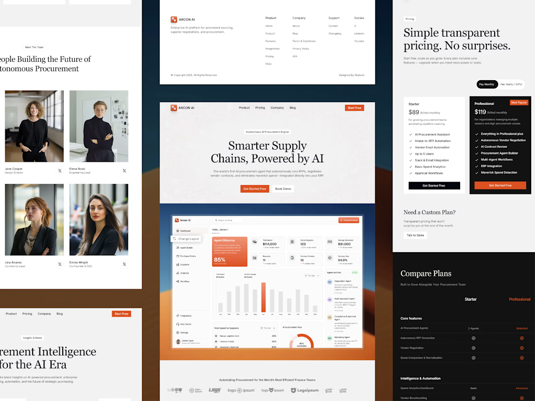
Free AI Framer template we designed for B2B SaaS.
Arcon AI is a premium Framer template built for AI startups, procurement platforms, enterprise SaaS, AI agents, workflow automation, supply chain technology, and B2B software. Designed with a modern enterprise aesthetic, it helps you launch a professional website that builds trust, showcases your product, and drives conversions.
Get it for free: https://www.framer.com/marketplace/templates/arconai/


Lovely work

Built my new Framer portfolio around custom code, motion, and interaction.
The project combines advanced Framer development, custom React components, scroll-driven interactions, and experimental WebGL effects.


Nice portfolio update!

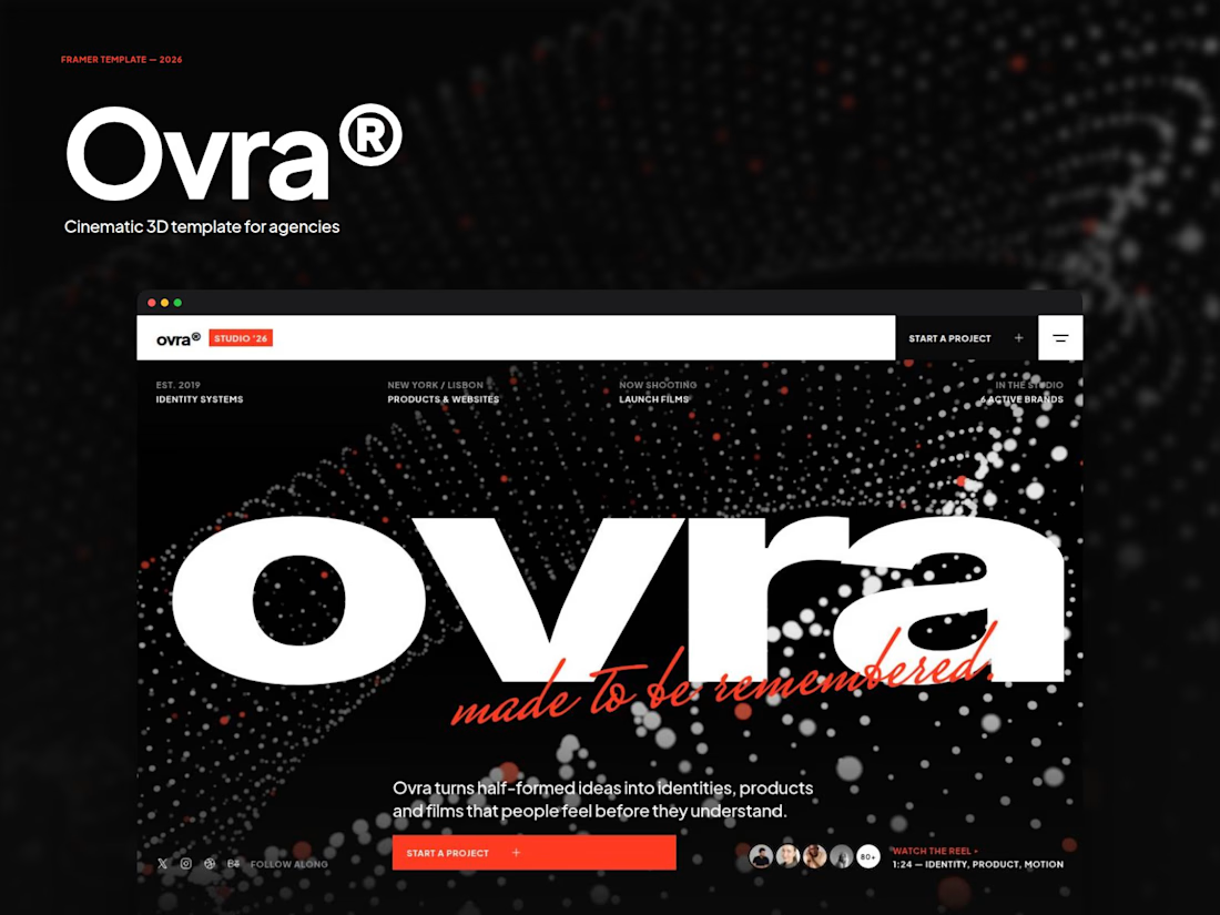
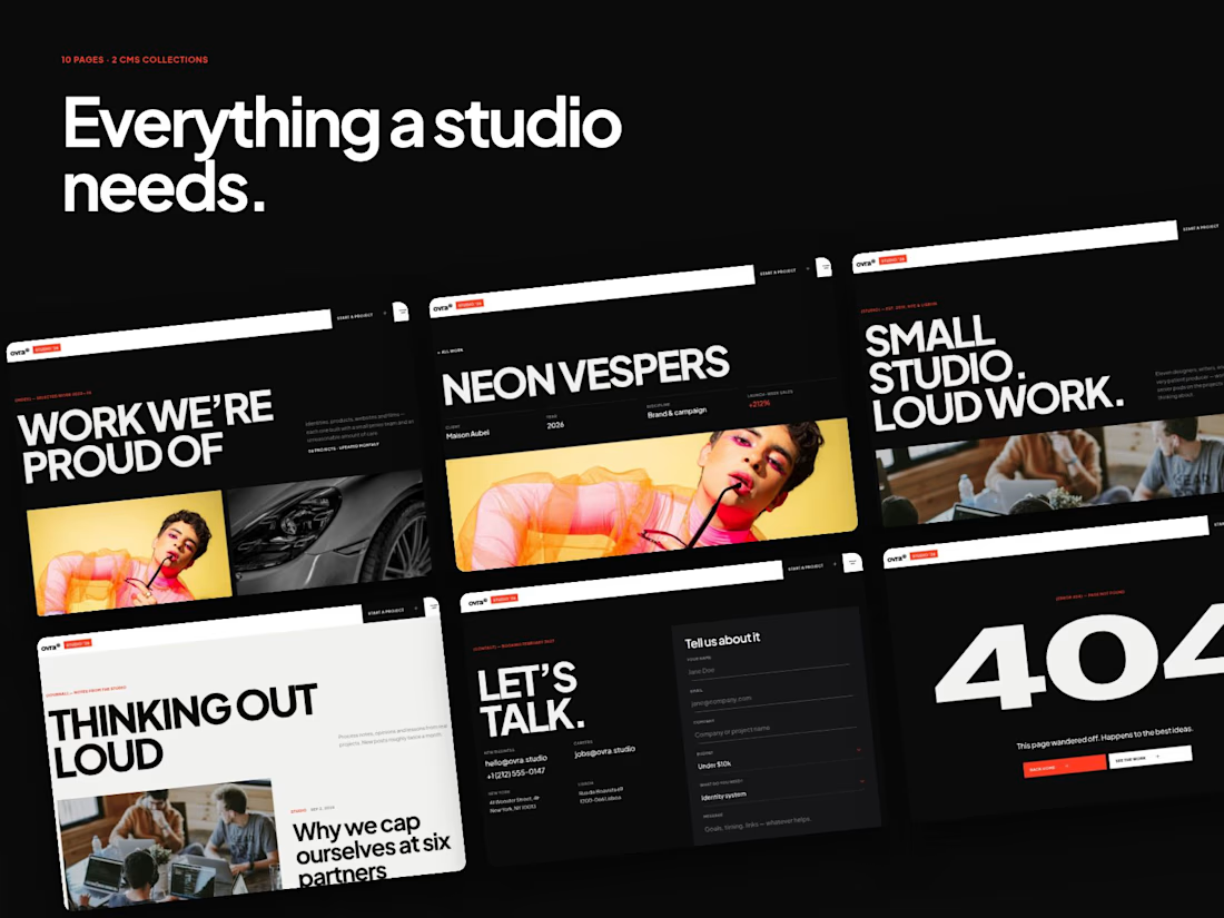
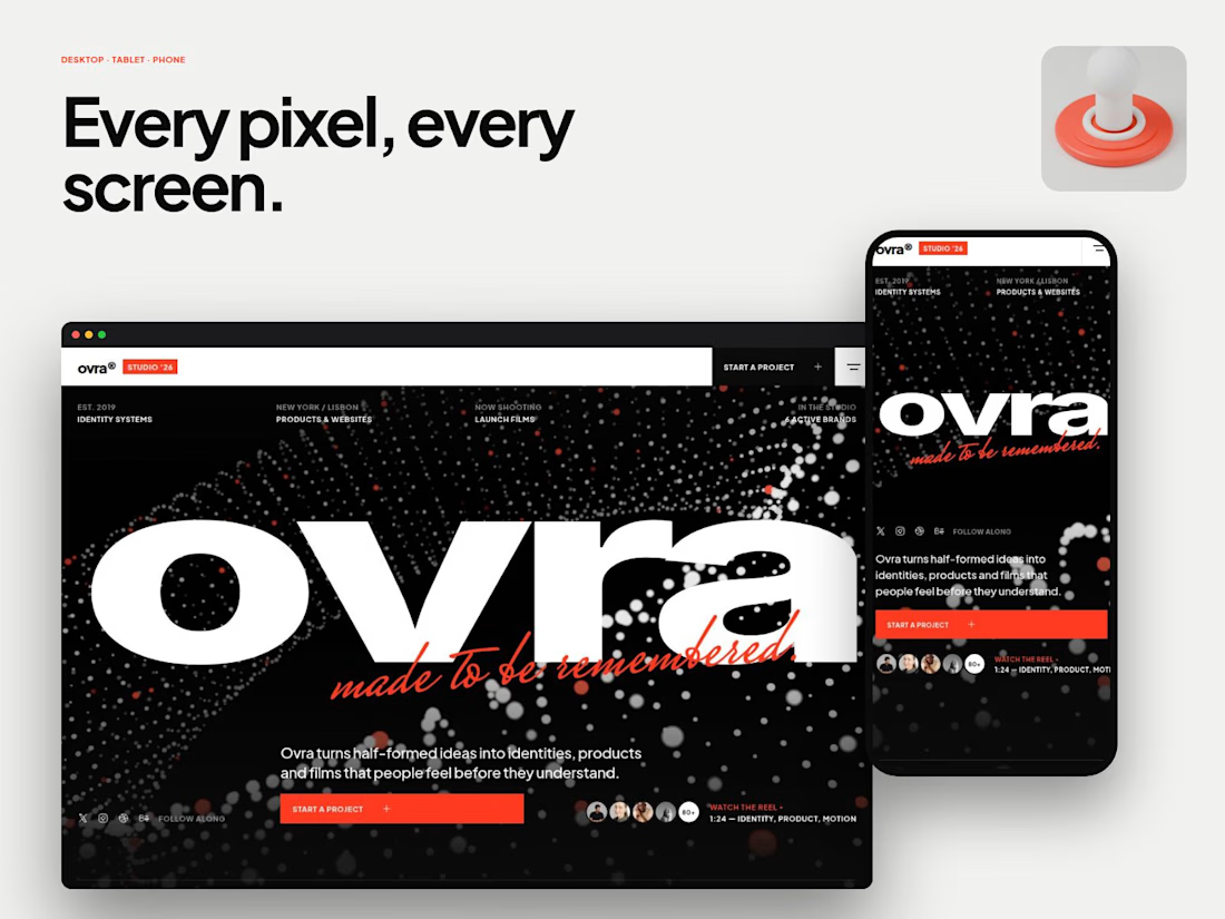
Try Ovra, the best agency website template on Framer - here.
Nice work on this


