The network for creativity
Join 1.25M professional creatives like you
Connect with clients, get discovered, and run your business 100% commission-free
Creatives on Contra have earned over $150M and we are just getting started
Back to feedPost

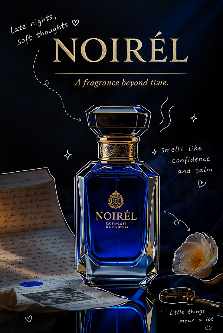
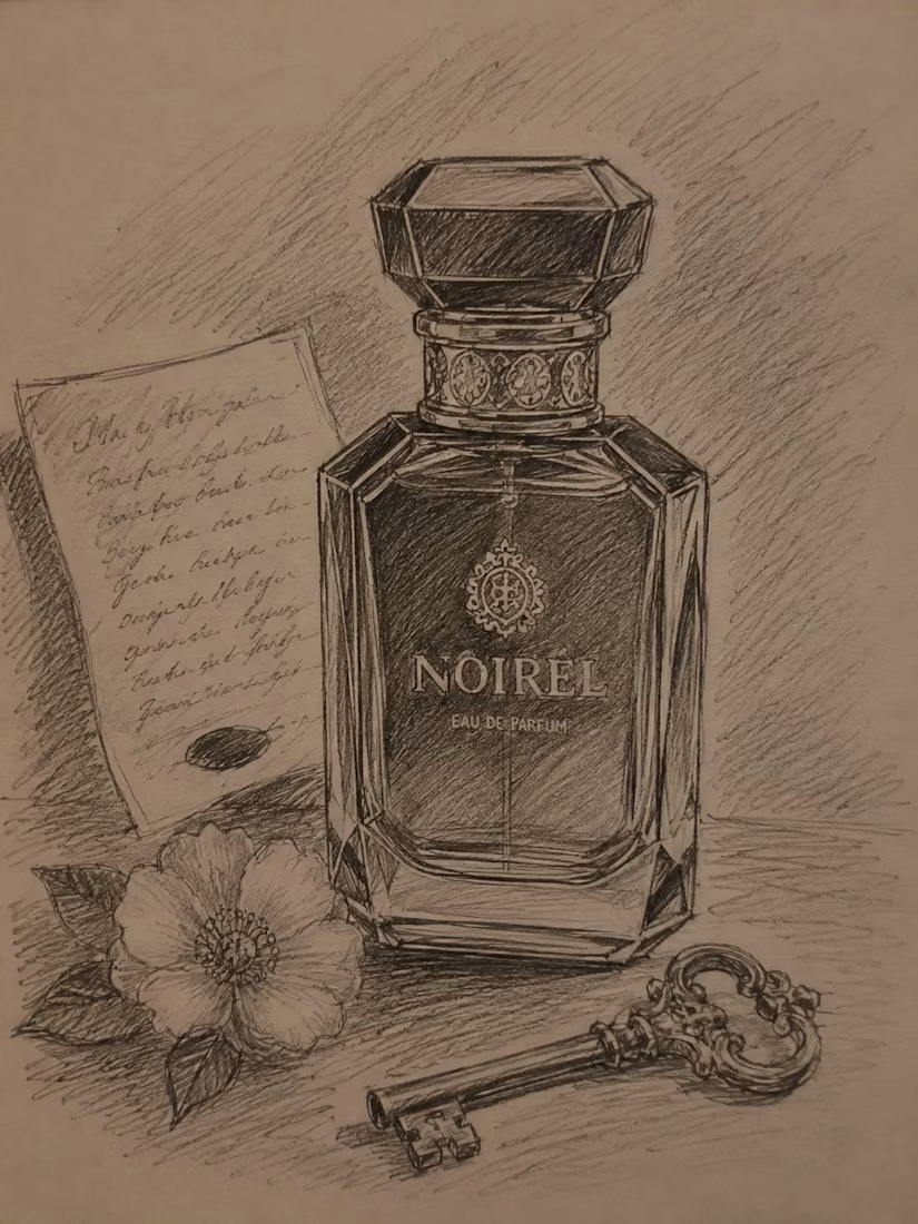
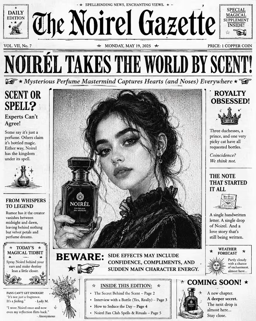
I'm still a rookie at this, so I know there's a lot I can improve. I'd really appreciate any feedback or suggestions on how I can make this project better. Every tip helps me learn. Thanks in advance! 🙌😊

The network for creativity
Join 1.25M professional creatives like you
Connect with clients, get discovered, and run your business 100% commission-free
Creatives on Contra have earned over $150M and we are just getting started











Related posts

Which mockup platforms are you sourcing your mockups from ?
These are my favorite ones ✨
Share yours below.

This is very useful, and of course very beautiful

An existing brand identity showcased across a new campaign. This was one of my favourite projects ever!

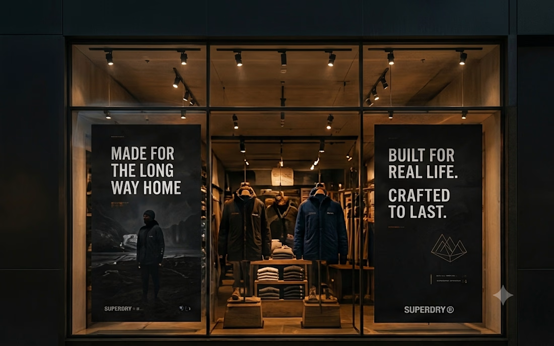
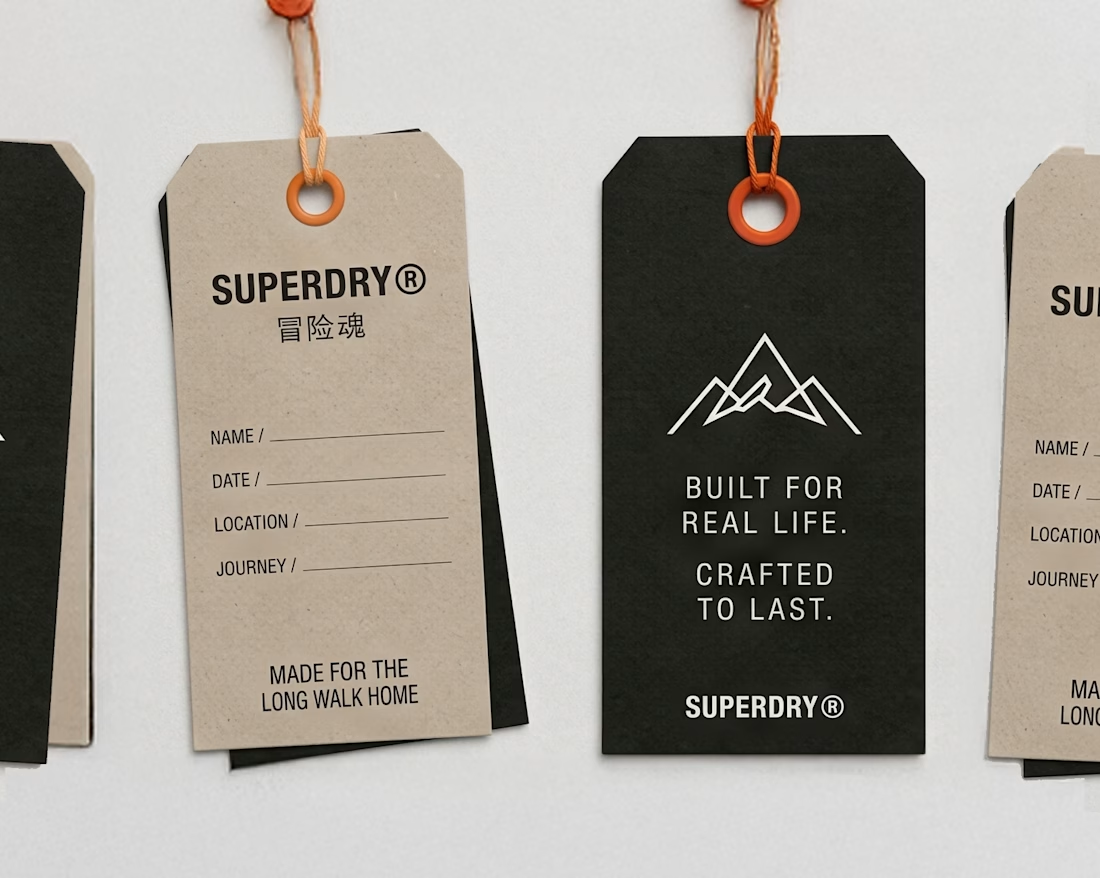
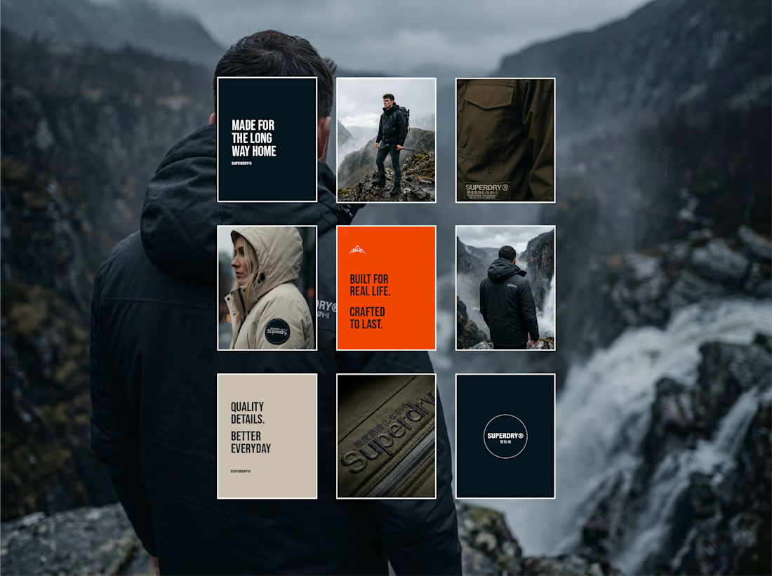
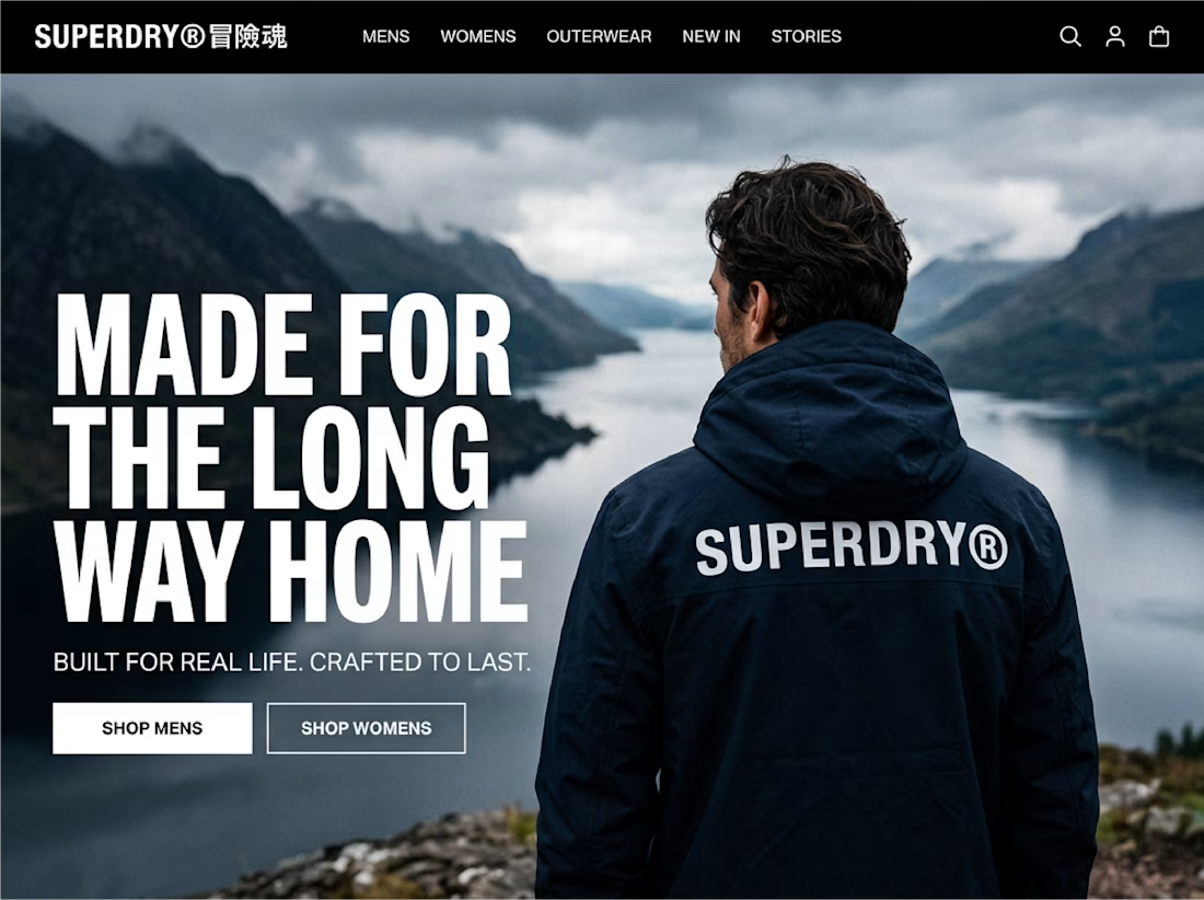

Taking an existing identity and stretching it across a whole new campaign is such a good test of a system. This looks like one of those projects where everything just clicked.

Brand Expressions -- Olivir




Thats so crazy!!!!!! Seeing this I feel we humans are still far better than AI