The network for creativity
Join 1.25M professional creatives like you
Connect with clients, get discovered, and run your business 100% commission-free
Creatives on Contra have earned over $150M and we are just getting started
Back to feedPost
Crafted a custom, multi-device website layout for Jōstre Cafe. ☕✨
Focused on delivering a warm, high-converting digital experience—ensuring seamless navigation and fast load speeds across desktop, tablet, and mobile.
Key Highlights:
• Fully responsive UI/UX across all device breakpoints
• High-contrast typography & minimalist coffee aesthetic
• Mobile-optimized navigation and clear call-to-action pathways
Looking to elevate your brand's web presence or optimize your store for seamless mobile conversion? Send a message or check out my services to get started!
#WebDesign #WebDevelopment #ResponsiveDesign #UIUX #Squarespace #Wix #WebsiteRedesign #SpeedOptimization #FreelanceDeveloper #ContraFreelancer
webdesignwebdevelopmentresponsivedesignSquarespace DevelopmentSquarespace Website DesignWix Studio DesignerSquarespaceWix StudioWordPress


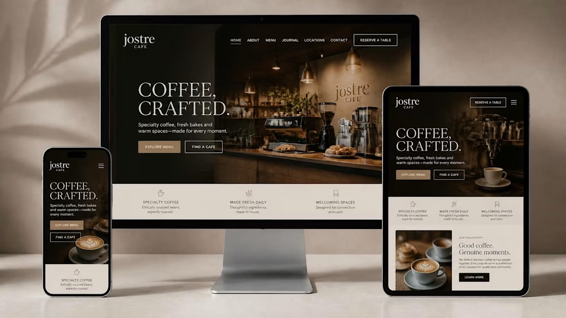


For Jōstre Cafe, we prioritized a dual-focused CTA hierarchy—placing "View Menu" as the primary above-the-fold CTA in the header, while keeping "Location & Hours" permanently accessible via a clean, sticky mobile navigation bar.
Why this structure works best:
Hierarchy based on...
The network for creativity
Join 1.25M professional creatives like you
Connect with clients, get discovered, and run your business 100% commission-free
Creatives on Contra have earned over $150M and we are just getting started





Related posts

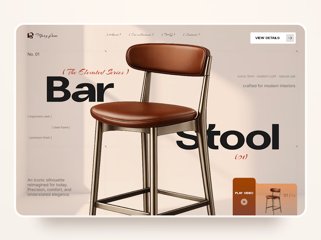
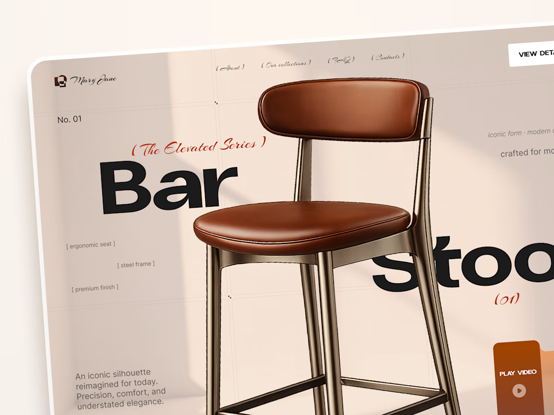
Mary Jane — Bar Stool Product Landing Page 🪑✨
A refined product landing page concept for a modern furniture brand, built around one statement piece
The design combines warm neutral tones, oversized typography, and editorial layouts to give the bar stool a premium, design-focused feel
Special attention was given to:
• Product-first composition
• Clean editorial typography
• Warm premium aesthetic
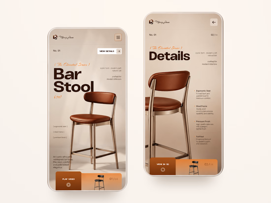
• Product details and features
• Video and 3D presentation
• Responsive mobile layout
The result is a simple, elegant experience that keeps the product at the center while giving the brand a distinctive visual character 🤎



Nice work

I think this could be my favorite Framer code component I’ve created. Meet Page Transition Studio, you can add animated transitions between pages across 10 styles. My favorites are vertical strips and centre split. What’s yours? Check the live preview here


Good work, like the interaction


Your homepage should answer one question: what do you do? If a visitor can't answer that in five seconds, everything below the fold doesn't matter.

I just saw Bright Studios’ new website. You guys nailed it! Really like it.