The network for creativity
Join 1.25M professional creatives like you
Connect with clients, get discovered, and run your business 100% commission-free
Creatives on Contra have earned over $150M and we are just getting started
Back to feedPost

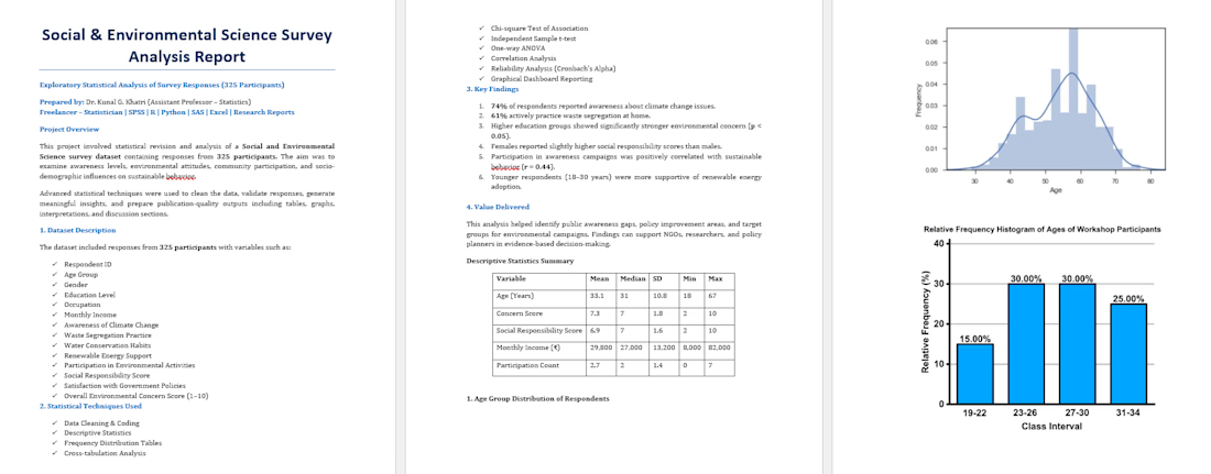
🧠 Title: Statistical Analysis of 325 Survey Responses for Research Study
📌 Problem: The client required a complete statistical analysis of survey data (325 respondents) to examine relationships between multiple factors such as organizational support, job involvement, and employee engagement.
They needed:
1. Correct statistical test selection
2. Accurate analysis
3. Clear interpretation for research reporting
⚙️ Approach: I followed a structured analytical process:
1. Data cleaning and preprocessing
2. Reliability testing (Cronbach’s Alpha)
3. Descriptive statistics
4. Correlation analysis
5. Regression analysis
6. Hypothesis testing using SPSS
🛠 Tools Used: SPSS, Excel, R, Python
📊 Results
1. Identified significant relationships between key variables
2. Established impact of organizational support on engagement
3. Generated clear statistical outputs with interpretation
🎯 Outcome: The client successfully completed their research project with strong statistical backing and well-structured results for their report/dissertation.
💡 Key Value Delivered
1. Accurate and reliable statistical analysis
2. Easy-to-understand interpretation
3. Research-ready outputs


The network for creativity
Join 1.25M professional creatives like you
Connect with clients, get discovered, and run your business 100% commission-free
Creatives on Contra have earned over $150M and we are just getting started





Related posts


Messy Data In. Clearer Decisions Out. 📊
Over the past year, I've noticed most businesses don't struggle because they lack data — they struggle because that data never turns into a decision.
That's the gap I work in:
→ Cleaning and analyze data with Python & R
→ Turning findings into investor-ready pitch decks
→ Polishing the final write-up so nothing gets lost in translation
If your team has data sitting in spreadsheets with no story attached, or a pitch deck that needs to actually land — that's exactly where I can help.
Open to projects. Let's talk 👇


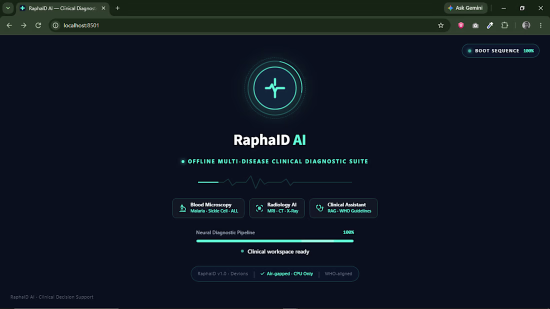
Building AI for healthcare leaves zero room for error.
I’m currently collaborating with an incredible team on Raphald AI, a medical detection application. Building the systems for a project with stakes this high is a massive reminder that the underlying backend architecture matters just as much as the machine learning model itself.
When integrating diagnostic AI, your API endpoints cannot drop requests, and your database workflows demand absolute integrity. You aren't just passing JSON payloads; you are handling critical, real-time workflows where stability is non-negotiable.
Engineering these systems continues to shape my approach to building robust Python backends. If you are developing a product that requires reliable AI integration or rock-solid FastAPI infrastructure, check out the newly updated services on my profile. Let's build something that works when it counts.

3 mistakes that will eventually make this board useless. 📉
I've reviewed several client dashboards over the years, and the same 3 problems show up over and over:
1️⃣ Too many charts, no clear takeaway — if I can't tell what to do after looking at it, it's decoration, not a dashboard.
2️⃣ Colors with no consistent meaning — red means "unacceptable" on one chart and "category 3" on the next. Pick a system and stick with it.
3️⃣ No comparison point — a number alone means nothing. "Revenue: $12,480" tells you nothing. "Revenue: $12,480 (+18% vs last month)" tells you everything.
Fix these three, and your data stops being numbers on a page — it starts being something people actually use to decide.
What's the most common dashboard mistake you've seen? 👇