The network for creativity
Join 1.25M professional creatives like you
Connect with clients, get discovered, and run your business 100% commission-free
Creatives on Contra have earned over $150M and we are just getting started


The network for creativity
Join 1.25M professional creatives like you
Connect with clients, get discovered, and run your business 100% commission-free
Creatives on Contra have earned over $150M and we are just getting started



Related posts


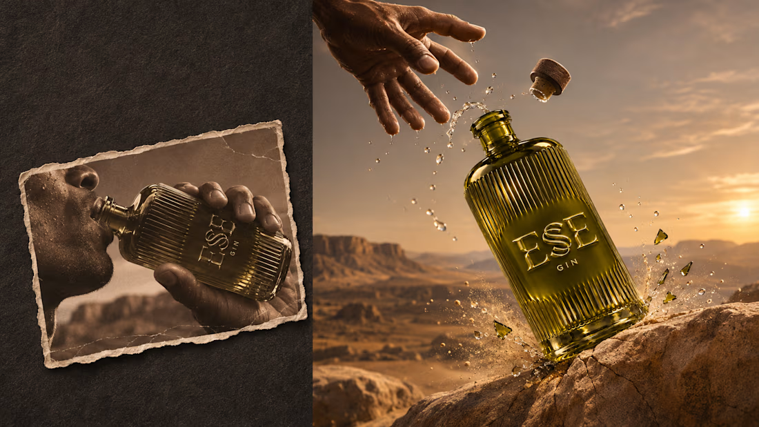
ESE GIN — Between the Dunes | Visual Identity & Packaging
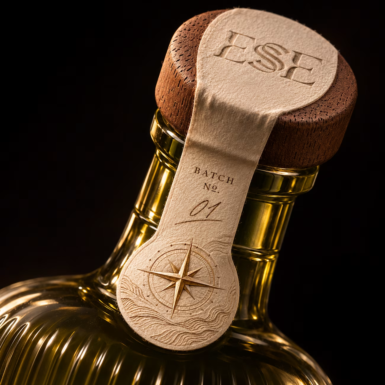
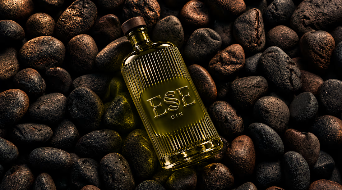
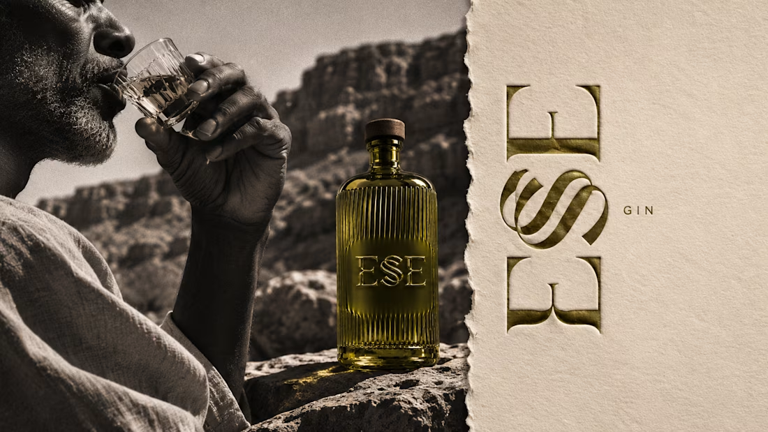
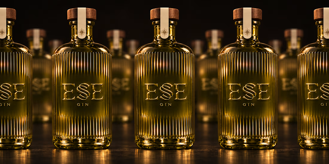
ESE GIN draws its curves from the dunes. The signature S catches the light in sculpted olive glass and leaves its imprint in wax.



This is gorgeous, Maya — the sculpted olive glass with that S catching the light is such a clever way to carry the dunes into the bottle itself. And the wax seal imprint is a beautiful finishing touch, it gives the whole thing a crafted, almost apothecary feel. Really cohesive...

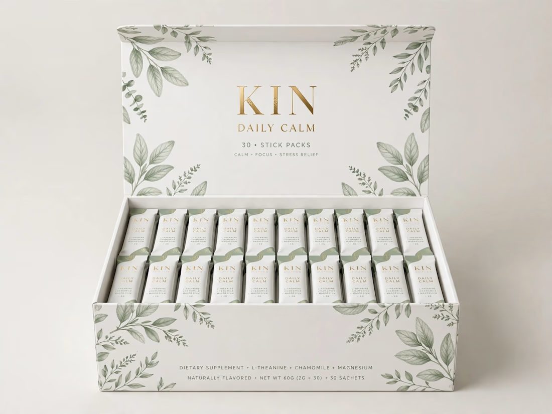
KIN Daily Calm - Premium 30-Stick Box + Sachet Packaging | DTC Wellness Brand
Premium luxury packaging concept for DTC wellness brand.
→ Luxury Lid-Box (30 x 2g sticks)
→ Botanical Pattern + Gold Foil
→ 2g Stick Sachet Design
→ Print-ready + 3D Mockups
Tools: Illustrator,
Photoshop
Price: $450
DM for similar luxury packaging for your brand!
#PackagingDesign #WellnessBrand #LuxuryBranding


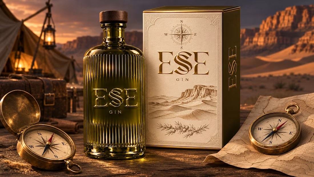
I designed the identity for ESE GIN around the curve of a dune ridge. In the custom wordmark, two sharply cut E forms frame a sweeping, double-stroked S. On the bottle, the letters rise from the olive glass itself. As the light shifts, it catches one edge of the S and then the other.
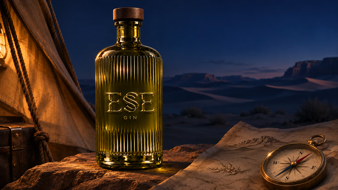
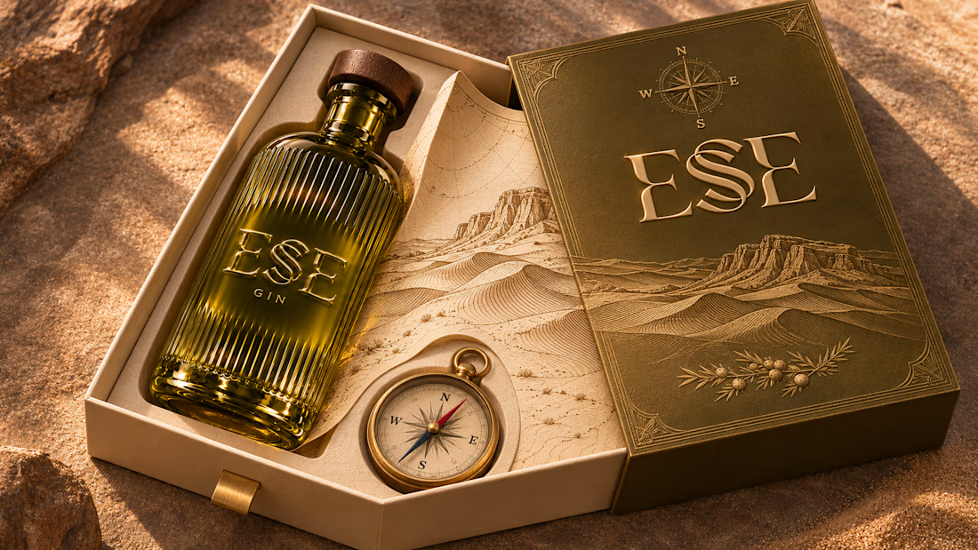
Across the packaging, the curve of the S returns in contour lines engraved on walnut cases and traced across warm ivory paper. A brass compass sits beside the bottle in the presentation box, and its compass rose reappears on the neck seal. The campaign follows the same bottle from sunlit sand to a lantern-lit camp at dusk, letting the desert light reveal a different detail in each scene.

That dune curve is lovely.