The network for creativity
Join 1.25M professional creatives like you
Connect with clients, get discovered, and run your business 100% commission-free
Creatives on Contra have earned over $150M and we are just getting started
Back to feedPost


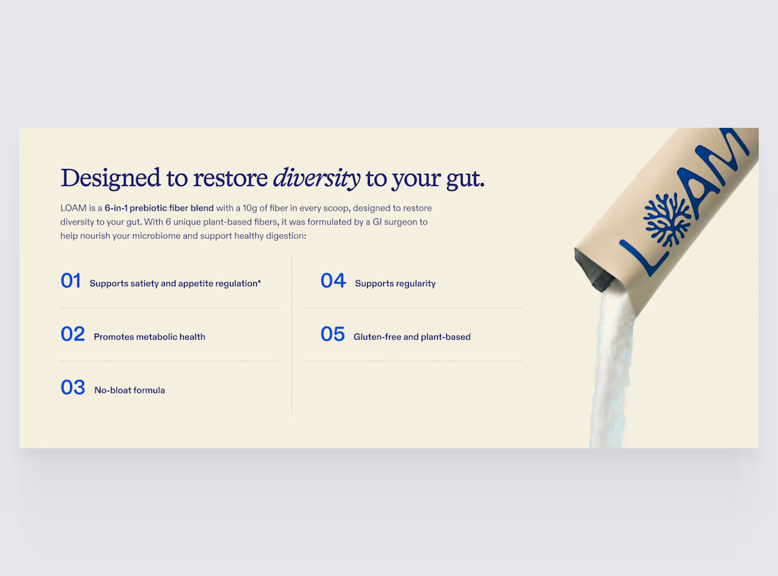
Benefits section we designed for LOAM Science. Full page here:




That no wallpaper visual and color hoerarchy looks really clean and cool!
Thanks, Abdullah!

The numbered benefit list next to that pour shot is a strong pairing, it reads fast but still feels premium instead of like a supplement facts label. Was the illustration style a client ask, or something you pushed for to stand out from the usual gut health pages?
Thanks, Diego!
The main goal of this section was to communicate the benefits as quickly and clearly as possible, so we didn’t want the visual to become too complex or distract from the message. We felt the illustration style was a good fit for keeping it simple while still giving the section some personality.
The network for creativity
Join 1.25M professional creatives like you
Connect with clients, get discovered, and run your business 100% commission-free
Creatives on Contra have earned over $150M and we are just getting started











Related posts


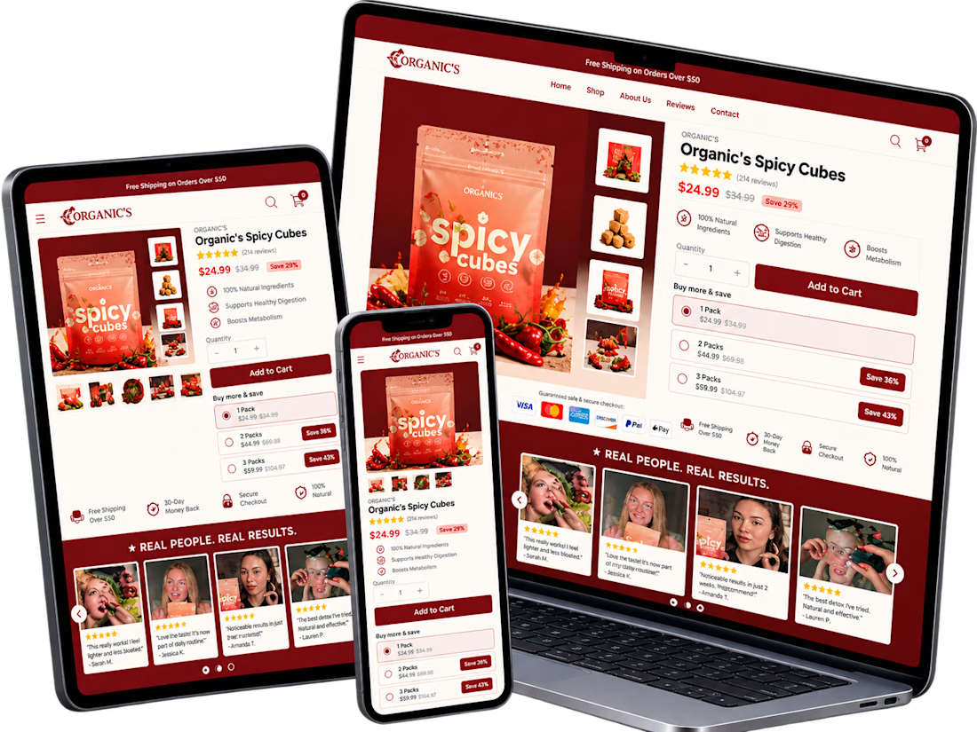
A conversion-focused Shopify product page featuring a clean, modern layout and an intuitive shopping experience.
The page brings together an engaging product gallery, bundle selection, clear Add to Cart actions, customer testimonials, product education, comparison tables, and FAQs.
The design emphasizes visual hierarchy, product discovery, purchase clarity, and trust-building elements to help shoppers make informed decisions.
Focus: Shopify UI/UX, product page design, and conversion rate optimization.

Clean layout. Keeping the bundle options, comparison table and FAQs on the same page really helps buyers decide without extra clicks. Great work on the product page structure.

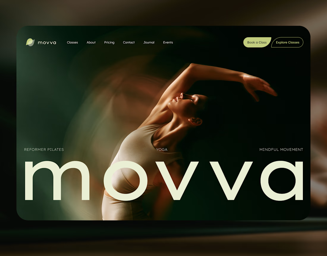
MOVVA is now featured on Contra 🤍
I’m especially happy about this because working on this template was a creative outlet for me.
I wanted to build something useful for a business: a website that covers what a studio needs when it opens, from an easy-to-use schedule to clearly structured class information, with a solid foundation for SEO.
At the same time, I wanted it to feel beautiful. To bring a sense of movement, lightness, and the joy of taking a class into the design. To capture that friendly atmosphere that makes you want to walk into a studio and give it a try.
Thank you, Contra team!


Huge congrats on getting featured! 🤍 MOVVA looks stunning - love the mindful movement vibe and that hero image. Super useful concept for studios. Well deserved feature!

A little peek at the brand work we did for Elio Mortgage.
A warm, approachable identity full of warm vibrant colors paired with soft sun rising inspired gradients, inner glows and custom illustrations & more. Loved this direction!
Full case study coming soon, from process to final identity.
Plenty of logo explorations to share too!


That color palette takes the whole identity to a different level!! I loove it.