The network for creativity
Join 1.25M professional creatives like you
Connect with clients, get discovered, and run your business 100% commission-free
Creatives on Contra have earned over $150M and we are just getting started
Back to feedPost


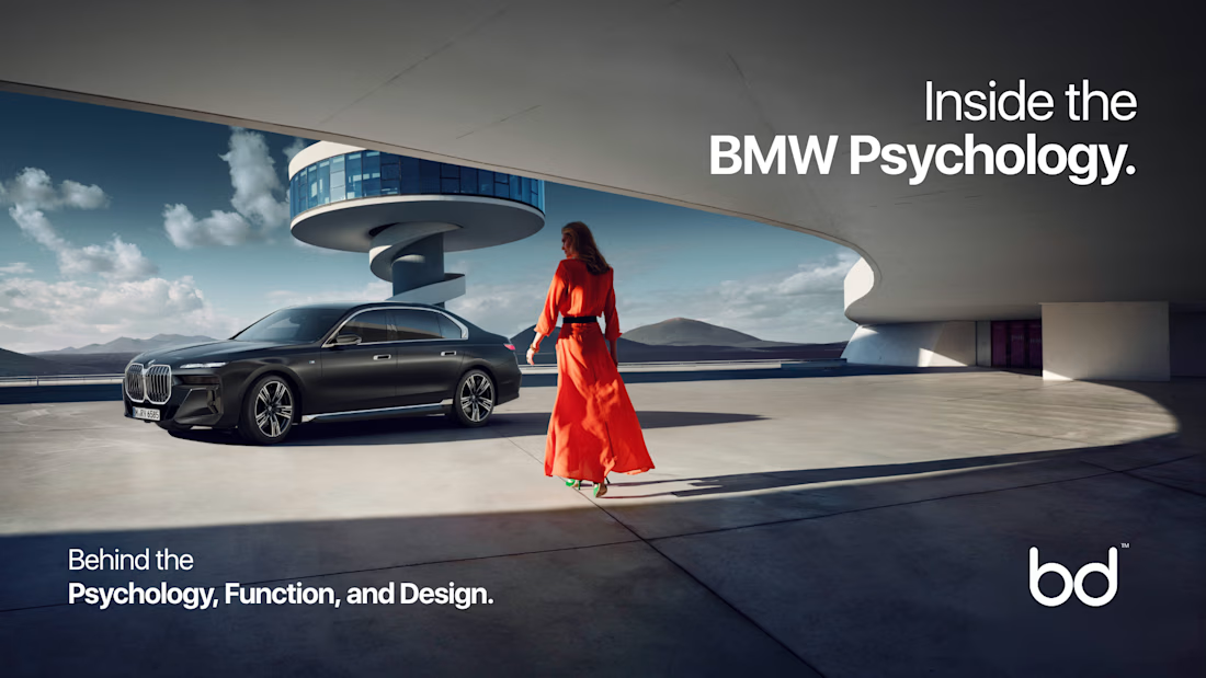
BMW doesn’t just sell cars. It sells status, desire, and control.
Even before driving, you feel it's premium.
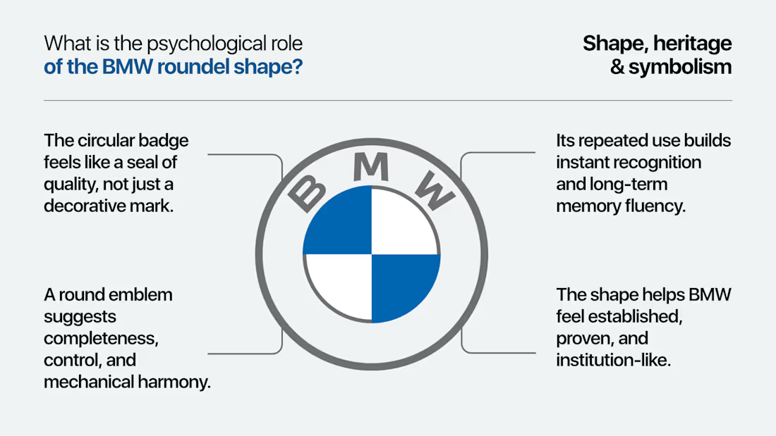
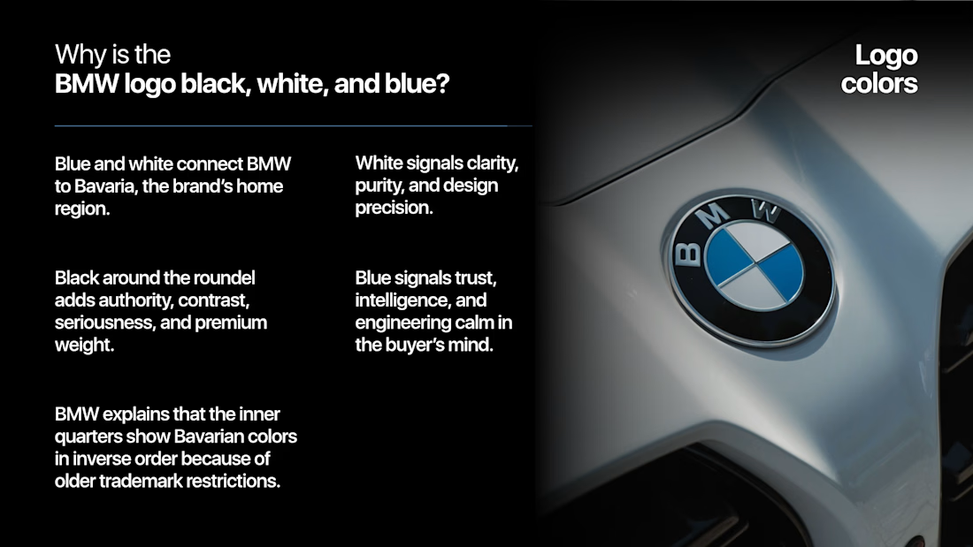
BMW builds automotive engineering into emotion and luxury, sold as an identity. It infuses multiple brand psychology secrets that make BMW so desirable.
It is deeper psychology and the usage of neuroscience engraved behind every word, color, design, curve, and choice.

The network for creativity
Join 1.25M professional creatives like you
Connect with clients, get discovered, and run your business 100% commission-free
Creatives on Contra have earned over $150M and we are just getting started
Challenges
View all


Related posts

New case study is live.
Kallay Studios is a visual media company specializing in architecture, real estate, and commercial projects. The original brief called for a well-structured grid system to convey professionalism and a design-oriented approach. Inspired by the grid overlays commonly seen in video cameras, this element became central to the design system and is consistently showcased across various applications to reinforce the brand concept.
A more in-depth description can be found in the project case study.
Long story short, I had a blast developing this visual system and seeing how the concept blended well with the overall identity.

Top class



Visual identity revision for a psychology and management consulting firm



handsome works! anyway did you use any ai to generate mockups on that? or you did manual

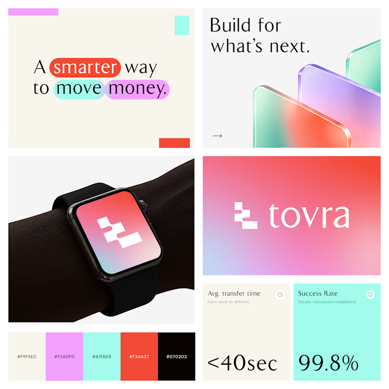
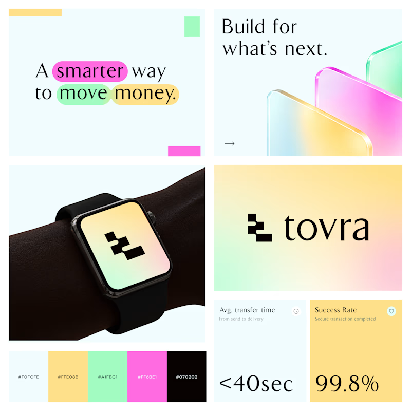
Two Color Directions. One Brand Identity.
Exploring two visual directions for Toyra, a modern fintech brand focused on making money movement smarter and simpler.
Both concepts feature bold typography, vibrant colors, playful gradients, and a clean visual identity.
Which color direction works better for Brand Option A or Option B? 👀
19 voted
40%
29 voted
60%
48 votes
Closed
