The network for creativity
Join 1.25M professional creatives like you
Connect with clients, get discovered, and run your business 100% commission-free
Creatives on Contra have earned over $150M and we are just getting started
Back to feedPost


The network for creativity
Join 1.25M professional creatives like you
Connect with clients, get discovered, and run your business 100% commission-free
Creatives on Contra have earned over $150M and we are just getting started



Related posts


Which homepage would make you more likely to explore the platform?
HackStack features bold typography, teal gradients, and a centered layout focused on AI tools and automation. DataVistaHQ uses purple accents, a split layout, and a prominent dashboard preview to introduce its business intelligence platform.
I would like your perspective on the visual design, clarity, and first impression. Which approach communicates its value more effectively and makes you want to take the next step?
Vote for your preferred design and share what influenced your choice: the colors, headline, layout, dashboard preview, or overall presentation.
#WebDesign #AIWebsites #UIUXDesign #SaaSDesign #TransformedDesign


2 voted
17%

10 voted
83%

12 votes
Closed

Visually, I lean toward DataVistaHQ, but the cognitive load is really high. The value proposition and the stats feel like they're competing for attention.
On the other hand, HackStack has a much better visual hierarchy. The value proposition and CTA group immediately give me a...

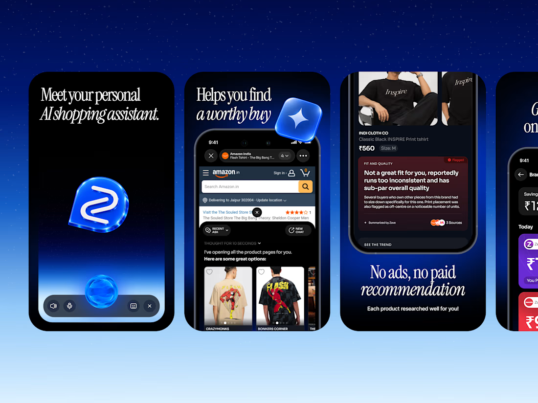
Zave — App Store Screenshots
Designed a series of App Store screenshots introducing Zave's AI-powered shopping assistant.


Looks nice

Your competitors are a reference point, not a creative brief!!
For Nazariya Living, we started by studying the visual language of the premium carpet and home décor category. From logo styles to typography and overall aesthetics, we mapped the conventions that had become familiar across the market.
But understanding the category was only the starting point.
We wanted to build something that didn't just fit into the market, but brought a distinct point of view to it.
An identity rooted in storytelling, archival references and a visual language of its own.
Understand the category. Challenge the convention. Build something worth remembering.
That's how we approach branding for all of our clients.
Are you looking to build a brand that stands apart rather than blend in? Let's talk.



Challenge the convention is easy to say. Ignoring the carpet aisle's beige bible takes nerve.