The network for creativity
Join 1.25M professional creatives like you
Connect with clients, get discovered, and run your business 100% commission-free
Creatives on Contra have earned over $150M and we are just getting started
Back to feedPost


A lot of landing pages have one problem: they try to say too much.
I've reviewed landing pages with:
Multiple offers.
Several calls-to-action.
Long paragraphs.
Too many sections.
And too many things competing for attention.
The result?
Visitors don't know where to focus.
When people land on a page, they are usually trying to answer a few simple questions:
What is this?
Who is it for?
How does it help me?
What should I do next?
If the page doesn't answer those questions clearly, people leave.
Not because the design is bad.
Not because the traffic is poor.
But because the message isn't clear.
One of the simplest ways to improve a landing page is to remove what isn't helping the visitor make a decision.
Sometimes higher conversions don't come from adding more.
They come from simplifying.
Clarity converts better than complexity.
When you visit a landing page, what makes you leave quickly?
Stephen Kolawole | Sales Funnel Designer | GoHighLevel Expert | Akure, Nigeria | Helping Coaches & Healthcare Businesses Build High-Converting Sales Funnels & Automation Systems
hashtag#SalesFunnels hashtag#LandingPages hashtag#ConversionRateOptimization hashtag#GoHighLevel hashtag#MarketingStrategy hashtag#LeadGeneration
The network for creativity
Join 1.25M professional creatives like you
Connect with clients, get discovered, and run your business 100% commission-free
Creatives on Contra have earned over $150M and we are just getting started
Trending
retrofuturism
Share your favorite designs from the past exploring the distant future. Or your own take on the aesthetic 🚀
halftone
Dots. Texture. Grain. Let's see your designs using the halftone technique.

Midjourney
Creatives are showing off what they're making with Midjourney.
colorgrade
Video editors sound off: How do you enhance the mood of your video in color grading?


Related posts

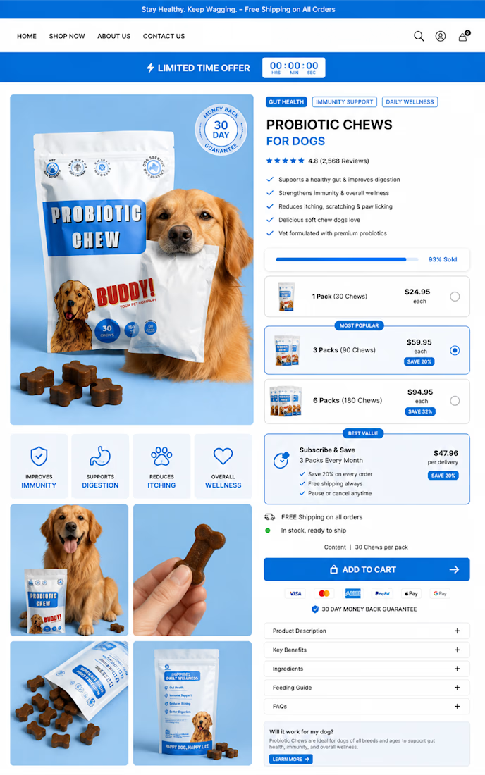
Your product page should do more than look good.
It should increase CR, AOV, and sales.
I design high-converting Shopify pages built to turn more traffic into customers.



𝗧𝗵𝗲 𝗠𝗼𝘀𝘁 𝗘𝘅𝗽𝗲𝗻𝘀𝗶𝘃𝗲 𝗪𝗲𝗯𝘀𝗶𝘁𝗲 𝗠𝗶𝘀𝘁𝗮𝗸𝗲 𝗜𝘀𝗻'𝘁 𝗕𝗮𝗱 𝗗𝗲𝘀𝗶𝗴𝗻.
It's solving the wrong problem.
Imagine spending thousands redesigning your website...
Only to discover six months later that your real problem was:
❌ Poor positioning
❌ Weak messaging
❌ No clear conversion path
❌ Slow lead response
❌ Poor traffic quality
The website wasn't necessarily the root problem.
It was just the most visible one.
That's why I believe a good developer needs to think beyond the browser.
Before changing the website, understand the business.
Before changing the design, understand the customer.
Before adding functionality, understand the purpose.
And before recommending a rebuild...
make sure something actually needs rebuilding.
Sometimes the best solution isn't a bigger project.
It's a smarter one.
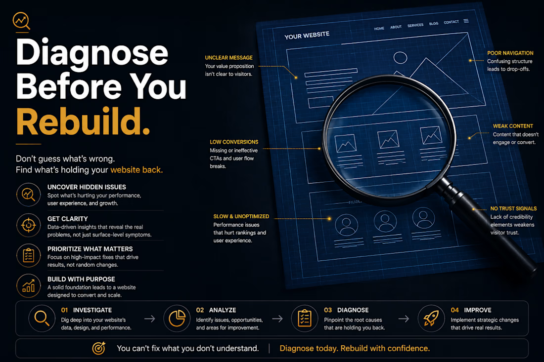

The slow lead-response point is the one I'd check first. A solid landing page can look broken when calls go unanswered, so I'd look at missed calls before blaming the design.

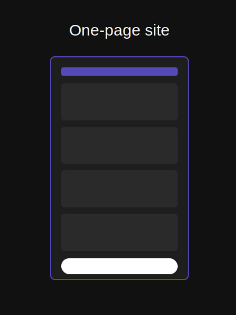
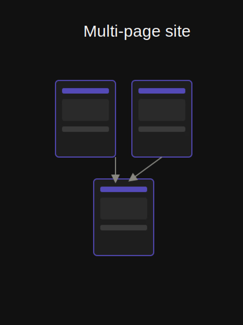
One-page or multi-page
which one actually converts better? 🤔
Everyone assumes more pages = more professional. But for most small businesses, a single well-structured page keeps people focused instead of clicking away.
Multi-page makes sense when there's real content to separate. Otherwise, it just adds friction.
Which one do you use?
9 voted
82%
2 voted
18%
11 votes
Closed

This is one of those debates that never really settles. Have you found the answer changes a lot by industry, or is one-page just generally the safer bet for small business sites?