The network for creativity
Join 1.25M professional creatives like you
Connect with clients, get discovered, and run your business 100% commission-free
Creatives on Contra have earned over $150M and we are just getting started
Back to feedPost

A modern logo design portfolio showcasing vibrant, geometric brand identities for Collabz , Printribe and Digit, utilizing dynamic gradients and clean typography to communicate innovation and connectivity.


The network for creativity
Join 1.25M professional creatives like you
Connect with clients, get discovered, and run your business 100% commission-free
Creatives on Contra have earned over $150M and we are just getting started
Related posts

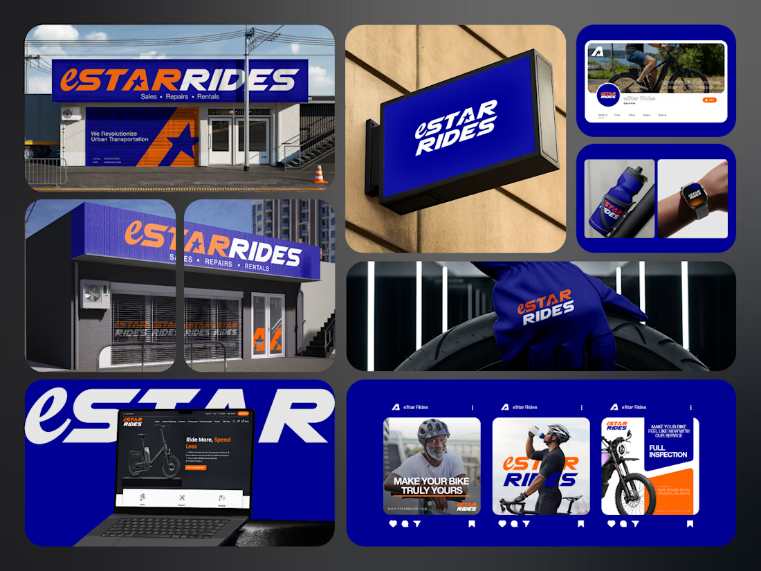
If you sell e-bikes, repairs and rentals, your brand should feel energetic before the customer even walks into the shop.
That was the challenge behind eStar Rides.
The brand needed to feel modern, confident and instantly recognizable across both physical locations and digital touchpoints.
So the identity was built around:
🟠 High-energy orange for visibility and impact
🔵 Deep electric blue for trust and technology
⭐ A bold star-led symbol for direction and recall
🔤 Custom typography with a strong, performance-driven feel
📱 A visual system designed to stay consistent everywhere
Then the identity was carried across:
Storefront signage
Retail environments
Website
Social media
Merchandise
Water bottles
Wearables
Campaign graphics
Digital applications
The goal was not just to make eStar Rides look modern.
It was to make the brand feel established, distinctive and ready to compete.
Because strong mobility branding should communicate:
Energy.
Freedom.
Confidence.
Reliability.
Before a customer even starts comparing options.
eStar Rides
Built for the ride.
What gives the brand the strongest presence?
A. The orange + blue palette
B. The custom wordmark
C. The storefront applications
D. The complete visual system
Drop A, B, C or D below.
If you are building a mobility, automotive, e-bike, transportation or tech-driven service brand and your visuals still feel generic, send me a message.
I help businesses build identities that feel more recognizable, credible and commercially ready.
#BrandIdentity #MobilityBranding #AutomotiveBranding #VisualIdentity #LogoDesign #RetailBranding #CreativeDirection #TransportationBranding



e bikes need branding with this kind of energy,, most of them look like appliance brands

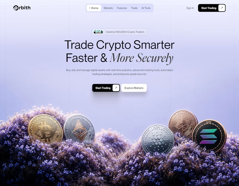
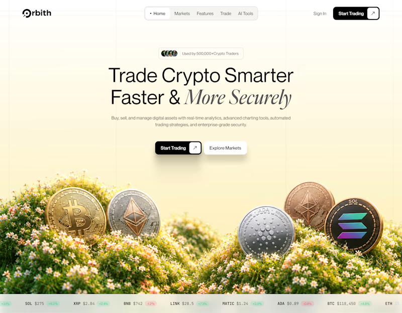
Your crypto landing page has 3 seconds to earn trust. Which direction gets it right?
One crypto homepage feels built for serious traders. The other makes crypto feel effortless.
Which one would make you click “Start Trading” without hesitation: #1 or #2?

10 voted
37%
17 voted
63%
27 votes
Closed

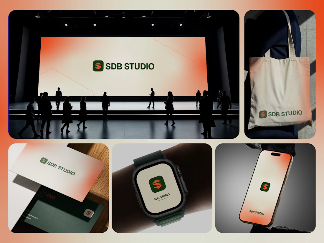
If your studio looks different every time it shows up, people are remembering the work, not the brand behind it.
That was the challenge behind SDB STUDIO.
The identity needed to feel clean and professional, but still have enough character to stay recognizable across very different environments.
So the system was built around:
🟢 Deep green for confidence and stability
🟠 Warm orange for energy and contrast
🔷 A compact symbol designed for quick recognition
🔤 Straightforward typography that keeps the identity clear
📱 A visual system that scales from small digital icons to large-format presentations
Then the identity was carried across:
Presentation environments
Business cards
Tote bags
Smartwatch applications
Mobile screens
Digital touchpoints
Brand collateral
The goal was not to create another polished studio logo.
It was to build a system that still feels like SDB STUDIO whether you see it on a phone, a business card, or across an entire stage.
Because consistency is what turns repeated exposure into recognition.
What gives this identity the strongest presence?
A. The symbol
B. The green + orange palette
C. The digital applications
D. The overall consistency
Drop A, B, C or D below.
If your studio, agency or service business has strong work but no equally strong visual system behind it, send me a message.
I help businesses build identities that are easier to recognize, trust and remember.
#BrandIdentity #StudioBranding #VisualIdentity #LogoDesign #CreativeDirection #BrandDesign #AgencyBranding #DigitalBranding