The network for creativity
Join 1.25M professional creatives like you
Connect with clients, get discovered, and run your business 100% commission-free
Creatives on Contra have earned over $150M and we are just getting started
Back to feedPost


The network for creativity
Join 1.25M professional creatives like you
Connect with clients, get discovered, and run your business 100% commission-free
Creatives on Contra have earned over $150M and we are just getting started





Related posts

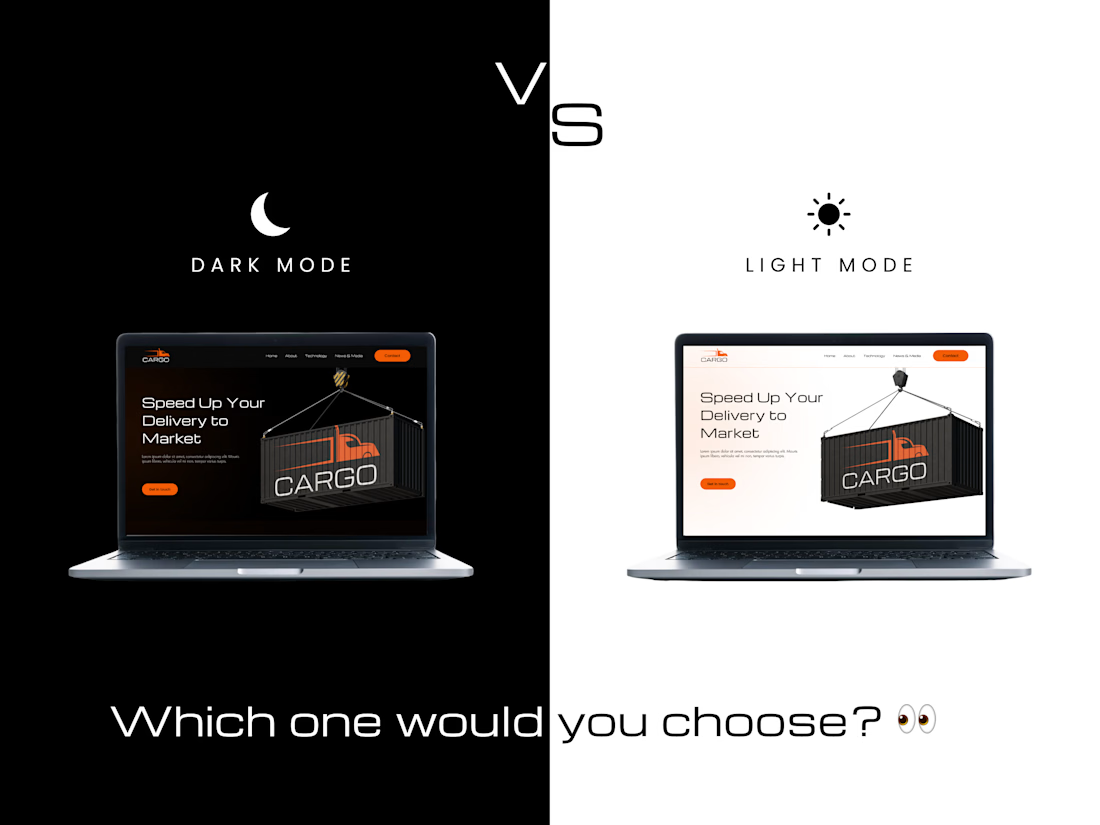
Which one would you choose? 👀
A — Dark & Bold 🌑
B — Clean & Minimal ☀️
Comment A or B below 👇
#Framer #WebDesign #UIUX #DesignChallenge #FramerDesign




Teams spend weeks choosing a font and zero time defining the system around it. Scale, weight, line height, spacing, pairing rules. The font is 10% of the work. The system is what makes it usable.

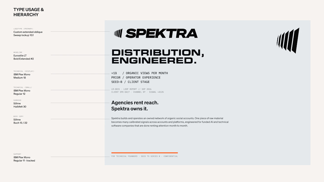

The system is what makes it usable!

New template just landed: Zara Okafor ✨
A clean, editorial portfolio for visual designers and art directors who want their work to be remembered.
What's inside:
Big Darker Grotesque headlines with Satoshi Soft warm neutrals and space for the work to breathe CMS case studies and a journal Work index About, contact with FAQ and a 404 that doesn't feel like an error
Link in the comments. Happy New Month 🍃
