The network for creativity
Join 1.25M professional creatives like you
Connect with clients, get discovered, and run your business 100% commission-free
Creatives on Contra have earned over $150M and we are just getting started
Back to feedPost

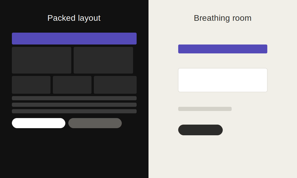
Unpopular opinion: white space isn't "wasted" space. 🤔
A lot of clients ask me to "fill in the gaps" but empty space is what makes the important stuff stand out in the first place.
A packed layout feels busy. A layout with room to breathe feels premium and easier to read.
Agree or disagree?
The network for creativity
Join 1.25M professional creatives like you
Connect with clients, get discovered, and run your business 100% commission-free
Creatives on Contra have earned over $150M and we are just getting started





Related posts

A bespoke tailor doesn't cut three different suits for three body types. They build one pattern that moves with whoever's wearing it — adjusts without ever looking altered.
I used to build Webflow sites backwards. Design desktop first, then panic-shrink everything for tablet and mobile. Same boxes, smaller numbers, hope for the best.
That's not responsive. That's three outfits stitched together and called one suit.
Now I build the relationship first — what stretches, what stacks, what just disappears below 768px — before I even look at a second breakpoint. The layout doesn't change shape. It just moves differently depending on who's wearing it.
Where's your site still wearing three different outfits at once?


One of the easiest ways to make a website feel more professional:
Give your content more room to breathe.
Not every empty space needs another button, graphic, animation or paragraph.
Good spacing helps create:
• Better visual hierarchy
• Easier readability
• Clearer CTAs
• A more premium feel
Sometimes improving a website isn't about adding more.
It's about knowing what to remove.
Designers: do you prefer spacious layouts or more content-heavy websites?
#WebDesign #Webflow #UIDesign #Figma #WebsiteDesign
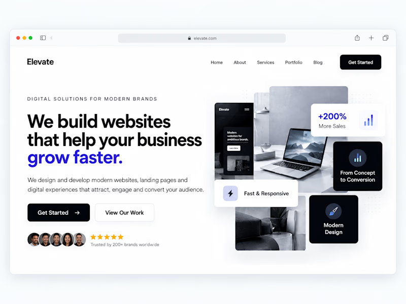
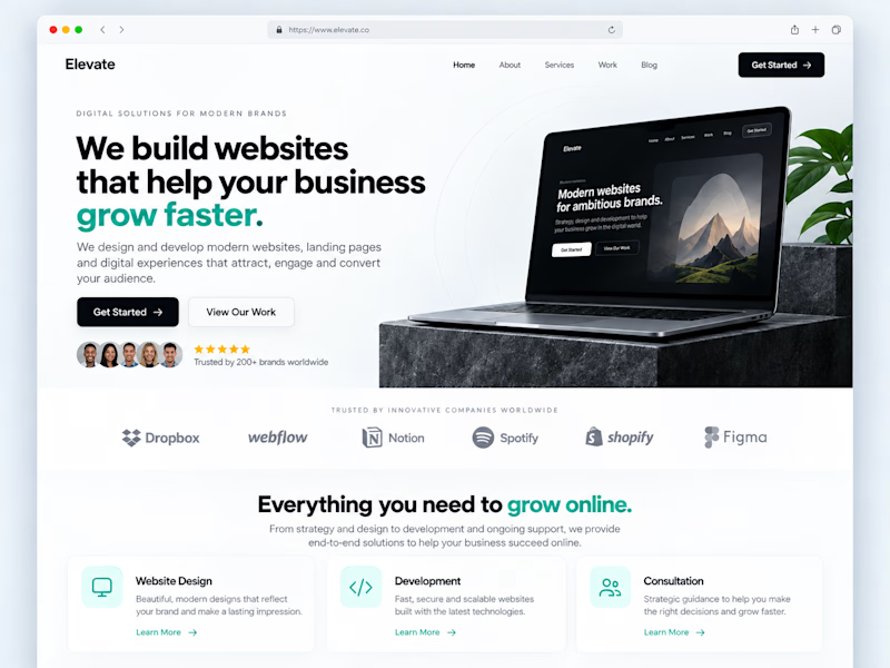
2 votes
Ends in 1d


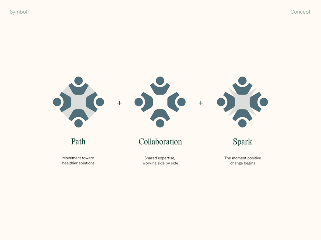
Mockups are great, but when presenting a visual identity to clients, we always include a slide explaining the thinking behind the logomark and connecting it back to the strategy.
It makes feedback and further revisions so much smoother too