The network for creativity
Join 1.25M professional creatives like you
Connect with clients, get discovered, and run your business 100% commission-free
Creatives on Contra have earned over $150M and we are just getting started
Back to feedPost

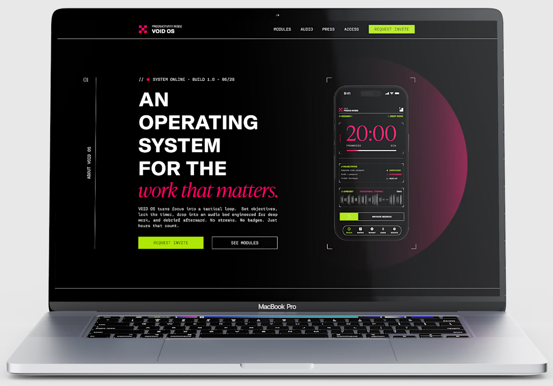
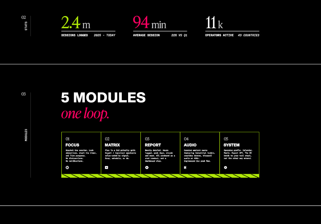
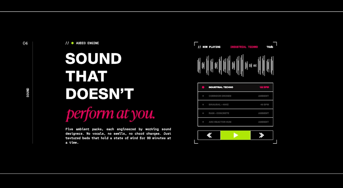
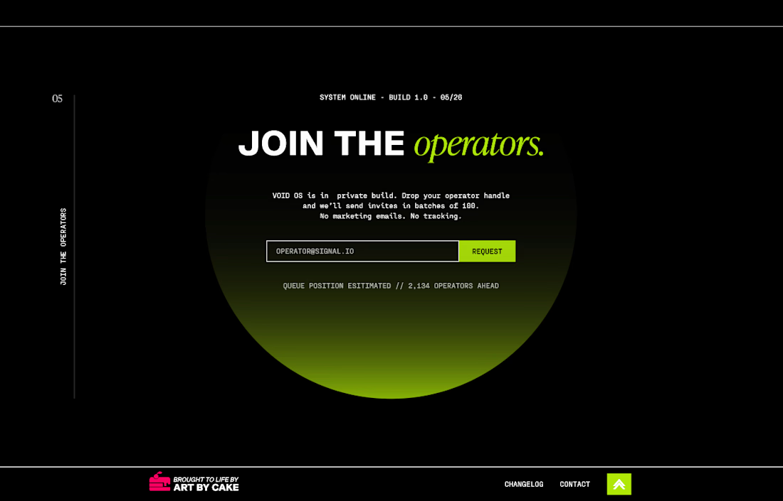
Continuing my work on the graphic realism styled productivity app. Created a web landing page for it. I kept the dark mode for it thanks to your feedback!
What do you think?
The network for creativity
Join 1.25M professional creatives like you
Connect with clients, get discovered, and run your business 100% commission-free
Creatives on Contra have earned over $150M and we are just getting started

Challenges
View all


Related posts

A brilliant SaaS tool needs a landing page that instantly builds trust and drives action.
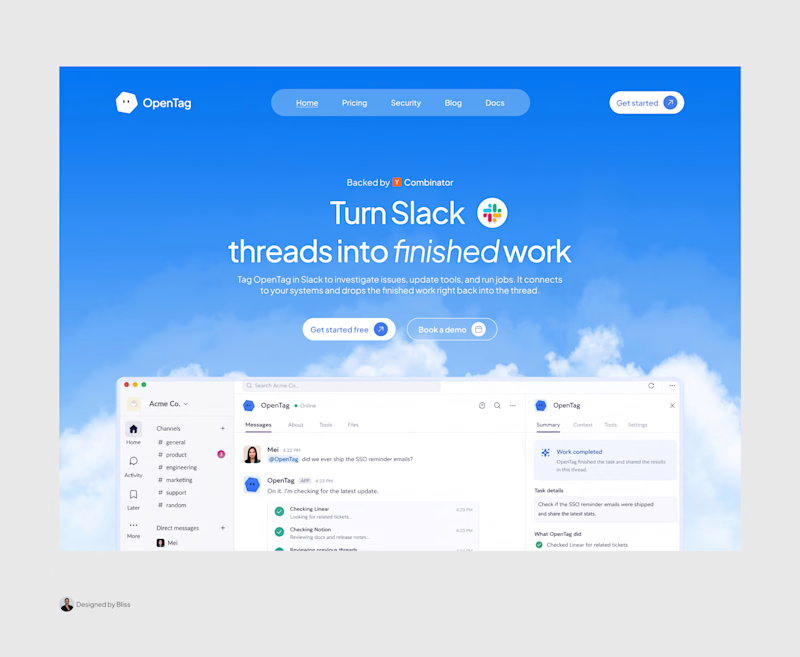
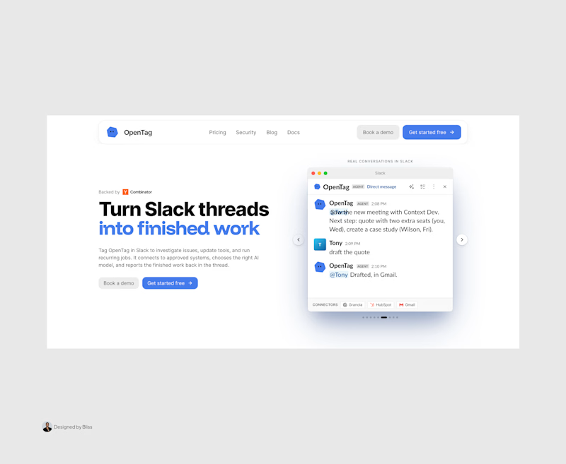
I recently put together this visual upgrade for OpenTag to explore how tightening the layout could elevate their first impression.
Option A (The Original): Strong product copy, but the split layout and floating elements create competing focal points that divide the user's attention.
Option B (The Redesign): Centered messaging, a much clearer visual hierarchy, and a dynamic, breathable layout. The goal was to remove distractions and let the product interface take center stage.
Which direction do you think communicates the value better and creates a stronger first impression?
Let me know your pick!

8 voted
100%
0 voted
0%
8 votes
Closed

Great work, Emmanuel!

Making productivity a little more colorful. 💜
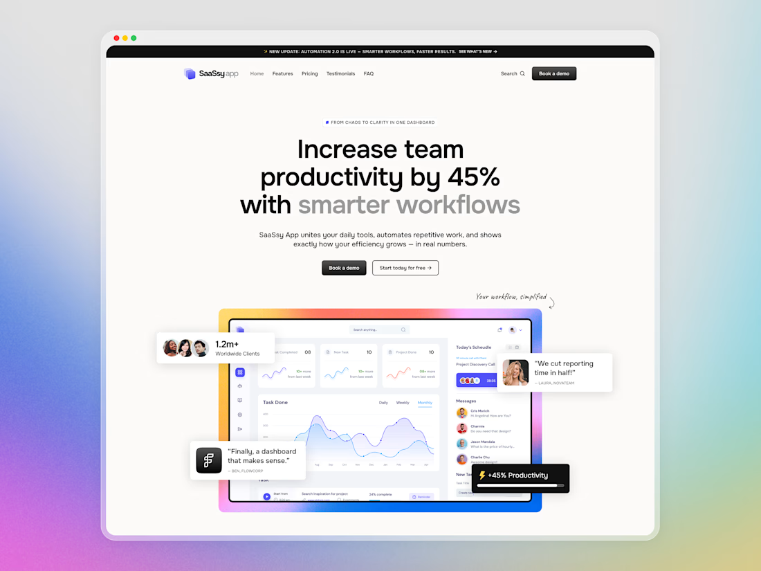
Hey Contra community! Today I want to share a closer look at SaaSsy App – a landing page concept for an all-in-one productivity platform.
The product has a lot going on, so the main challenge was presenting all those features without making the landing page feel overloaded. I kept the structure simple and used colorful gradients and bold typography to make the content easier to follow and a bit more memorable.


Creative work and UI Flow


Digiket: a free website template for SEO and marketing agencies.
The traffic chart sits on the photo, so a result shows first. Link in the reply.