The network for creativity
Join 1.25M professional creatives like you
Connect with clients, get discovered, and run your business 100% commission-free
Creatives on Contra have earned over $150M and we are just getting started
Back to feedPost

Hale Electrical's website could convert better, so I redesigned it in Framer.
Here's what I changed and why.
The original wasn't bad.
It just wasn't helping visitors make a decision.
A few things I changed:
• clearer headline
• real human image instead of a house
• stronger visual hierarchy
• more obvious CTA
• cleaner service cards
Design isn't just how a website looks.
It's how quickly people understand why they should choose you.
Before → After


The network for creativity
Join 1.25M professional creatives like you
Connect with clients, get discovered, and run your business 100% commission-free
Creatives on Contra have earned over $150M and we are just getting started


Related posts


The services menu from the Adara website, a residential architecture and planning practice in London.
One of our favourite details on this project. A tiny piece of a much bigger build, and it got the same attention as the hero.

The fact that you can view a visualization for each service right away is super cool. Another point to consider is what percentage of users will actually see this visualization, given that the navigation opens in a rather unpredictable way. I don’t mean this aggressively at all,...


The colorful spines on the wood shelf under the big TOKYO STYLE title feel like a real bookstore. When a book slides out, does the shelf close the gap or leave a space?

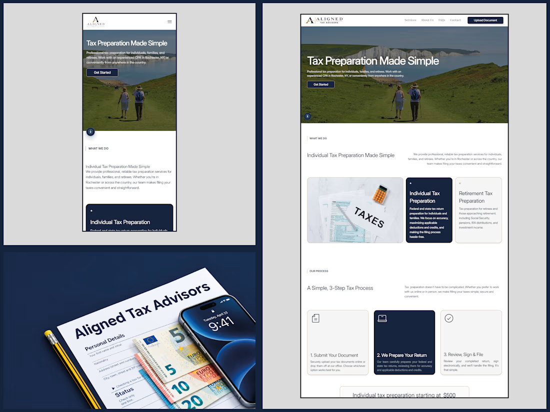
After designing Aligned Retirement Planners, I got the opportunity to bring that same clean, refined aesthetic to their sister brand, Aligned Tax Advisors.
Same brand DNA. A fresh digital experience. Built with Framer. 🚀
Always a pleasure when good work brings clients back!
What do you think of the result?