The network for creativity
Join 1.25M professional creatives like you
Connect with clients, get discovered, and run your business 100% commission-free
Creatives on Contra have earned over $150M and we are just getting started
Back to feedPost


A long-term perspective, expressed through design.
For Longview Capital Partners, AMca created a brand identity that balances financial authority with warmth and accessibility. Refined typography and a restrained visual language communicate expertise without relying on familiar wealth-management clichés.
The subtly extended “O” in the logotype suggests longevity, a quiet, distinctive expression of Longview’s commitment to lasting relationships and sustained value.
The network for creativity
Join 1.25M professional creatives like you
Connect with clients, get discovered, and run your business 100% commission-free
Creatives on Contra have earned over $150M and we are just getting started
Related posts

If a logo had to tell what a brand does, Apple would be a fruit stand.
New on our blog: why comparing "logo + guidelines" with a branding process is comparing two different products, how to tell whether you need a new logo or a new brand, and why sometimes the professional move is to turn the work down.
A logo is the signature. The story is everything else. Read it here: https://ander.agency/blog-posts/branding-is-not-a-logo

Luxury logo for Dubai real estate brand.
I designed this AA monogram inspired by Islamic arch architecture.
Clean, premium look for high-end properties.
What you see:
Business card, building signage, 3D logo, villa flag mockups.
Made this for my portfolio - open for custom work.
Designed by Mirza Shehriyar


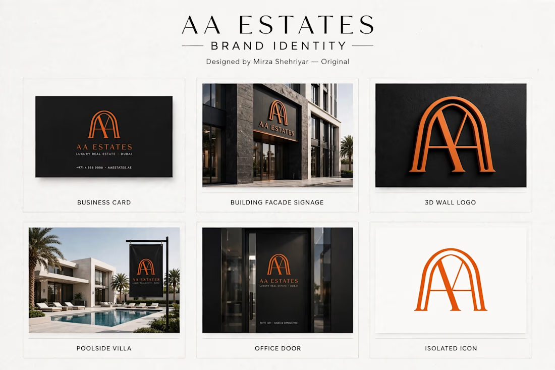


This is a very strong portfolio piece. The clean, minimal typography paired with that bold monogram creates a very sophisticated look. Great job on this.

Every brand has a story to tell.
From logo marks to full visual systems, we design identities that hold up on screens, merch, and apps alike.
Watch the showcase and tell us which one is your favorite.
#BrandIdentity #LogoDesign #GraphicDesign #VisualIdentity

Great work