The network for creativity
Join 1.25M professional creatives like you
Connect with clients, get discovered, and run your business 100% commission-free
Creatives on Contra have earned over $150M and we are just getting started
Back to feedPost

FigmaFlow — Figma Designs That Ship, Not Just Sit Pretty | Top 1% Figma Expert | Contra
Figma designs that ship, not just sit pretty.
I'm a Top 1% Figma expert on Contra. I don't just make pretty screens — I help founders ship production-ready Figma that devs actually love to build.
Most Figma files are messy. No auto-layout, broken components, no variants. Devs hate it. I fix that.
This is how I did FigmaFlow:
1. The Problem I Solved:
Founders come to me with Figma files that look good but can't be shipped. Fixed frames break on mobile. 20 different button components. No documentation. Engineering wastes weeks fixing design. My job is to make Figma that ships in days, not months.
2. How I Built It — Built to Ship Method:
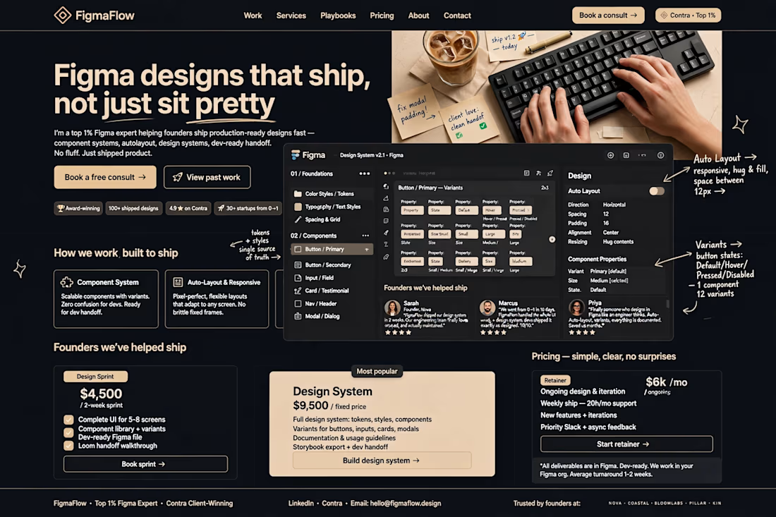
Component System: I built a scalable system with variants. One button = 12 variants (Default, Hover, Pressed, Disabled x Sizes). Zero confusion for devs. Example in the design shows Button / Primary with Property: State, Size, Style.
Auto-Layout & Responsive: Every frame uses Auto-Layout. Direction: Horizontal, Spacing: 12, Padding: 16, Resizing: Hug contents. Pixel-perfect, flexible layouts that adapt to any screen. No brittle fixed frames. I show this live in the Figma panel screenshot with hand-drawn notes.
Tokens + Styles — Single Source of Truth: Color Styles / Tokens, Typography / Text Styles, Spacing & Grid. I annotated it in the design: "tokens + styles single source of truth →" so founders understand why it's valuable.
Human Touch: I added real hands on keyboard, iced coffee, sticky notes that say "fix modal padding →", "client love: clean handoff , "ship v1.2 today ". This makes it feel human, not AI. Real work environment.
3. Social Proof That Sells:
I added "Founders we've helped ship" — Sarah (Founder, Nova): "FigmaFlow shipped our design system in 2 weeks. Our engineering team finally loves our Figma." + Marcus + Priya with 5-star reviews. Plus badges: Award-winning, 100+ shipped designs, 4.9 on Contra, 30+ startups from 0→1.
4. Pricing — Simple, Clear, No Surprises:
I designed 3 offers founders already buy:
Design Sprint: $4,500 / 2-week sprint — Complete UI for 5-8 screens, Component library + variants, Dev-ready Figma file, Loom handoff walkthrough
Design System (Most Popular): $9,500 / fixed price — Full tokens, styles, components, variants, documentation, Storybook export
Retainer: $6k/mo — Ongoing design & iteration, Weekly ship — 20h/mo support
All deliverables are in Figma. Dev-ready. I work in your Figma org. Average turnaround 1-2 weeks.
Tools: Figma (Auto-Layout, Variants, Component Properties, Figma Tokens), FigJam for planning.
Result: A landing page that doesn't just show I can design — it shows I can THINK like an engineer and SHIP like a founder. That's why founders pay $4.5k - $9.5k for this, not $200.
If you have a messy Figma file or need a design system that your devs won't hate — DM me "SHIP" and let's book a free consult.
Tags: Figma Expert, Design System, Auto-Layout, Components & Variants, Figma to Dev Handoff, SaaS Design, Startup Design, Contra Top 1%

The network for creativity
Join 1.25M professional creatives like you
Connect with clients, get discovered, and run your business 100% commission-free
Creatives on Contra have earned over $150M and we are just getting started





Related posts

Credit card landing page design for a fintech startup — an interactive 3D claw machine that turns the offer into the hero instead of another floating card at 15 degrees.
Every card brand ships the same hero: a card hovering over a gradient. Clawd sells one card, not a marketplace, and the entire pitch is "stop comparing — we already did the comparing". So the landing page had to make a single-product offer read as a win rather than a shortage of options, and pull early-access sign-ups from people who are deliberate about money: the ones who actually track spending and read the APR line.
The metaphor does the positioning work. A claw machine that never misses, plus "we already picked the best one", means the visual is the argument and the headline doesn't have to explain itself.
I built the scene in Blender as an interactive element rather than a still render — the claw follows the cursor, the card tilts in the grip, and the pile underneath reacts, so a visitor plays with the product's core idea for a few seconds instead of scrolling past it.
Hero plus full page structure, desktop and mobile designed separately, the Blender scene with web-ready exports, interaction notes, and a developer-ready Figma file.


nice work

Winder is a bold brand identity built around a geometric W-inspired symbol, combining sharp angles and forward movement to represent progress, speed, and direction.
The identity uses a striking red and deep burgundy palette, supported by clean typography and a consistent visual system across brand guidelines, digital applications, and product mockups.
Progress in Motion.




Great logo it feels it really has an identity 🎉🎉

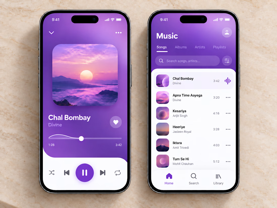
🎧💜 The clean and vibrant UI of this music app creates a calm, immersive listening experience, while smooth controls and simple navigation make finding and playing your favorite songs effortless.
🎶 Thoughtful organization, clear song lists, and a minimal player layout let you stay focused on the music without unnecessary clutter or extra clicks.


sick execution