The network for creativity
Join 1.25M professional creatives like you
Connect with clients, get discovered, and run your business 100% commission-free
Creatives on Contra have earned over $150M and we are just getting started
Back to feedPost

OVI – Premium Perfume Brand Experience
OVI is a concept website created to capture the elegance and identity of a luxury perfume brand. The goal was to build an immersive digital experience where visuals, typography, and motion work together to create a premium first impression.
Instead of relying on heavy content, the website emphasizes product presentation through clean layouts, cinematic animations, and thoughtful interactions that encourage users to explore the brand naturally.
What I Built
Crafted a premium landing page with a luxury aesthetic
Designed engaging scroll-based animations and micro-interactions
Built a fully responsive experience across all screen sizes
Focused on smooth navigation and intuitive user experience
Optimized the website for speed and modern web standards
Technologies Used
Next.js
TypeScript
Tailwind CSS
GSAP
Project Highlights
Elegant visual design inspired by luxury brands Smooth interactive animations Mobile-first responsive development Optimized performance and accessibility Component-based architecture for scalability
This project demonstrates my approach to building high-end brand websites where design, motion, and performance come together to create an engaging user experience.


The network for creativity
Join 1.25M professional creatives like you
Connect with clients, get discovered, and run your business 100% commission-free
Creatives on Contra have earned over $150M and we are just getting started







Related posts

Day 12/30 of my hero section challenge.
Another day of prioritising the visuals and imagining a company that doesn't exist. I promise the next one is a tech brief with barely any imagery at all, I've leaned hard on beautiful photography for twelve days straight.
Concept: a mycelium materials company producing leather, packaging and foam grown from fungal networks. The design deliberately inverts the category's defaults; biotech branding tends toward dark, clinical and electric blue, so this one goes warm and botanical, with a subtle looping video of spores drifting and mushrooms emerging. The copy pulls hard the other way: plain, technical, B2B-direct, anchored by two concrete numbers instead of sustainability adjectives.
Twelve briefs across travel, food retail, personal branding, events, landscape architecture, pet services, hospitality, coffee, lighting, wellness, restaurants and now biomaterials.
12 down, 18 to go.
Built on the Viper template by Westhill Studio, adapted and customised by me.
Imagery and video generated with AI.


brilliant

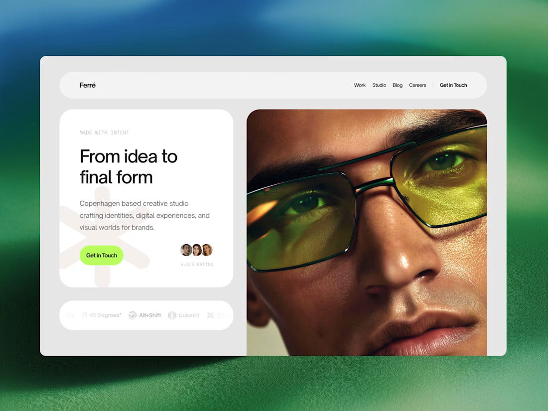
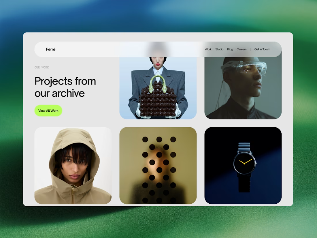
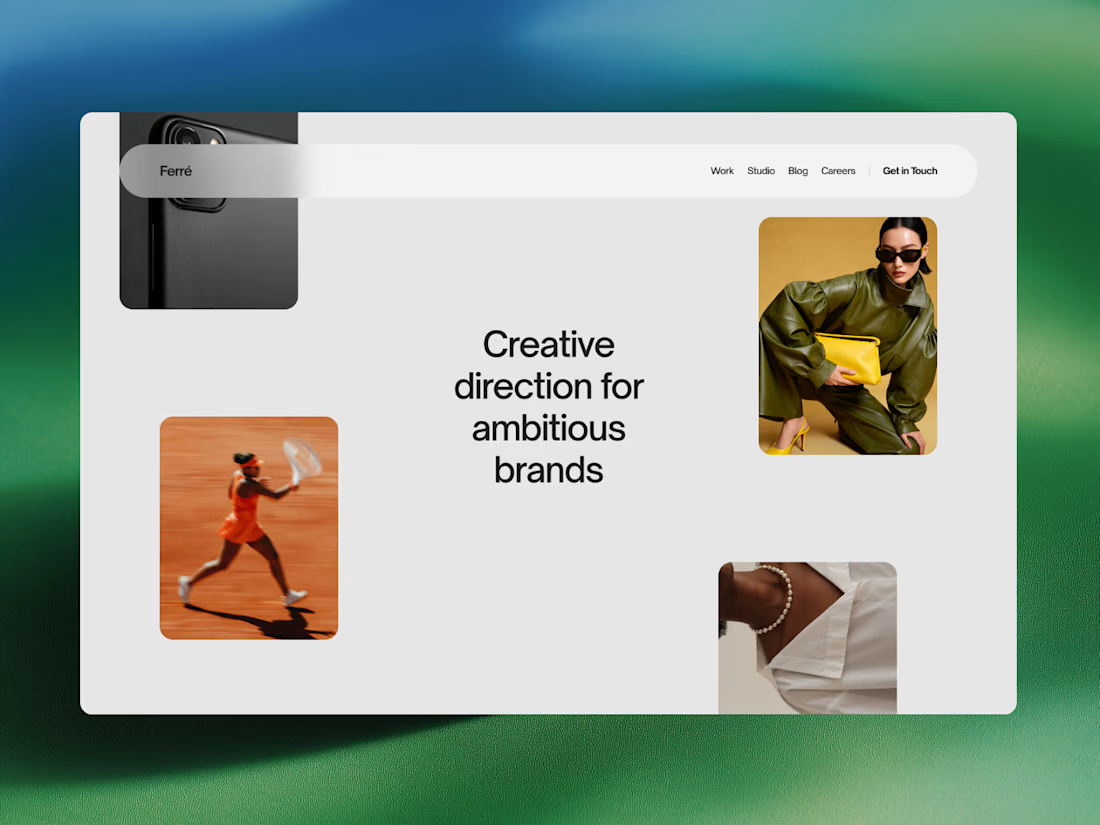
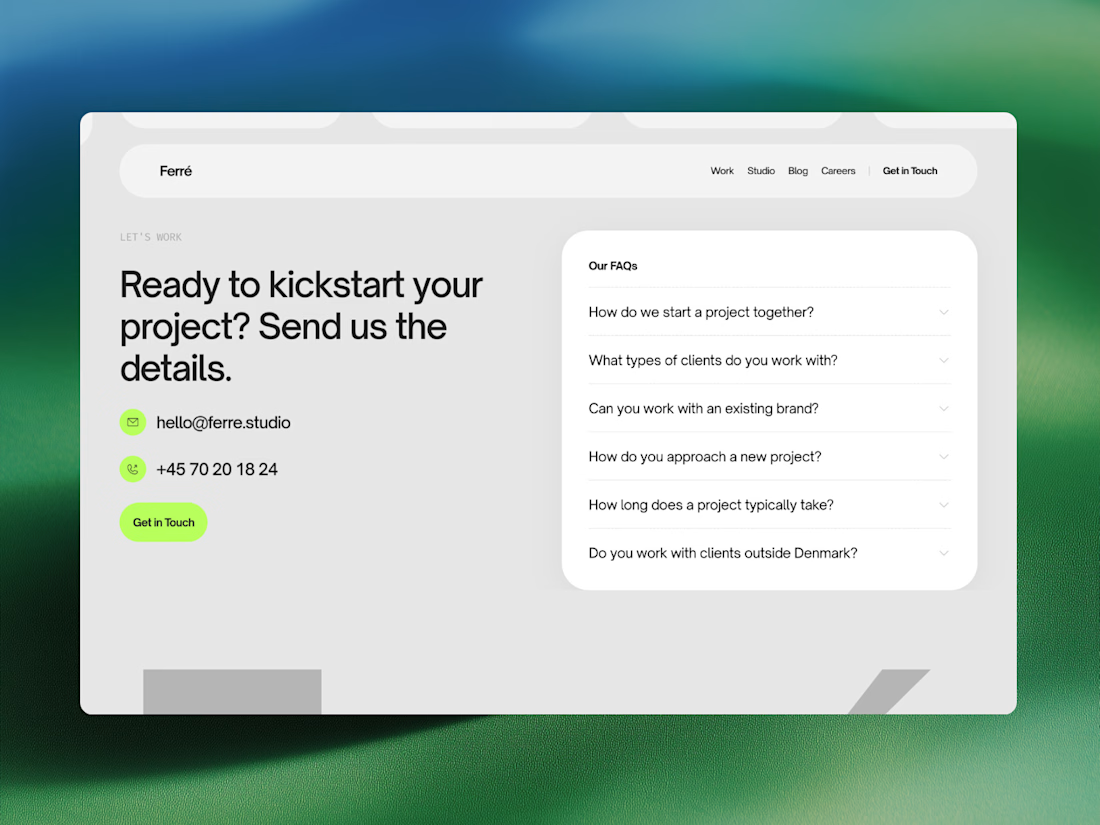
Ferré is an agency template designed for creative studios, design firms, and independent practices looking to present their work with clarity and confidence.
Built around an editorial visual language, this template combines bold typography, subtle interactions, and an immersive layout to create a sophisticated digital presence. Showcase your work, introduce your studio, share ideas through a journal, and give potential clients a clear sense of what you do.



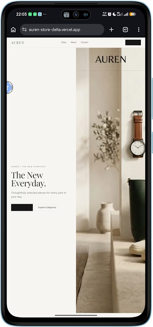
AUREN — Premium Storefront
Built a premium e-commerce storefront from scratch, focused on clean product presentation, responsive design, and a simple shopping experience.
Built with Next.js, React, CSS, and Cloudinary.
Source: https://github.com/JJTGG/auren-store


Glad it was useful. I’d keep that line compact near the CTA—something like “Ships in X–Y days · 30-day returns”—and link to the full policy. It answers a key risk question without interrupting the premium feel. The storefront already has a strong base.