The network for creativity
Join 1.25M professional creatives like you
Connect with clients, get discovered, and run your business 100% commission-free
Creatives on Contra have earned over $150M and we are just getting started
Back to feedPost

Faceless avatars UI design. Do you prefer dark mode or light mode?
Check full project here



Dark mode for this one, the purple background makes that faceless avatar look intentional and sculptural rather than like a placeholder icon. Nice detail putting the SVG export right in the same panel too, that's the kind of thing users actually need fast.

Dark mode, it makes the avatar itself feel like the hero instead of competing with a bright background. Are these avatars generated per-user in the product, or is it a fixed set people pick from?


Cool 👏
The network for creativity
Join 1.25M professional creatives like you
Connect with clients, get discovered, and run your business 100% commission-free
Creatives on Contra have earned over $150M and we are just getting started
Related posts

Designed a simple hero section for a decentralized On-chain Bank app. Which do you prefer? A or B?
#herosection #productdesign

2 voted
40%
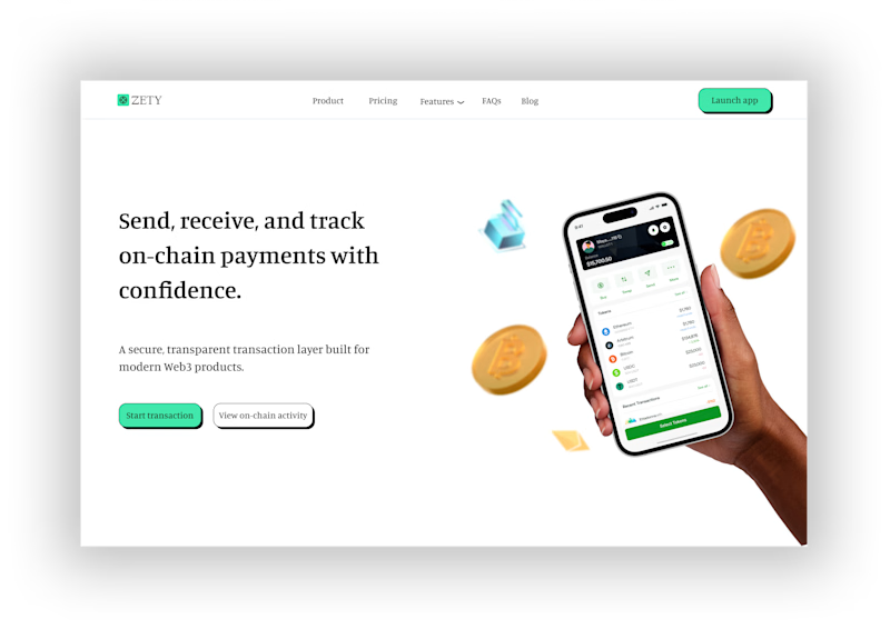
3 voted
60%

5 votes
Closed
Light mode obviously

What if every transition had a little personality? ✨
Experimenting with Figma Motion on one of my web projects.
Are you guys using Figma Motion yet or sticking with prototypes?

Really clean work! I'm curious, does designing with Motion from the start change how you approach layouts and interactions?

Spent today exploring two moodboard directions for a coffee brand I'm working on. ☕️ The brief is to create something clean, playful, and illustration-led, while keeping the colours bold and vibrant. I'm torn between the two—which direction would you pick, Blue or Red? Let me know why in the comments! 👇
3 voted
43%
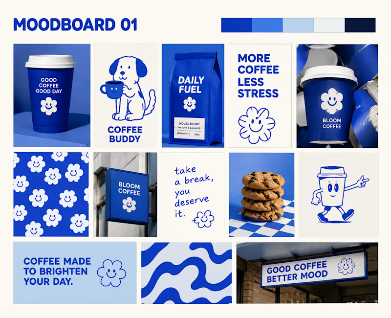
4 voted
57%
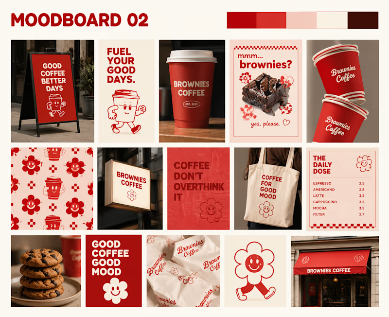
7 votes
Closed

Both are good !








Trending

Claude
Claude has entered the design space. How are you using Claude Design?

Contra University
Learn from expert creatives how to earn more using next-gen AI tools.
fifaworldcup2026
The World Cup is here and the whole world's watching. How are you designing for the world stage?
creativeaiflow
Creative AI workflows are evolving. What tools do you use, and what are their strengths and weaknesses?
freelancerlife
Freelancer life is wins, pivots, and everything in between. What’s yours right now?